Designing Custom Spectral Indices with the Index Creator Lab

In the previous lesson you computed indices from a catalog of literature formulas. But your research target may not have a standard index, or the published ones may saturate, respond to the wrong feature, or were designed for sensors with far fewer bands than Tanager's 426.
This is where hyperspectral data pays off. Because Tanager samples the spectrum in narrow, contiguous steps, you can place a band almost anywhere a material has a diagnostic absorption or reflectance feature, and design your own index from scratch.
To learn how, we will do something deliberately humbling: reinvent NDVI. Instead of treating the world's most famous vegetation index as a formula to memorize, we will rediscover it from physics, the same way its inventors did, using the Index Creator Lab. Once you have rebuilt a known index from first principles, inventing a new one is just a change of windows and a change of math.
Note
This lesson assumes you already understand spectral indices and the principles behind NDVI, EVI, and NDRE. The full theory, including leaf physics and the illumination-invariance proof, is covered in Lesson 10, “Calculate Narrow-band Spectral Indices.”. Here, we keep the physics brief and focus on the main skill: using the tool to design similar spectral indices.
In this lesson, you will learn the five main tools that TanagerSpec provides for testing and inventing spectral indices, as illustrated in the figure below.
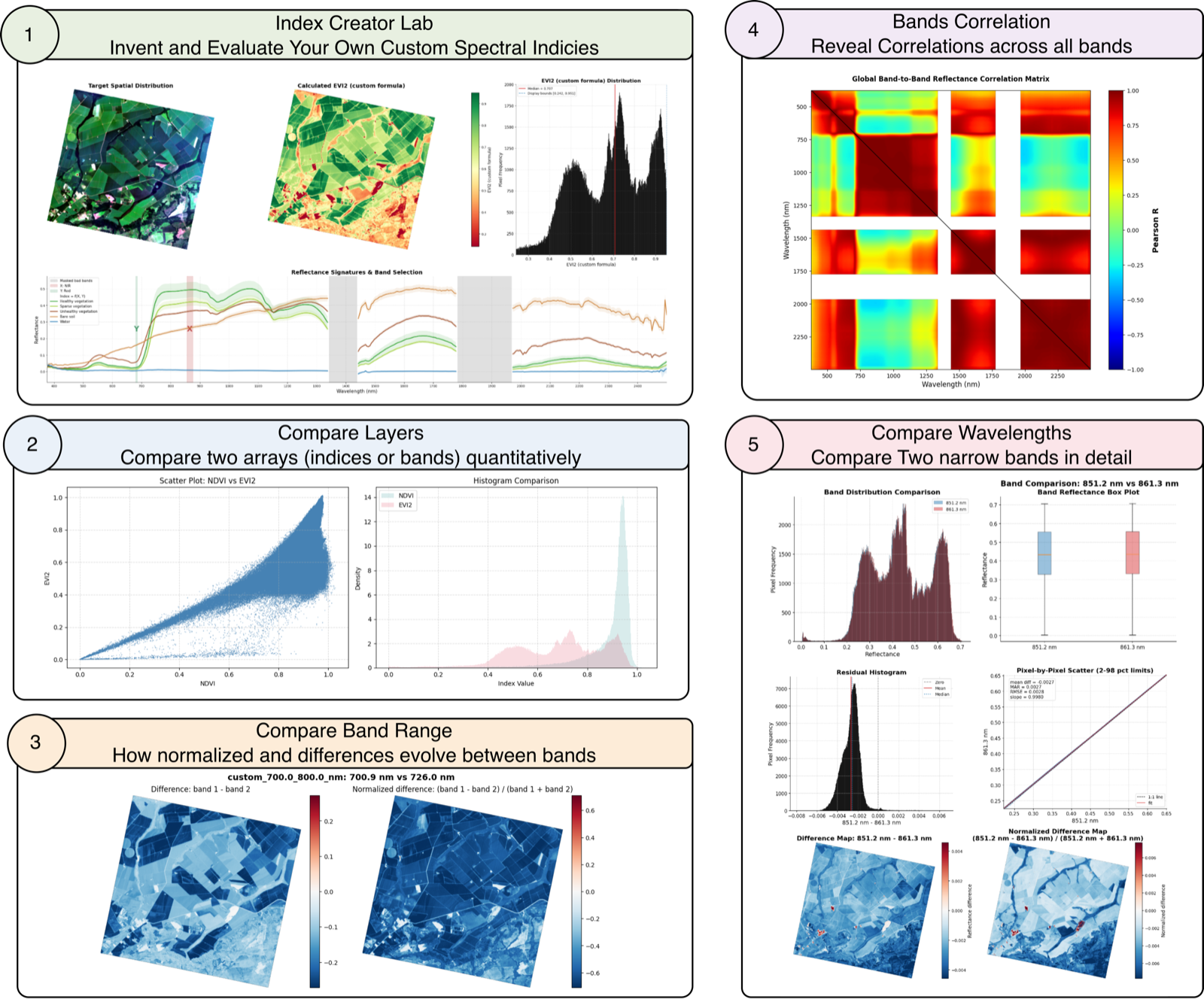
What You Will Learn
- Reinvent NDVI from physics (
.analysis.index_creator_lab()): Reason from leaf physics to two spectral windows and discover that the lab's default formula already is the normalized difference, so you rebuild NDVI without writing a single equation. - Bring your own math (
index_func): Swap in a custom function to go beyond the normalized difference (we reproduce two-band EVI2), proving the lab can prototype any well-behaved formula, not just ratios. - Compare the indices you produce: Put two of your lab outputs side by side, a pixel scatter plus overlaid histograms, to see quantitatively where your designs agree, where they diverge, and how their dynamic ranges differ.
- Find where to place your bands, then invent one: Use
.plot.bands_correlation()for a global view of band redundancy,.analysis.compare_band_range()to rank the highest-contrast band pairs inside a region, and.analysis.compare_bands()to drill into a single pair, then feed the winners back into the lab to design a brand-new red-edge index.
By the end you will have walked the full scientific loop: spectral intuition → custom formula → index map → comparison → real application.
Workspace Setup & TanagerSpec Initialization
Just like in previous lessons, this notebook is designed to run completely on its own.
Our first step is to set up our workspace and initialize TanagerSpec. The cell below will check your data/ folder for the agricultural scene (ortho_sr_scene.h5), the same clear scene we explored in the Visualization and Spectral Indices lessons. If you're continuing straight from those lessons, the script detects the existing file and instantly skips the download. If you're jumping in fresh through Google Colab, don't worry, it will automatically fetch the data from the Open STAC catalog so we can get right to building indices.
## Unhide cell for package install if needed

# %pip install tanagerspec
# Standard library imports
from datetime import datetime               # For timestamping output folders
from pathlib import Path                    # For handling file and directory paths

# TanagerSpec package imports
from tanagerspec import download_scene      # Utility function to download a Tanager scene
from tanagerspec import TanagerSpec         # Main class for interacting with Tanager hyperspectral data

# third party imports
import matplotlib.pyplot as plt
import numpy as np

# 1. Setup Data and Output Directories
DATA_DIR = Path("data")
DATA_DIR.mkdir(parents=True, exist_ok=True)

timestamp = datetime.now().strftime("%Y%m%d_%H")
OUTPUT_DIR = Path(f"outputs_{timestamp}")
OUTPUT_DIR.mkdir(parents=True, exist_ok=True)

# Figure directory
FIGURE_DIR = OUTPUT_DIR / "figures"
FIGURE_DIR.mkdir(parents=True, exist_ok=True)

# 2. Define Scene Parameters (same clear agricultural scene as the Visualization & Indices lessons)
URL = 'https://storage.googleapis.com/open-cogs/planet-stac/tanager1-release2-core-imagery/ortho_sr_hdf5/20250501_143138_87_4001_ortho_sr_hdf5.h5'
FILE_NAME = "ortho_sr_scene.h5"
target_path = DATA_DIR / FILE_NAME

# 3. Smart Download: Check if file exists before downloading
if target_path.exists():
    print(f"Scene already exists locally at: {target_path}. Skipping download.")
    TANAGER_SCENE_PATH = target_path
else:
    print("Local scene not found. Downloading from STAC...")
    TANAGER_SCENE_PATH = download_scene(
        URL,          # URL of the HDF5 file to download
        target_path   # Destination path to save the file
    )

# 4. Verify Final Path
if TANAGER_SCENE_PATH is not None and Path(TANAGER_SCENE_PATH).exists():
    print(f"Ready for analysis with scene: {TANAGER_SCENE_PATH}")
else:
    print("Error: Scene file is missing or download failed.")

# 5. Initialize the TanagerSpec object using the verified scene path
tanager_ortho_sr = TanagerSpec.from_file(TANAGER_SCENE_PATH)

print("TanagerSpec object successfully initialized!")
Reinventing NDVI from First Principles
Imagine you are a remote-sensing scientist looking at a hyperspectral image for the first time. You only have the reflectance spectrum of the Earth, and one question:
Can I build a mathematical contrast that makes healthy vegetation stand out clearly from soil, water, and built surfaces?
The physics gives the answer. A healthy green leaf is dark in the red (~650–680 nm, chlorophyll absorption) and bright in the near-infrared (~760–850 nm, internal cell-structure scattering), and no other common surface does both at once. So NIR − Red is large only for vegetation, and dividing by the total brightness (NIR + Red) removes the bias toward simply-bright surfaces, giving the normalized difference:
$$\text{NDVI} = \frac{\text{NIR} - \text{Red}}{\text{NIR} + \text{Red}}$$
Here is the punchline for this lesson: the Index Creator Lab's default formula is exactly the normalized difference. So if we hand it a NIR window and a Red window and don't pass a formula at all, it will reinvent NDVI for us, no equation typed.
How the Index Creator Lab Works
.analysis.index_creator_lab() turns a spectral hypothesis into a full-scene map. You give it two wavelength windows (band_x and band_y) and a set the named targets. The lab averages reflectance inside each window to build two images, RA (from band_x) and RB (from band_y), projects a formula across every pixel, and returns the index plus a four-panel dashboard:
- An RGB context map with your targets
- Calculated Index Map
- Histogram (Values Distribution) of Calculated Index
- the mean spectra with your windows highlighted
- Spectral Signatures of Targets with the Selected Wavelength Windows
By default it applies the normalized difference (RA - RB) / (RA + RB). Later we will learn how to pass your own function to index_func(RA, RB).
Parameter Reference
| Parameter | Type | Description |
|---|---|---|
target_dict |
dict[str, tuple[int, int]] |
Label → (row, col) training pixels, used to extract and overlay spectral signatures (same convention as .plot.hunt_pixels() / .plot.pixel_spectra()). |
color_dict |
dict[str, str] |
Label → Matplotlib color for each target on the map and spectra plot. |
band_x, band_y |
tuple |
(name, min_nm, max_nm, color). The two spectral windows averaged into RA (band_x) and RB (band_y). The 4th element is the highlight color used to shade that window on the mean-spectra plot — not a unit. |
index_func |
callable or None |
A function f(RA, RB) returning a 2-D index array. If None, defaults to the normalized difference (RA - RB) / (RA + RB). |
index_name |
str |
Title / colorbar label for the index (default "Custom Index"). |
avg_radius |
int |
Half-width (pixels) of the square window averaged around each target when building its signature (default 2). |
cmap |
str |
Colormap for the index panel (default "viridis"). |
robust_percentiles |
tuple |
(low, high) percentiles for display scaling of the map and histogram; None uses min/max. |
mask_threshold |
float, tuple, or None |
A scalar masks index values below it to NaN; a 2-tuple (start, stop) masks values outside that interval. |
Returns
A dict with: index_image (the 2-D custom index), band_a_image, band_b_image (the averaged RA / RB window images), and band_a_mask, band_b_mask (the per-band validity masks used in the averaging).
# 1 . Define your two spectral windows
# Tuple format: (name, min_nm, max_nm, highlight_color)
nir_window = ("NIR", 855,875, "firebrick")   # leaf-structure plateau (bright for vegetation)
red_window = ("Red", 680, 685, "seagreen")    # chlorophyll absorption (dark for vegetation)
# 2. Define your pixels for spectral signatures
targets = {
    "Healthy vegetation": (403, 495),
    "Sparse vegetation":  (225, 486),
    "Unhealthy vegetation": (400, 140), # There is no validation for this target, it's a guess from the shape of the spectral signature
    "Bare soil": (508, 289),
    "Water": (456, 514)
}
# 3. Color each target with a different color
colors = {
    "Healthy vegetation": "tab:green",
    "Sparse vegetation":  "yellowgreen",
    "Unhealthy vegetation": "sienna",
    "Bare soil": "peru",
    "Water": "tab:blue"
}
# 4. Run the Index Creator Lab with the specified spectral windows, targets, and visualization options.
result = tanager_ortho_sr.analysis.index_creator_lab(
    target_dict=targets,            # Dictionary of labeled pixel positions for signature extraction
    color_dict=colors,              # Color assignment for each target
    band_x=nir_window,              # RA = mean reflectance in the NIR window (e.g., "NIR", 855-875nm)
    band_y=red_window,              # RB = mean reflectance in the Red window (e.g., "Red", 680-685nm)
    index_name="NDVI (reinvented)", # Name/title for the custom index and colorbar
    avg_radius=2,                   # Average reflectance in 5x5 window (radius=2)
    cmap="RdYlGn",                  # Colormap for rendering the index visualization
    robust_percentiles=(2, 98),     # Percentile scaling to limit influence of outlier pixels
)
# Unpack the result dict and Explore the index and band maps

ndvi         = result["index_image"]
band_a_image = result["band_a_image"]
band_b_image = result["band_b_image"]
band_a_mask  = result["band_a_mask"]
band_b_mask  = result["band_b_mask"]

def plot_index_maps(index, band_a_image, band_b_image):
    """
    Plots the NDVI, Band A, and Band B maps side by side.

    Parameters:
    - index: 2D array of index values
    - band_a_image: 2D array of Band A (NIR) reflectance values
    - band_b_image: 2D array of Band B (Red) reflectance values
    """
    fig, axes = plt.subplots(1, 3, figsize=(15, 8))

    # Index map
    im0 = axes[0].imshow(index, cmap="RdYlGn")
    cbar0 = plt.colorbar(im0, ax=axes[0], fraction=0.046, pad=0.04)
    cbar0.set_label("Index")
    axes[0].set_title("Index Map")

    # Band A map
    im1 = axes[1].imshow(band_a_image, cmap="viridis")
    cbar1 = plt.colorbar(im1, ax=axes[1], fraction=0.046, pad=0.04)
    cbar1.set_label("Band A (NIR) Reflectance")
    axes[1].set_title("Band A Map")

    # Band B map
    im2 = axes[2].imshow(band_b_image, cmap="magma")
    cbar2 = plt.colorbar(im2, ax=axes[2], fraction=0.046, pad=0.04)
    cbar2.set_label("Band B (Red) Reflectance")
    axes[2].set_title("Band B Map")

    plt.tight_layout()
    plt.show()

# Plot the index map
plot_index_maps(ndvi, band_a_image, band_b_image)
Note
You can use the optional mask_threshold parameter to mask index values by:
- Set a float to mask values below this threshold to
NaN. - Use a tuple
(start, stop)to mask values outside that interval.
You can access the generated masks from the output Dict using the keys band_a_mask and band_b_mask.
Next step. That crowded spike at the top is the well-known NDVI saturation, over dense canopy it loses sensitivity. The natural question becomes: can a different formula re-expand that compressed top end? That is exactly what EVI2 was designed to do, so we swap in our own math next.
Beyond the Normalized Difference
Reinventing NDVI proved the workflow, but the lab is not limited to ratios. Pass a callable as index_func and the lab projects that math across the scene instead of the default. The contract is simple:
def my_index(RA, RB):
    # RA = mean reflectance in band_x window (here, NIR)
    # RB = mean reflectance in band_y window (here, Red)
    ...
    return result_2d_array   # same (rows, cols) shape as RA / RB
Guard against divide-by-zero (some pixels are masked or dark) and return NaN where the math is undefined.
To show this off with a real formula, we reproduce two-band EVI2 (Jiang et al., 2008), the soil/background-adjusted index you met in Lesson 10, which resists the saturation NDVI suffers over dense canopy:
$$\text{EVI2} = g \cdot \frac{\text{NIR} - \text{Red}}{\text{NIR} + 2.4 \cdot \text{Red} + 1}, \quad g = 2.5$$
Notice we keep the exact same two windows as before — only the math changes.
# Custom formula: two-band EVI2. Same windows as Act 1 (RA = NIR, RB = Red).
def evi2_index(RA, RB):
    # Two-band EVI2 (Jiang et al., 2008): RA = NIR window mean, RB = Red window mean.
    g, L, C = 2.5, 1.0, 2.4
    with np.errstate(divide="ignore", invalid="ignore"):
        out = g * (RA - RB) / (RA + C * RB + L)
    return np.where(np.isfinite(out), out, np.nan)
result_evi2 = tanager_ortho_sr.analysis.index_creator_lab(
    target_dict=targets,
    color_dict=colors,
    band_x=nir_window,             # RA = NIR window
    band_y=red_window,             # RB = Red window
    index_name="EVI2 (custom formula)",
    index_func=evi2_index,         # <-- our own math, replacing the default
    avg_radius=2,
    cmap="RdYlGn",
    robust_percentiles=(2, 98),
    mask_threshold=0.0,            # drop non-positive (non-vegetated) values from the map
)
evi2         = result_evi2["index_image"]
band_a_image = result_evi2["band_a_image"]
band_b_image = result_evi2["band_b_image"]

plot_index_maps(evi2, band_a_image, band_b_image)
Reading the Result: did EVI2 help?
Put this dashboard next to the NDVI one:
- Index map — the near-uniform saturated green of NDVI is gone. EVI2 now renders the canopy as graded greens and yellows, so field-to-field and within-field differences that NDVI flattened are suddenly visible. (The
mask_threshold=0.0we passed has also dropped the non-vegetated pixels, so the map is vegetation-only.) - Histogram — the single tall NDVI spike has spread into a broad distribution across roughly 0.3–1.0. The pixels NDVI crushed against its ceiling are now stretched over a range exactly the saturation relief EVI2 promises.
Next step. Eyeballing two maps is suggestive, not proof. To claim EVI2 is genuinely more sensitive here, we need to put the two indices on the same axes and measure how they relate, pixel against pixel. That is what .analysis.compare_layers() is for.
Comparing the Indices You Designed with .analysis.compare_layers()
You now have two index maps built in this lab: the reinvented NDVI and the custom EVI2 . They target the same feature green vegetation, but with different math, so a natural question follows: how differently do they actually behave across this scene? NDVI saturates over dense canopy; EVI2 was designed to keep responding there. .analysis.compare_layers() lets you see that quantitatively instead of guessing.
Note
We already covered the .analysis.compare_layers() API in the previous lesson — including call shape, parameters, and the fact that it renders/saves a figure and returns None. See Lesson 19 — Calculating and Comparing Spectral Indices with TanagerSpec.
# Compare the two index maps you designed: reinvented NDVI (Act 1) vs custom EVI2 (Act 2).
# Pixels masked to NaN (e.g. EVI2's mask_threshold) are dropped automatically.
comparison = tanager_ortho_sr.analysis.compare_layers(
    ndvi,
    evi2,
    index1_name="NDVI",
    index2_name="EVI2",
    save_png=FIGURE_DIR / "compare_ndvi_vs_evi2.png",
)
Reading the Result: does EVI2 actually win?
The two panels turn our hunch into a measurement.
- Scatter (NDVI vs EVI2) — below NDVI ≈ 0.4 the points track a tight, almost-linear path: where vegetation is sparse, the two indices agree. But above NDVI ≈ 0.8 the cloud fans out vertically — pixels sitting at essentially the same NDVI (~0.9) spread across EVI2 values from ~0.35 all the way to ~1.0. That fan is NDVI saturation made visible: NDVI assigns one near-maximal number to canopies that EVI2 still resolves into distinct densities. (The thin scatter trailing along the bottom is mixed/edge pixels.)
- Histograms — NDVI collapses into a tall, narrow spike near 0.9 , while EVI2 is a broad distribution (multimodel) spread across ~0.3–0.95. EVI2 uses far more of its dynamic range on this scene.
So over this dense, healthy canopy, EVI2 is the better discriminator, exactly what it was designed for, now confirmed numerically rather than asserted.
Next step. TanagerSpec provides additional tools for exploring narrow hyperspectral bands. As shown, users can adjust the wavelength window, calculate the average reflectance, and use it instead of relying on a single narrow band. However, what if you want to investigate an individual narrow band within a specific spectral region, such as the NIR or red range? For example, how can you answer questions such as: What is the difference between 680 nm and 675 nm? How do reflectance values change across the NIR region? How are different wavelengths correlated? TanagerSpec helps answer these questions through tools such as
bands_correlation(),compare_band_ranges(), andcompare_bands().
Designing a Brand-New Index
For NDVI we already knew which windows to use, because the leaf physics is famous. But when you chase a less-charted target, crop stress, a specific mineral, water quality, you first have to find where in the spectrum the contrast actually lives. Three tools answer that, as a funnel that narrows from the whole cube down to a single band pair, and their output feeds straight back into the lab:
.plot.bands_correlation()— a global map of which bands are redundant and which carry independent information..analysis.compare_band_range()— zoom into one region (e.g. the red edge) and rank every band pair inside it by contrast..analysis.compare_bands()— drill into a single pair to confirm it is genuinely informative before you build with it.
Then we close the loop by feeding the winning windows back into the Index Creator Lab.
Find Where the Information Lives: .plot.bands_correlation()
In a hyperspectral cube, neighbouring bands are usually highly correlated, two channels 5 nm apart see almost the same thing. A band-to-band correlation heatmap makes this concrete: each cell is the Pearson correlation between two bands, computed over the valid pixels.
Bright off-diagonal blocks mark groups of redundant bands; darker regions mark band pairs that carry independent information. Reading this map tells you which spectral regions are worth contrasting in a custom index.
tanager_ortho_sr.plot.bands_correlation(
    save_png=FIGURE_DIR / "bands_correlation.png"
)
Rank the Best Band Pairs in a Region: .analysis.compare_band_range()
bands_correlation() gives a global view of redundancy. When designing an index, though, you usually care about a specific spectral region, say the red edge, and want to know which pair of bands inside it carries the most contrast. That is exactly what .analysis.compare_band_range() answers: it selects every band in a wavelength range (a named preset or a custom interval), compares all possible pairs, ranks them by a contrast metric, and plots the difference / normalized-difference maps for the top-ranked pairs.
The ranking points you straight at the most informative (band_1, band_2) pair to feed back into the Index Creator Lab.
Note
compare_band_range is a beta exploratory tool. It plots one figure per ranked pair, so keep max_plot_pairs modest on wide ranges.
Available presets
coastal, blue, green, yellow, orange, red, red_edge, nir, visible or pass your own wavelength_range=(start_nm, stop_nm).
Parameter Reference
| Parameter | Default | Description |
|---|---|---|
preset |
"red" |
Named wavelength region (see list above). Ignored if wavelength_range is given. |
wavelength_range |
None |
Custom (start_nm, stop_nm) interval; overrides preset. |
use_good_bands |
True |
Skip bands flagged invalid in scene metadata. |
sort_by |
"mean_abs_normalized_difference" |
Metric used to rank pairs (also accepts rmse, mean_abs_reflectance_difference, slope, …). |
ascending |
False |
Sort direction; False lists the highest-contrast pairs first. |
max_plot_pairs |
12 |
Cap on how many ranked pair figures to draw; None plots all. |
min_valid_pixels |
10 |
Minimum overlapping valid pixels required for a pair. |
return_maps |
False |
If True, include the per-pair map arrays in the returned dict. |
robust_percentiles |
(2, 98) |
Display stretch for the map color limits. |
plot |
True |
If False, compute and rank without drawing figures. |
save_png |
None |
Base path for saved figures; multiple pairs get _pair_XX suffixes. |
Returns
A dict with range_name, wavelength_range, selected_bands, pair_count, a ranked summary list (one row per pair: wavelengths, indices, mean/abs differences, RMSE, slope, dominant band, …), and maps (only when return_maps=True).
# See the available preset regions (this is a PROPERTY -> no parentheses)
print(tanager_ortho_sr.analysis.band_range_presets)

# Compare every band pair inside the red-edge region and rank by spatial contrast
band_range_report = tanager_ortho_sr.analysis.compare_band_range(
    wavelength_range=(700,800),                            # or wavelength_range=(700, 750)
    use_good_bands=True,                          # skip bands flagged invalid in metadata
    min_valid_pixels=10,
    max_plot_pairs=5,                             # cap how many pair figures are drawn
    return_maps=True,
    plot=True,
    save_png=FIGURE_DIR / "red_edge_band_range_comparison.png",
)
Drill Into the Winning Pair: .analysis.compare_bands()
The ranking above put ~700.9 nm vs ~746.0 nm at the top (mean |normalized difference| ≈ 0.72). Notice that this exact pair was not one of the eight maps we just drew — compare_band_range plots pairs in enumeration order and we capped it at eight, stopping one short of the winner. So before committing those two windows to an index, let's inspect that single pair directly: are the two wavelengths effectively redundant, is one consistently offset from the other, and do they diverge over particular land-cover types? That is the final narrowing step of the funnel, and .analysis.compare_bands() is built for it.
It takes two target wavelengths (snapping each to the nearest available band) and produces a six-panel
diagnostic: overlaid reflectance histograms, side-by-side box plots, a residual histogram of
band_1 − band_2, a pixel-by-pixel scatter with a 1:1 line and a fitted slope, a spatial difference
map (band_1 − band_2), and a normalized difference map ((band_1 − band_2) / (band_1 + band_2)).
It also returns a metrics dictionary so you can read off RMSE, mean difference, Pearson r, and slope.
Parameter Reference
| Parameter | Type | Default | Description |
|---|---|---|---|
first_wavelength, second_wavelength |
float or int |
— | Target wavelengths in nm; each maps to the nearest available band. |
robust_percentiles |
tuple or None |
(2, 98) |
Display stretch for the scatter and maps; None uses full min/max. |
difference_cmap |
str |
"RdBu_r" |
Colormap for the reflectance difference map. |
sample_size |
int or None |
50000 |
Max pixels drawn in the scatter (keeps it responsive); None plots all. |
random_seed |
int |
42 |
Seed for reproducible scatter sampling. |
bins |
int |
500 |
Histogram bin count. |
nodata |
float or int |
-9999 |
Pixel value converted to NaN before any statistics. |
plot |
bool |
True |
If False, skip the figure and just return the metrics dict. |
save_png |
str or None |
None |
Path to save the diagnostic figure. |
Returns
A dict with first_band, second_band, a comparison block (RMSE, mean/abs difference, Pearson r,
slope, intercept, valid pixel count, …), and a maps block holding the reflectance_difference and
normalized_difference arrays.
# Drill into the ranking's #1 red-edge pair (~700.9 nm vs ~746.0 nm).
# Note: compare_band_range plotted band pairs in enumeration order and stopped one short
# of this pair, so we inspect it directly here before committing it to an index.
band_pair_report = tanager_ortho_sr.analysis.compare_bands(
    first_wavelength=850,
    second_wavelength=860,
    robust_percentiles=(2, 98),
    plot=True,
    save_png=FIGURE_DIR / "index_creator_lab.png",   # ← new
)
What's Next?
You have moved from using indices to designing them, reasoning from physics to rebuild NDVI, and creating your own formula to reproduce EVI2. In addition, you are now familiar with the helper tools that support informed decisions when selecting your narrow bands.
So far every technique has worked one band, one pair, or one index at a time. In the final lesson, Machine Learning Applications, we let algorithms work across all the bands at once: compressing the spectral axis with dimensionality reduction, grouping pixels without labels through clustering, and — once you supply labelled examples — classifying every pixel in the scene into named materials.
See you in the next lesson!