Visualizing Hyperspectral Data with TanagerSpec

Up to this point, we have focused on the foundational mechanics of hyperspectral workflows: downloading scenes, applying quality masks, reducing noise, and formatting files. Now comes one of the most rewarding stages of remote sensing: Visualization and Exploration.
In this lesson, we will execute Phase 1 and Phase 2 of our hyperspectral analysis recipe: taking raw data cubes and translating them into actionable visual insights.
A standard Tanager-1 data cube is a massive numerical volume, stacking 426 contiguous spectral bands on top of one another. Because the human eye is limited to the visible spectrum, we need specialized routines to slice through these hidden layers and map narrow wavelengths into impactful, interpretable graphics.
Whether you are identifying healthy vegetation, mapping mineral deposits, or checking for sensor artifacts, visual exploration is your indispensable first line of analysis. TanagerSpec provides a built-in plotting engine optimized for fast, publication, quality spatial and spectral rendering directly inside your Python notebook.
What You Will Learn
In this module, you will learn how to bring your hyperspectral cubes to life. Specifically, we will cover how to:
- Render RGB Composites (
.plot.rgb): Generate standard True-Color imagery to establish visual context, or build customized False-Color composites using Near-Infrared (NIR) and Shortwave-Infrared (SWIR) channels to make specific surface features pop. - Inspect Band Galleries (
.plot.bands_gallery): Render multi-band grid layouts to instantly evaluate spatial textures, structural clarity, and sensor behavior across distinct regions of the electromagnetic spectrum. - Evaluate Reflectance Distributions (
.plot.analyze_reflectance_band): Pair single-band spatial maps with their corresponding statistical histograms to examine pixel frequency distributions, establish threshold ranges, and perform rigorous visual quality control. - Hunt Pixels Interactively (
.plot.hunt_pixels): Launch dynamic UI widgets to explore your scene directly within the notebook, pinpointing the exact(row, column)spatial coordinates of target surface materials. - Extract Spectral Signatures (
.plot.pixel_spectra): Drill down into individual pixels to plot continuous reflectance curves (Z-profiles), revealing the unique physical fingerprints of your target features. - Assess ROI Consistency (
.plot.roi_spectral_variability): Analyze intra-class variability, sub-pixel mixing, and spatial noise across multi-pixel Regions of Interest (ROIs) using standard deviation envelopes. - Animate the Spectrum (
.plot.animate_bands): Export dynamic, frame-by-frame GIFs that sweep through contiguous wavelengths to visualize spectral continuity and track atmospheric shifts over your scene.
Let’s re-establish our clean workspace and start exploring our scene!
Workspace Setup & TanagerSpec Initialization
Just like in previous lessons, this notebook is designed to run completely on its own.
Our first step is to set up our workspace and initialize TanagerSpec. The cell below will check your data/ folder for the raw scene (ortho_sr_scene.h5). If you're continuing straight from Lesson 1 or 2, the script will detect your existing file and instantly skip the download. If you are jumping in fresh through using Google Colab, don't worry, it will automatically fetch the data from the Open STAC catalog so we can get right to exporting.
## Unhide cell for package install if needed

# %pip install tanagerspec
# Standard library imports
from datetime import datetime               # For timestamping output folders
from pathlib import Path                    # For handling file and directory paths

# TanagerSpec package imports
from tanagerspec import download_scene      # Utility function to download a Tanager scene
from tanagerspec import TanagerSpec         # Main class for interacting with Tanager hyperspectral data

# 1. Setup Data and Output Directories
DATA_DIR = Path("data")
DATA_DIR.mkdir(parents=True, exist_ok=True)

timestamp = datetime.now().strftime("%Y%m%d_%H")
OUTPUT_DIR = Path(f"outputs_{timestamp}")
OUTPUT_DIR.mkdir(parents=True, exist_ok=True)

# Figure directory
FIGURE_DIR = OUTPUT_DIR / "figures"
FIGURE_DIR.mkdir(parents=True, exist_ok=True)

# 2. Define Scene Parameters
URL = 'https://storage.googleapis.com/open-cogs/planet-stac/tanager1-release2-core-imagery/ortho_sr_hdf5/20250501_143138_87_4001_ortho_sr_hdf5.h5'
FILE_NAME = "ortho_sr_scene.h5"
target_path = DATA_DIR / FILE_NAME

# 3. Smart Download: Check if file exists before downloading
if target_path.exists():
    print(f"Scene already exists locally at: {target_path}. Skipping download.")
    TANAGER_SCENE_PATH = target_path
else:
    print("Local scene not found. Downloading from STAC...")
    TANAGER_SCENE_PATH = download_scene(
        URL,          # URL of the HDF5 file to download
        target_path   # Destination path to save the file
    )

# 4. Verify Final Path
if TANAGER_SCENE_PATH is not None and Path(TANAGER_SCENE_PATH).exists():
    print(f"Ready for preprocessing with scene: {TANAGER_SCENE_PATH}")
else:
    print("Error: Scene file is missing or download failed.")

# 5. Initialize the TanagerSpec object using the verified scene path
tanager_ortho_sr = TanagerSpec.from_file(TANAGER_SCENE_PATH)

# 6. Denoise the scene (Optional)
tanager_ortho_sr.denoise(
    n_components=4,
)

print("TanagerSpec object successfully initialized!")
Phase 1 — Image and Band Exploration
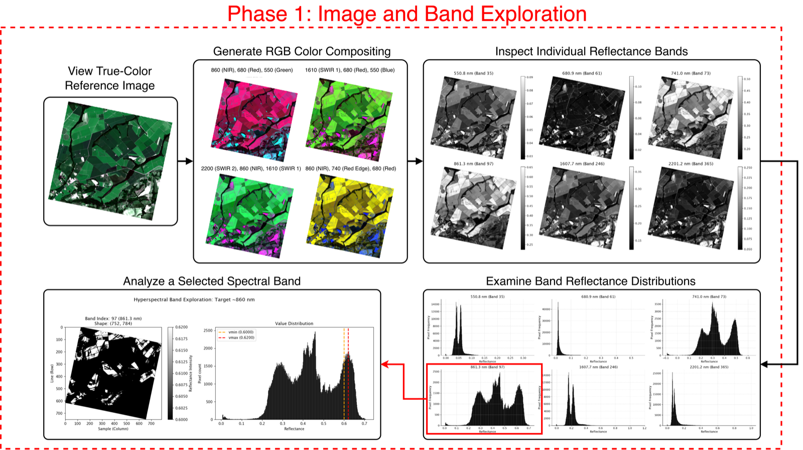
We open the recipe with Image and Band Exploration. The goal of this phase is to turn the raw 426-band cube into something you can actually see and trust: first establishing visual context with color composites, then working down to the behavior of individual wavelengths. Everything here is spatial and per-band inspection: there are no indices or models yet, just a disciplined visual quality-control pass that tells you whether your scene is clean, what surfaces are present, and which bands carry usable signal before you commit to any quantitative analysis.
In this phase, you will:
- View a true-color reference and build RGB composites with
.plot.rgb()to anchor the scene in familiar colors and highlight specific features using false-color presets. - Inspect individual reflectance bands as a grid with
.plot.bands_gallery()to judge spatial texture, contrast, and sensor noise across the spectrum. - Examine band reflectance distributions with
.plot.bands_histograms()to read the numeric value spread and spot saturation or distinct surface populations. - Analyze a single critical wavelength with
.plot.analyze_reflectance_band(), pairing its spatial map with its histogram for focused quality control. - Compare two wavelengths directly with
.analysis.compare_bands()to decide whether neighboring bands are redundant or carry independent information.
For the general call shape (object.accessor.method, assigning outputs, export kwargs), see Lesson 15 — How TanagerSpec Method Calls Are Structured.
Rendering RGB Composites with .plot.rgb()
Slicing a 426-band hyperspectral cube into a standard 3-channel image requires mapping specific wavelengths to the Red, Green, and Blue channels of your display.
The .plot.rgb() method handles both the wavelength mapping and contrast stretching automatically. It returns a standard Height × Width × 3 NumPy array and, by default, renders the polished image directly.
Parameter Reference
| Parameter | Type | Default | Description |
|---|---|---|---|
rgb_bands |
tuple |
None |
Optional tuple of specific wavelengths (R_nm, G_nm, B_nm) to assign to the Red, Green, and Blue channels. If omitted, the method defaults to the selected preset. |
preset |
str |
"true_color" |
Built-in band combinations for quick rendering: • "true_color": Natural visual spectrum.• "false_color_nir": Highlights vegetation health.• "false_color_swir": Emphasizes geology and moisture.• "false_color_urban": Isolates built environments. |
stretch |
str |
"percentile" |
Contrast enhancement technique: "percentile", "gamma", "percentile_gamma", or "none". |
percentiles |
tuple |
(2, 98) |
Tuple (low, high) defining the lower and upper bounds for the percentile stretch. |
gamma |
float or None |
None |
Non-linear brightness adjustment value. Passing None allows the method to auto-estimate optimal gamma where supported. |
target_brightness |
float |
engine default | Target mean image brightness used when gamma is estimated automatically. |
save_png |
str or None |
None |
File path to automatically export and save the rendered composite figure to disk. |
plot |
bool |
True |
Display the figure inline. Set to False if you only want to extract the raw NumPy RGB array for custom layouts. |
Note
Don't forget! You can save any rendered image as a PNG file.
Creating an RGB Composite
Here, we will explore two approaches for generating an RGB composite image. The first method utilizes a built-in preset for quick visualization, while the second method allows you to specify custom wavelength bands for full control over the displayed colors.
# Option 1: Generate and display based on the preset
# choose one of the presets (true_color, false_color_nir, false_color_swir, false_color_urban)

rgb_array = tanager_ortho_sr.plot.rgb(
    preset="true_color",
    save_png=FIGURE_DIR / "true_color_preview.png"
    )

rgb_array = tanager_ortho_sr.plot.rgb(
    preset="false_color_nir",
    save_png=FIGURE_DIR / "false_color_nir_preview.png"
    )
# Option 2: Generate and display based on user-defined custom bands
rgb_array = tanager_ortho_sr.plot.rgb(
    rgb_bands=(1500.0, 840.0, 560.0),  # Specify any three wavelengths (in nm) as (R, G, B) to customize channel mapping
    save_png=FIGURE_DIR / "custom_rgb_1500_840_560_preview.png"
    )
The plot.rgb() method offers different types of stretching, which you can modify as you prefer. Below are two examples: one using both percentile and gamma, and one using only percentile. Feel free to adjust the options and experiment with different settings.
# Change the stretch
# There are 4 options for the stretch: "percentile", "gamma", "percentile_gamma", "none"

rgb_array = tanager_ortho_sr.plot.rgb(
    stretch="percentile_gamma",
    gamma=0.8,
    target_brightness=0.1,
    percentiles=(2, 98),
    save_png=FIGURE_DIR / "true_color_percentile_gamma_preview.png" # to save the image to a file
    )
rgb_array = tanager_ortho_sr.plot.rgb(
    stretch="percentile",
    percentiles=(2, 98),
    # save_png=FIGURE_DIR / "true_color_preview.png" # to save the image to a file
    )
Now that we've explored the RGB method, it's time to examine the intensity of the individual bands and compare their value distributions.
Exploring Spatial Textures with .plot.bands_gallery()
While RGB composites are excellent for overall scene context, evaluating the true quality of a hyperspectral dataset often requires inspecting individual spectral channels. Spatial contrast, sensor noise, and land-cover textures can vary wildly as you move from the visible spectrum into the Shortwave-Infrared (SWIR).
The .plot.bands_gallery() method renders a clean grid of single-band maps at specified wavelengths. Each panel applies independent, robust percentile scaling so that extreme outliers do not wash out the local spatial detail. This makes it an ideal tool for quick Quality Control (QC) before running advanced spectral indices or classification algorithms.
Parameter Reference
| Parameter | Type | Default | Description |
|---|---|---|---|
target_wvls |
list or None |
None |
List or array of target wavelengths (in nanometers). The engine automatically selects the nearest valid band to each target. If set to None, it evenly samples bands across the entire available spectrum. |
max_bands |
int |
12 |
Upper limit on the number of grid panels to display when wavelengths are sampled automatically. |
cmap |
str |
"gray" |
Matplotlib colormap used to render the single-band spatial reflectance maps. |
robust_percentiles |
tuple |
(2, 98) |
Tuple (low, high) defining the display stretch bounds for each individual band to ensure outliers do not dominate the visual range. |
save_png |
str or None |
None |
File path to automatically export and save the rendered gallery figure to disk. |
| save_dpi | int | 300 | Resolution (Dots Per Inch) applied when saving the output image.
Important
If your scene contains clouds, run tanager_ortho_sr.preprocess(masking=True) first. Cloud-contaminated pixels behave as extreme outliers: they stretch the colour-map limits and wash out the real spatial detail in every band. Masking them out gives each panel a sensible min/max range and a far more readable gallery.
# List of target wavelengths (in nanometers) for band gallery visualization and histograms.
# These wavelengths correspond to Blue, Green, Red, NIR, SWIR1, and SWIR2 regions, respectively.
TARGET_WVLS = [450, 550, 650, 850, 1600, 2200]
💡 Pro-Tip: If you want to compare the statistical distributions of these exact same channels rather than their spatial layouts, try running
tanager_ortho_sr.plot.bands_histograms(). It shares the same band-selection parameters but outputs comparative reflectance histograms band-to-band!
# Visualize selected bands as a grid of single-band images using the bands_gallery method.
tanager_ortho_sr.plot.bands_gallery(
    target_wvls=TARGET_WVLS,  # Blue, Green, Red, NIR, SWIR1, SWIR2
    cmap="viridis",            # choose a colormap: "gray", "viridis", "plasma", "inferno", "magma", "cividis"
    robust_percentiles=(2, 98),
    save_png=FIGURE_DIR / "bands_gallery_preview.png",
)
Examining Statistical Distributions with .plot.bands_histograms()
While a band gallery shows you where spatial features are located, a band histogram tells you how your data values are distributed numerically. Evaluating reflectance distributions is a crucial step for verifying sensor calibration, spotting saturation artifacts, and identifying distinct statistical populations (such as distinct peaks for water, vegetation, and bare soil).
The .plot.bands_histograms() method mirrors the layout logic of the gallery but outputs a multi-panel grid of frequency distributions. Slicing the data this way allows you to immediately see the dynamic range and pixel counts across targeted wavelengths.
Parameter Reference
| Parameter | Type | Default | Description |
|---|---|---|---|
target_wvls |
list or None |
None |
Target wavelengths (in nanometers). Maps to the nearest valid sensor band. If None, evenly samples across the spectrum. |
bins |
int |
100 |
Number of equal-width bins for grouping pixel reflectance values. |
max_bands |
int |
12 |
Upper limit on histogram panels when auto-sampling. |
save_png |
str or None |
None |
File path to export the rendered histogram figure. |
| save_dpi | int | 300 | Resolution applied when saving the output image.
# Visualize selected bands as a grid of single-band images using the bands_gallery method.
tanager_ortho_sr.plot.bands_histograms(
    target_wvls=TARGET_WVLS,  # Blue, Green, Red, NIR, SWIR1, SWIR2
    save_png=FIGURE_DIR / "bands_histograms_preview.png",
)
Deep-Dive into Single-Band Reflectance with .plot.analyze_reflectance_band()
Sometimes, your research requires an intense focus on a single critical wavelength—such as a specific Shortwave-Infrared (SWIR) absorption feature, the vegetation red edge (the steep rise in reflectance between roughly 680 and 750 nm, where healthy vegetation transitions from absorbing red light to strongly reflecting near-infrared), or the high reflectance of the Near-Infrared (NIR) plateau.
The .plot.analyze_reflectance_band() method provides a dedicated, two-panel diagnostic view for any targeted wavelength. It simultaneously renders a spatial grayscale map alongside a pixel value histogram marked with vertical boundary lines. This side-by-side layout allows you to directly link physical land-cover patterns in space to the statistical distribution of reflectance across your scene.
Parameter Reference
| Parameter | Type | Default | Description |
|---|---|---|---|
target_wavelength |
float or int |
— | The target wavelength in nanometers. The engine automatically selects the closest valid band to your request and displays the actual center wavelength in the figure title. |
vmin, vmax |
float or None |
None |
Optional display limits for the color scale. If None, limits default to the robust 2nd and 98th percentiles of valid pixels. Tighten or widen manually to emphasize specific structural details. |
| save_png | str or None | None | File path to automatically export and save the rendered dual-panel figure to disk.
# Analyze the spatial and statistical distribution of the NIR plateau (~850 nm)
tanager_ortho_sr.plot.analyze_reflectance_band(
    target_wavelength= 850,
    vmin=None,  # Auto-scale using robust percentiles
    vmax=None,
    save_png=FIGURE_DIR / "analyze_band_850nm_default.png"
)

tanager_ortho_sr.plot.analyze_reflectance_band(
    target_wavelength=850,
    vmin=0,  # Manual color limits (fixed 0.0–0.2 reflectance)
    vmax=0.2,
    save_png= FIGURE_DIR / "analyze_band_850nm_custom_0_0.2.png"
)
Comparing Two Wavelengths with .analysis.compare_bands()
After inspecting individual bands, a common next question is: how do two specific wavelengths relate to each other? Are two neighbouring bands effectively redundant, is one consistently offset from the other, and do they diverge over particular land-cover types? This matters when you are choosing bands for an index or deciding which channels carry independent information.
The .analysis.compare_bands() method takes two target wavelengths (it snaps each to the nearest
available band) and produces a six-panel diagnostic: overlaid reflectance histograms, side-by-side
box plots, a residual histogram of band_1 − band_2, a pixel-by-pixel scatter with a 1:1 line and a
fitted slope, a spatial difference map (band_1 − band_2), and a normalized difference map
((band_1 − band_2) / (band_1 + band_2)). It also returns a metrics dictionary so you can read
off RMSE, mean difference, Pearson r, and slope.
Parameter Reference
| Parameter | Type | Default | Description |
|---|---|---|---|
first_wavelength, second_wavelength |
float or int |
— | Target wavelengths in nm; each maps to the nearest available band. |
robust_percentiles |
tuple or None |
(2, 98) |
Display stretch for the scatter and maps; None uses full min/max. |
difference_cmap |
str |
"RdBu_r" |
Colormap for the reflectance difference map. |
sample_size |
int or None |
50000 |
Max pixels drawn in the scatter (keeps it responsive); None plots all. |
random_seed |
int |
42 |
Seed for reproducible scatter sampling. |
bins |
int |
500 |
Histogram bin count. |
nodata |
float or int |
-9999 |
Pixel value converted to NaN before any statistics. |
plot |
bool |
True |
If False, skip the figure and just return the metrics dict. |
| save_png | str or None | None | Path to save the diagnostic figure.
Returns
A dict with first_band, second_band, a comparison block (RMSE, mean/abs difference, Pearson r,
slope, intercept, valid pixel count, …), and a maps block holding the reflectance_difference and
normalized_difference arrays.
# Compare two narrow red-edge bands to check whether they are redundant or genuinely different
band_pair_report = tanager_ortho_sr.analysis.compare_bands(
    first_wavelength=735,
    second_wavelength=740,
    robust_percentiles=(2, 98),
    plot=True,
    # save_png=FIGURE_DIR / "compare_735_vs_745.png",
)

# The call returns a metrics dictionary -> inspect the pair-comparison summary
# band_pair_report["comparison"]
Phase 2 — Spectral Signature Analysis
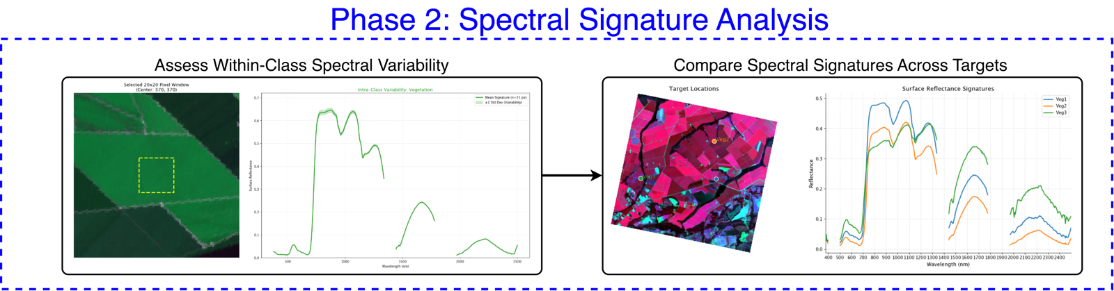
Phase 1 asked where features sit in the scene and how bright each band is. Phase 2 — Spectral Signature Analysis — pivots to a different question: what does each material's full reflectance curve look like across all 426 bands? That continuous curve is the physical "fingerprint" of a surface, and the real power of hyperspectral data lies in reading it. Here we stop looking at one band at a time and instead drill into specific pixels and patches, extracting and comparing their complete spectral profiles.
In this phase, you will:
- Locate target pixels interactively with
.plot.hunt_pixels()to pinpoint the exact(row, column)coordinates of the surfaces you want to profile. - Assess within-class spectral variability with
.plot.roi_spectral_variability(), plotting a mean curve and ±1 standard deviation envelope across a patch to gauge how consistent a single material really is. - Compare spectral signatures across targets with
.plot.pixel_spectra()to overlay the fingerprints of different materials and see exactly where they separate. - Animate the spectrum band-by-band with
.plot.animate_bands()to watch spatial patterns and contrast evolve as you sweep continuously across wavelengths.
Finding Target Coordinates Interactively with .plot.hunt_pixels()
Before you can extract and plot the exact spectral signature (Z-profile) of a specific surface target—such as a single tree canopy, a bare soil patch, or a distinct mineral outcrop—you need to know its exact spatial row and column indices within the data cube.
The .plot.hunt_pixels() method launches an interactive user interface directly inside your notebook. By exploring the rendered scene map, you can easily inspect different features and pinpoint the exact (row, column) coordinates of pure pixels or target areas of interest.
Connecting to Downstream Workflows
Once you write down the target coordinates discovered during your interactive "hunt," you can plug them directly into the advanced spectral analysis tools we will cover next:
.plot.pixel_spectra(): Plot continuous spectral curves for specific points..plot.roi_spectral_variability(): Analyze the spectral spread across a Region of Interest (ROI)..build_spectral_library(): Save extracted signatures as reusable reference libraries.
tanager_ortho_sr.plot.hunt_pixels()
🧭 How to Use: Run the cell above, interact with the displayed widget to locate your features of interest, and note the
(row, column)values displayed for your target pixels. We will use these coordinates in the upcoming code blocks!
Analyzing Patch Consistency with .plot.roi_spectral_variability()
In real-world environments, a surface target is rarely contained within a single isolated pixel. A forest canopy, an agricultural field, or a bare soil expanse spans dozens of pixels, each exhibiting subtle natural variations in moisture, structure, or sub-pixel shadowing.
The .plot.roi_spectral_variability() method allows you to evaluate this within-patch spectral consistency. By cutting a square spatial window centered on your target coordinates, it extracts all enclosed pixels and generates a comprehensive two-panel plot:
- Spectral Distribution Panel: Plots the mean reflectance curve across all wavelengths, enveloped by a shaded ±1 standard deviation boundary to visualize spectral spread and noise.
- Context Map Panel: Displays a localized RGB map showing exactly where your spatial window sits over the landscape.
Parameter Reference
| Parameter | Type | Default | Description |
|---|---|---|---|
target_name |
str |
— | String label used for the figure title and legend (e.g., "Healthy Crop", "Bare Soil"). |
coords |
tuple |
— | Tuple (row, col) defining the center pixel of your extraction window. Uses the exact same coordinate convention retrieved from .plot.hunt_pixels(). |
window_size |
int |
5 |
The side length (in pixels) of the square extraction window. |
color |
str |
"tab:green" |
Matplotlib color assigned to the mean spectral line and its corresponding shaded envelope. |
preset |
str |
"true_color" |
RGB rendering preset for the spatial context map background (e.g., "true_color", "false_color_nir"). |
| save_png | str or None | None | File path to automatically export and save the rendered diagnostic figure to disk.
# Analyze the spectral spread across a 5x5 pixel patch of vegetation
tanager_ortho_sr.plot.roi_spectral_variability(
    target_name="Dense Canopy Patch",
    coords=(350, 420),  # Plug in coordinates discovered during your pixel hunt
    window_size=5,
    color="tab:green",
    preset="false_color_nir",  # Use false-color NIR context to make vegetation pop
    save_png=FIGURE_DIR / "roi_spectral_variability_canopy_false_color_nir.png"
)
Comparing Pixel Signatures with .plot.pixel_spectra()
Once you have identified the spatial coordinates of distinct surface materials using .plot.hunt_pixels(), the next logical step is to compare their spectral signatures (Z-profiles) side-by-side. Different materials absorb and reflect light uniquely across the spectrum, creating distinct physical "fingerprints."
The .plot.pixel_spectra() method takes a dictionary of target coordinates and generates a comprehensive comparative visualization:
- Spectral Overlay Panel: Plots the continuous reflectance curves for every targeted pixel onto a single shared axis, making it easy to contrast absorption depth and overall brightness.
- Context Map Panel: Displays a reference RGB map with labeled spatial markers showing exactly where each extracted pixel sits in the scene.
Parameter Reference
| Parameter | Type | Default | Description |
|---|---|---|---|
targets |
dict |
— | Dictionary dict[str, tuple[int, int]] defining points of interest. Each key is the legend label; each value is the (row, col) coordinate tuple. |
colors |
dict or None |
None |
Optional dictionary mapping target labels to Matplotlib colors (e.g., {"Water": "tab:blue"}). If omitted, default categorical colors are applied. |
preset |
str |
"true_color" |
RGB rendering preset for the reference context map (e.g., "true_color", "false_color_swir"). |
| save_png | str or None | None | File path to automatically export and save the rendered comparative figure to disk.
Typical Workflow Integration
- Run
.plot.hunt_pixels()to explore the scene and note down the(row, col)positions for your materials of interest. - Construct your
targetsdictionary and pass it to.plot.pixel_spectra()to evaluate their spectral separation.
# Define targets discovered during the pixel hunt
TARGETS = {
    'Veg1': (403, 495), # y,x
    'Veg2': (225, 486), # y,x
    'Veg3': (400, 140)   # y,x
}

# Define custom colors to match the surface types logically
# Colors are optional, if not provided, the engine will automatically apply default categorical colors
COLORS_TARGETS = {
    "Veg1": "tab:blue",
    "Veg2": "tab:green",
    "Veg3": "tab:brown"
}

# Generate the comparative signature plot
tanager_ortho_sr.plot.pixel_spectra(
    targets=TARGETS,
    colors=COLORS_TARGETS,
    preset="true_color",
    save_png=FIGURE_DIR / "pixel_spectra_comparison_true_color.png"
)
Animating Spectral Continuity with .plot.animate_bands()
Hyperspectral sensors capture a continuous spectrum, meaning adjacent bands often flow smoothly into one another. However, as you cross major atmospheric windows or absorption features, spatial patterns, contrast, and noise levels can shift dramatically.
The .plot.animate_bands() method exports an animated GIF that steps sequentially through your data cube band-by-band. Each frame renders a single-band spatial map with the current center wavelength dynamically updated in the title. This makes it an incredibly intuitive tool for presentations, teaching spectral continuity, or performing a comprehensive visual sweep to see exactly where sensor noise or cloud artifacts appear across the spectrum.
Parameter Reference
| Parameter | Type | Default | Description |
|---|---|---|---|
start_wvl, end_wvl |
float or None |
None |
The wavelength boundaries (in nanometers) to include in the animation. If both are left as None, the engine animates through all currently valid bands in the cube. |
fps |
int |
5 |
Playback speed defined in Frames Per Second. Increase this value for a faster, smoother sweep through the spectrum. |
filename |
str |
"bands_timelapse.gif" |
The output file path. Providing a simple string saves the GIF to your current working directory; pass a full Path object to route it to a specific folder. |
cmap |
str |
"gray" |
The Matplotlib colormap applied to render the spatial reflectance of each frame. |
dynamic_stretch |
bool |
True |
Contrast scaling behavior: • True: Recomputes display limits per frame, maximizing visual contrast for every individual band.• False: Applies a single global stretch calculated across the entire requested range. This prevents visual "popping" and allows for a true cross-band brightness comparison. |
| robust_percentiles | tuple | (2, 98) | Tuple (low, high) defining the percentile bounds used to drop extreme outliers during contrast stretching.
Performance and Usage Notes
- External File Output: This method directly compiles and saves an external
.giffile to your disk rather than rendering an inline Jupyter widget. You will need to open the resulting file from your file explorer to view the animation. - Rendering Time: Animating across hundreds of bands requires slicing and rendering individual arrays sequentially. Broad wavelength spans paired with high frame rates will result in larger file sizes and longer processing times.
Performance and Usage Notes
⚠️ Important Note on Memory (RAM) Consumption Generating high-fidelity animations requires loading, slicing, and caching multiple rendered arrays in memory before compiling them into the final GIF. Executing this method across broad wavelength ranges (such as the entire 426-band cube) requires sufficient available system RAM. If you experience memory exhaustion or kernel crashes, narrow your
start_wvlandend_wvlrange, or test the animation on a spatially cropped subset of your scene first.
# Generate an animation sweeping through the Visible and Near-Infrared (VNIR) spectrum

tanager_ortho_sr.plot.animate_bands(
    start_wvl=400,
    end_wvl=1000,
    fps=8,                  # Slightly faster playback
    filename=FIGURE_DIR / "vnir_spectral_sweep.gif",
    cmap="gray",
    dynamic_stretch=True    # Maximize local contrast for every frame
)
Wrapping Up
Congratulations! You have successfully completed Phase 1 and Phase 2 of our hyperspectral analysis recipe and brought your Tanager-1 data cube to life.
Moving from a massive, 426-band numerical volume to polished, publication-ready visuals is a critical milestone in remote sensing. In this lesson, you unlocked TanagerSpec's specialized plotting engine to bridge the gap between raw arrays and actionable insights. In Phase 1 (Image and Band Exploration) you explored your scene spatially and per-band: building RGB composites, inspecting band galleries and reflectance distributions, and comparing individual wavelengths. In Phase 2 (Spectral Signature Analysis) you went deeper, hunting target pixels, extracting and comparing full spectral signatures, and assessing within-class variability across regions of interest.
With this exploratory toolkit integrated into your workflow alongside data loading, preprocessing, and GIS exporting, you have established a reliable visual baseline of your imagery and a feel for the spectral fingerprints it contains.
What's Next?
Whether you are mapping dense forest canopies, monitoring coastal water turbidity, or identifying complex mineral structures, visual exploration is only the first step.
In the next lesson, we will execute Phase 3 of our hyperspectral analysis recipe: Spectral Index Development. We will transition from visual inspection to mathematical extraction by leveraging TanagerSpec's built-in index catalog to compute targeted thematic layers, apply lower-bound threshold masks, and quantitatively cross-examine index performance across our scene.
See you in the next lesson to execute Phase 3!