
Welcome to Lesson 2 of the analysis and applications module.
At this point in the course, you may have asked yourself a very good question:
Why don’t we visualize the entire hyperspectral dataset at once?
Or, why can we only combine three bands at a time to create an image?
These are excellent questions, and they lead us directly to one of the most important concepts in hyperspectral analysis: dimensionality reduction, as illustrated in Figure 1.
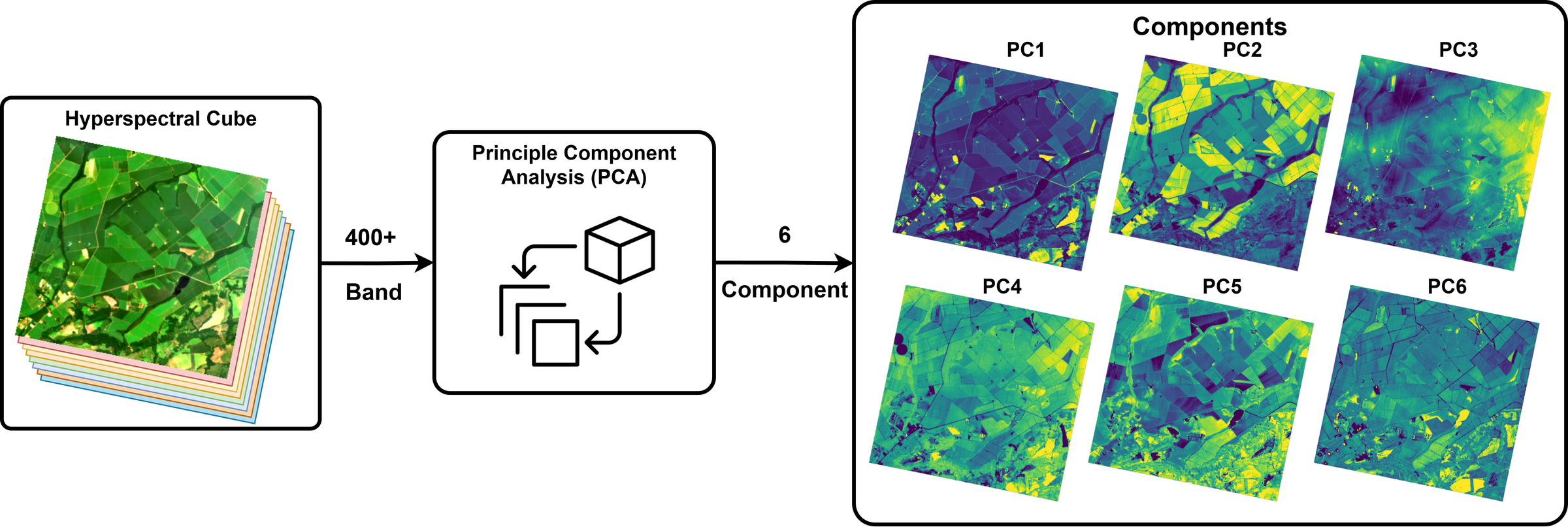
Figure 1:Dimensionality Reduction (e.g., Principal Component Analysis)
As we learned earlier, hyperspectral data contains a large number of contiguous, narrow spectral bands, which we can use to calculate spectral indices and analyze materials in great detail. Unlike multispectral imagery, which usually contains only a limited number of bands, hyperspectral imagery may contain dozens or even hundreds of bands for the same scene.
This rich spectral information is a major advantage, but it also creates a major challenge: hyperspectral data is high-dimensional.
A hyperspectral image can be represented as a data cube:
where:
is the image height,
is the image width,
is the number of spectral bands.
In many machine learning and statistical analysis tasks, we do not work with the cube directly. Instead, we flatten the image so that each pixel becomes one sample and each band becomes one feature:
So if the cube has size , then the flattened representation becomes .
This means we now have 250,000 samples, and each sample is described by 420 features.
We can also write one pixel as a spectral vector:
where each value corresponds to the reflectance or intensity measured in one spectral band.
At first, having more bands may always seem beneficial because it means we have more information. However, as the number of dimensions increases, the feature space grows rapidly, and the available data points become increasingly sparse within that space. This is what is called the curse of dimensionality.
The curse of dimensionality refers to the phenomenon in which the performance of data analysis and machine learning methods deteriorates as the number of dimensions increases.
In high-dimensional spaces, data points become more spread out, which creates two major problems:
Distances become less informative
Neighborhood relationships become less reliable
For example, the distance between two samples and is often measured using the Euclidean distance.
As the number of features increases, many points begin to appear similarly far from one another. This makes it harder for algorithms to determine which points are truly similar or different.
This is especially important in machine learning, where many algorithms rely on distances, neighborhoods, or the geometric distribution of the data.
We can also think about this from the perspective of a simple predictive model. With only one feature, a model may look like:
But as we add more features, it becomes:
As the number of features increases, the model becomes more complex, requires more data, and becomes more prone to overfitting.
This is one of the main reasons why dimensionality reduction is such an important step in hyperspectral analysis.
In the next section, we will see how Principal Component Analysis (PCA) helps reduce dimensionality while preserving the most important information in the data.
HS Cube for this lesson
In this lesson, we will again use the agricultural scene shown below. This scene is unique and particularly useful for explaining and exploring different concepts such as PCA because it contains diverse land cover types, including vegetated crop fields, water bodies, bare soil, and field boundaries. However, as you may have noticed, the scene is dominated by vegetation. This dominance of vegetation is intentional, as it will help demonstrate how PCA works based on variance.
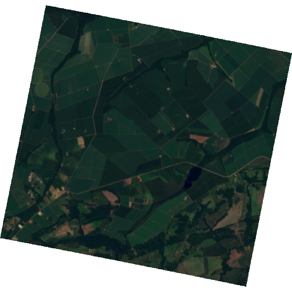
Scene: Tanager-1 scene near Campo Verde, Mato Grosso, Brazil.
🧰 Your Toolkit So Far
Because this lesson is dense, we would like you to concentrate on understanding dimensionality reduction and PCA. Your toolkit for this lesson contains only the functions you will need throughout.
# Essential imports
import h5py
import numpy as np
import matplotlib.pyplot as plt
import pandas as pd
from IPython.display import display
from sklearn.decomposition import PCA
from sklearn.preprocessing import StandardScaler

# ---- setup -------------------------------------------------------------

def download_tanager_data(url, file_path):
    import os
    import urllib.request

    def _progress(count, block_size, total_size):
        mb_done = count * block_size / 1_000_000
        mb_total = total_size / 1_000_000
        print(f"\rDownloading... {mb_done:.1f} / {mb_total:.1f} MB", end="", flush=True)

    if not os.path.exists(file_path):
        urllib.request.urlretrieve(url, file_path, reporthook=_progress)
        print(f"\nDownload complete: {file_path}")
    else:
        print(f"File already exists, skipping download: {file_path}")
    return file_path


# ---- io ----------------------------------------------------------------

def load_hdf5(
    file_path,
    data_path='HDFEOS/GRIDS/HYP/Data Fields/surface_reflectance',
    nodata_path='HDFEOS/GRIDS/HYP/Data Fields/nodata_pixels',
    clean=True,
    band=None
    ):

    with h5py.File(file_path, 'r') as f:
        dset = f[data_path]
        # select all or a single band
        if band is None:
            data = dset[:].astype(np.float32)
        else:
            data = dset[band].astype(np.float32)
        attrs = dict(dset.attrs)

        wavelengths = np.asarray(attrs['wavelengths'], dtype=np.float32)
        good = np.asarray(attrs['good_wavelengths'], dtype=bool)
        no_data = f[nodata_path][:].astype(bool)

    if clean:
        if band is None:
            data = data[good]
            wavelengths = wavelengths[good]
            data[:, no_data] = np.nan
            good = good[good]
        else:
            # For a single band, check if it is good, else return all nan
            wavelengths = np.array([wavelengths[band]], dtype=np.float32)
            if not good[band]:
                data = np.full_like(data, np.nan)
            else:
                data[no_data] = np.nan
            good = np.array([good[band]], dtype=bool)

    attrs['wavelengths'] = wavelengths
    attrs['good_wavelengths'] = good

    return data, attrs, no_data
# Download the Tanager-1 Ortho SR HDF5 file using the provided
# download_tanager_data helper (defined just above).
url = "https://storage.googleapis.com/open-cogs/planet-stac/tanager1-release2-core-imagery/ortho_sr_hdf5/20250501_143138_87_4001_ortho_sr_hdf5.h5"
file_path = "20250501_143138_87_4001_ortho_sr_hdf5.h5"
download_tanager_data(url, file_path)File already exists, skipping download: 20250501_143138_87_4001_ortho_sr_hdf5.h5
'20250501_143138_87_4001_ortho_sr_hdf5.h5'Let’s load our cube from the HDF5 file and extract the wavelengths, quality flags, and nodata mask needed for preprocessing before fitting PCA.
# Load and clean the cube with your Toolkit loader
# (drops bad bands and sets no-data pixels to NaN across all bands).
cube, attrs, no_data = load_hdf5(file_path, clean=True)

# Don't forget that the wavelengths is updated with the clean=True flag
# it only contains the good wavelengths values
wavelengths = attrs['wavelengths']

bands, rows, cols = cube.shape
print(f"Cube shape after cleaning: bands={bands}, rows={rows}, cols={cols}")
print(f"Wavelength range: {wavelengths.min():.1f}–{wavelengths.max():.1f} nm")
print(f"No-data pixels: {no_data.sum():,} / {no_data.size:,}")
Cube shape after cleaning: bands=368, rows=752, cols=784
Wavelength range: 376.4–2499.0 nm
No-data pixels: 167,011 / 589,568
What is Principal Component Analysis (PCA)?
As we mentioned hyperspectral bands are often highly correlated, especially neighboring wavelengths. This means the original data may contain:
redundant information,
noisy information, and
more dimensions than we really need for visualization or machine learning.
Principal Component Analysis (PCA) Abdi & Williams, 2010Ringnér, 2008 is a dimensionality reduction method that transforms the original spectral bands into a smaller set of new variables called principal components.
Instead of using the original band axes, PCA creates new axes that better describe the main variation in the data. These new axes are ordered by the amount of variance they explain:
PC1 captures the greatest variance in the data.
PC2 captures the next greatest variance and is orthogonal to PC1.
In higher-dimensional data, additional components such as PC3, PC4, and so on capture the remaining variance, while remaining orthogonal to the previous components.
In a simple 2D example, PC1 and PC2 can be visualized as two new perpendicular directions fitted to the spread of the data, as shown in Figure 3.
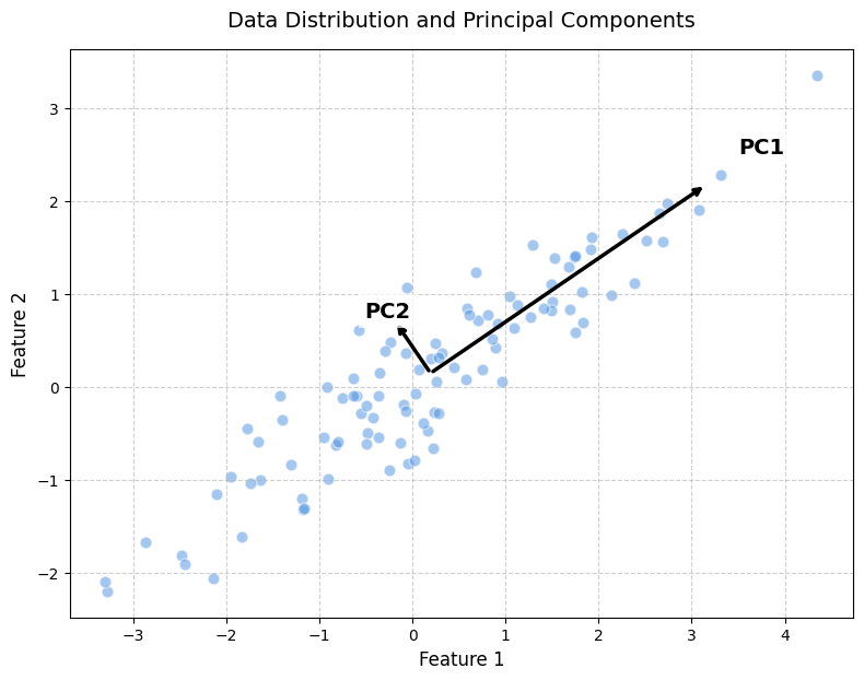
Figure 3:PCA defines new orthogonal axes called principal components. PC1 captures the largest variance in the data, while PC2 captures the next largest variance and is perpendicular to PC1.
Mathematically, PCA solves the eigenvalue problem of the covariance matrix:
where:
is the covariance matrix of the centered data,
is the -th eigenvector, representing a principal direction,
is the corresponding eigenvalue, representing the variance explained in that direction.
The data must first be centered by subtracting the mean:
where is the mean vector of the original data.
The transformed data is then obtained by projecting the centered data onto the principal component directions:
where:
is the centered data matrix,
is the matrix whose columns are the retained eigenvectors (in scikit-learn,
pca.components_has shape , so the equivalent operation is ),contains the transformed coordinates, also called PCA scores.
The projection step means that each original data point is mapped onto the new PCA axes. For example, projecting a point onto PC1 gives its coordinate along the direction of maximum variance, as illustrated in Figure 4.
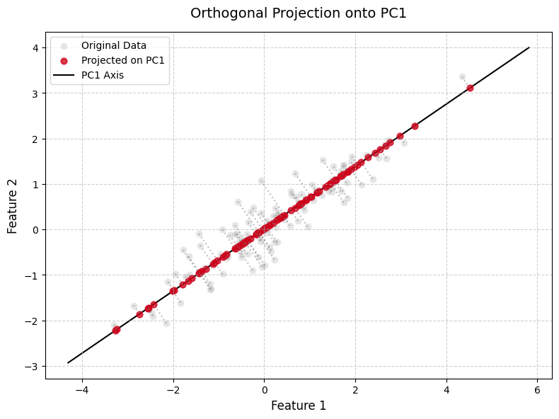
Figure 4:Projection onto PC1. Each centered data point is projected onto the PC1 direction to obtain its PCA score along the first principal component.
For a new data point , the PCA projection is calculated using the same mean and principal component directions learned from the training data.
First, the new point is centered:
Then it is projected onto the PCA directions:
For two components, this gives:
where:
is the coordinate of the point along PC1,
is the coordinate of the point along PC2.
If we only keep PC1, the projected point back in the original feature space is:
This point lies on the PC1 axis and represents the best one-dimensional approximation of the original point using only the first principal component.
In this lesson, we will not implement PCA from scratch. Instead, we will use the scikit-learn API with its default settings.
Prepare and Explore Data Variance Before PCA
For hyperspectral imagery, PCA is applied after reshaping, or flattening, the image cube into a 2D data matrix. The spatial dimensions are collapsed into one pixel dimension, while the spectral bands remain as variables:
In this matrix, each row is one pixel spectrum, and each column is one spectral band. PCA then analyzes how the spectral bands vary and covary across all pixels. In other words, it treats the pixels as observations and the bands as features.
This flattening step does not remove the spatial information permanently. It only reorganizes the cube so PCA can operate on the spectral variance structure. After PCA, the resulting component scores can be reshaped back to ((H, W)) image form, allowing each principal component to be visualized as a spatial pattern.
def flatten_cube(cube):
    # Extract the number of bands, rows, and columns from the input cube shape
    bands, rows, cols = cube.shape

    # Reshape the cube so that each row is a pixel and each column is a spectral band
    # The original shape is (bands, rows, cols); we make it (bands, rows*cols) then transpose to (pixels, bands)
    X = cube.reshape(bands, rows * cols).T

    # Compute a mask to keep only valid pixels (pixels with all band values finite)
    valid_mask = np.isfinite(X).all(axis=1)

    # Select only valid pixels (those without any NaN or Inf values in any band)
    X_valid = X[valid_mask]

    # Return the full flattened array, the valid pixels-only array, and a mask indicating valid pixels
    return X, X_valid, valid_mask
# Flatten the cube: (bands, rows, cols) -> (pixels, bands)
X_full, X_valid, valid_pixel_mask = flatten_cube(cube)
n_samples, n_bands = X_valid.shape
print(f"Flattened matrix shape: {X_valid.shape}")
print(f"Valid pixels used for PCA: {valid_pixel_mask.sum():,} / {X_full.shape[0]:,}")
print(f"Bands used for PCA: {n_bands}")Flattened matrix shape: (422557, 368)
Valid pixels used for PCA: 422,557 / 589,568
Bands used for PCA: 368
Checking Band Standard Deviation Before PCA
After flattening the cube and before applying PCA to hyperspectral data, it is crucial to examine the standard deviation of each spectral band across all valid pixels. As mentioned earlier, PCA results are influenced by the variance in the data. PCA identifies new axes, called principal components, based on the largest directions of variation in the dataset. This step provides a simple diagnostic for assessing how much each wavelength varies across the scene. Therefore, bands with larger standard deviations can have a stronger influence on the first principal components, especially when PCA is applied to centered but unscaled reflectance data.
For a hyperspectral cube, this means that some wavelength regions may contribute more strongly to the PCA results than others. For example, if the red-edge or near-infrared bands have much higher standard deviations than the visible bands, the first principal components may be strongly influenced by variation in those spectral regions.
This does not mean that bands with high standard deviations are always better or that bands with low standard deviations should automatically be removed. Instead, this analysis helps us understand the structure of the data before PCA.
In this lesson, after loading and cleaning the Tanager-1 hyperspectral cube, the bad bands have already been removed and the wavelength array has been updated. We now examine the band-wise standard deviation of the remaining bands to better understand which wavelength regions contain the most variation and how this may affect the PCA results.
# Band Standard Deviation Analysis

# Calculate the standard deviation for each spectral band across all valid pixels
band_std = X_valid.std(axis=0)

# Construct a DataFrame to summarize band index, wavelength, and standard deviation, using band_index as the index
std_table = pd.DataFrame({
    "wavelength_nm": wavelengths,
    "std": band_std
}, index=np.arange(len(band_std)))
std_table.index.name = "band_index"

# Display the 10 bands with the lowest standard deviation
print("\nBands with the lowest standard deviation:")
display(std_table.sort_values("std").head(10))

# Display the 10 bands with the highest standard deviation
print("\nBands with the highest standard deviation:")
display(std_table.sort_values("std", ascending=False).head(10))

# Visualize standard deviation as a function of wavelength
plt.figure(figsize=(10, 5))
plt.plot(std_table["wavelength_nm"], std_table["std"], marker="o", linewidth=1)
plt.xlabel("Wavelength (nm)")
plt.ylabel("Standard deviation")
plt.title("Band Standard Deviation Across Valid Pixels")
plt.grid(True)
plt.show()
Bands with the lowest standard deviation:
Bands with the highest standard deviation:
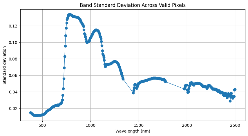
Interpreting the Band Standard Deviation Results
The standard deviation plot shows that spectral variation is not evenly distributed. The lowest variation occurs in the blue-visible bands around 421–466 nm, while the highest occurs around 766–811 nm, in the red-edge / NIR transition region.
Bands near 780 nm vary much more than bands near 430–460 nm. For example, the standard deviation is about 0.134 at 781 nm compared with about 0.011 at 431 nm, a difference of roughly 12×. Because PCA is based on variance, this corresponds to about 144× more variance.
Therefore, if PCA is applied to centered but unscaled reflectance data, the first PCs are likely to be dominated by the high-variance red-edge / NIR region, especially around 766–811 nm. The standard deviation curve can therefore help anticipate which wavelengths may drive the PCA results.
Later, PCA loading plots should be compared with this curve. Strong loadings around 766–811 nm would indicate dominant NIR variation, while strong loadings in lower-variance blue-visible bands may reflect subtler spectral patterns.
However, high standard deviation can also result from extreme pixels (outliers), so it may not always represent typical scene variation.
Optional: Band Correlation
Because one objective of PCA is dimensionality reduction, let’s examine the relationship between the spectral bands. In hyperspectral imagery, it is often claimed that many bands are highly correlated, especially bands that are close to each other in wavelength. Is this true? Let’s examine it using the correlation matrix. The correlation matrix shows how strongly each band is related to every other band.
When two or more bands carry similar information, we say that the data contains redundancy. Redundancy means that some bands do not add much new information compared with other bands.
In the next code cell, we will compute and visualize the correlation matrix of the hyperspectral bands. This will help us determine whether neighboring bands contain similar information.
When reading the correlation matrix:
A correlation value close to +1 means that two bands are strongly positively correlated.
A value close to 0 means that the bands have little or no linear relationship.
A value close to -1 means that two bands are strongly negatively correlated.
# Compute the correlation between every pair of spectral bands.
# Each column in X_valid is assumed to be one wavelength band.
corr_matrix = np.corrcoef(X_valid, rowvar=False)

# Plot the band-to-band correlation matrix.
plt.figure(figsize=(8, 7))

plt.imshow(
    corr_matrix,
    cmap="coolwarm",        # blue = negative correlation, red = positive correlation
    vmin=-1,
    vmax=1,                 # Pearson correlations always range from -1 to 1
    interpolation="nearest"
)

plt.colorbar(label="Pearson correlation")
plt.title("Band-to-band correlation matrix")
plt.xlabel("Wavelength")
plt.ylabel("Wavelength")
plt.tight_layout()
plt.show()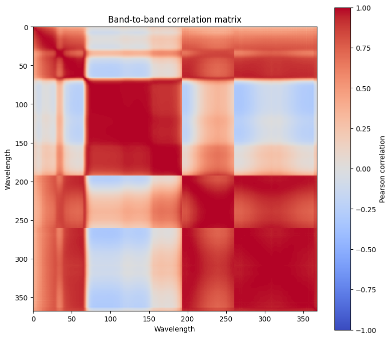
Interpretation:
The correlation matrix reveals that many hyperspectral bands are highly correlated, especially neighboring bands (red blocks near the diagonal), indicating redundancy. Some bands show weaker or negative correlations (lighter or blue areas), suggesting they contain distinct information.
Applying PCA
Now that we have examined the band correlation and seen that many spectral bands contain redundant information, we can apply PCA to reduce the dimensionality of the hyperspectral data.
At this stage, the hyperspectral cube has already been flattened into a 2D matrix called X, where:
each row represents one valid pixel,
each column represents one spectral band.
In the following code cell, we apply PCA using scikit-learn and retain N_PCS = 10 principal components. This provides enough components to examine the explained-variance distribution and select a meaningful cutoff (discussed in the next section). For visualization purposes later, only the first three components will be displayed as images and combined into an RGB composite, because a standard display can only show three channels at once.
# This lesson also adds `run_pca` to your Toolkit — a thin wrapper around scikit-learn's
# PCA (with optional per-band standardization).
# Fix a RANDOM_STATE for reproducibility.

RANDOM_STATE = 31

def run_pca(X, n_components=10, scale=False, random_state=RANDOM_STATE):
    """
    Run PCA, optionally after per-band standardization.

    Parameters
    ----------
    X : ndarray, shape (n_pixels, n_bands)
        Feature matrix of spectral data.
    n_components : int
        Number of principal components to compute.
    scale : bool
        If True, standardize each band before PCA.
    random_state : int
        Random seed for reproducibility.

    Returns
    -------
    X_pca : ndarray, shape (n_pixels, n_components)
        Transformed data in PCA space.
    pca_model : PCA
        Fitted PCA model object.
    scaler : StandardScaler or None
        Fitted scaler if scale=True, otherwise None.
    """

    scaler = None
    X_input = X

    if scale:
        scaler = StandardScaler()
        X_input = scaler.fit_transform(X)

    pca_model = PCA(n_components=n_components, random_state=random_state)
    X_pca = pca_model.fit_transform(X_input)

return X_pca, pca_model, scaler# Number of principal components to keep
N_PCS = 10
# Apply PCA to the flattened hyperspectral data (no scaling for surface reflectance)
scores, pca, _ = run_pca(X_valid, n_components=N_PCS, scale=False)
print(f"Input shape before PCA: {X_valid.shape}")
print(f"Output shape after PCA: {scores.shape}")
print(
f"PCA reduced the feature dimension from {X_valid.shape[1]} bands "
f"to {scores.shape[1]} components."
)Input shape before PCA: (422557, 368)
Output shape after PCA: (422557, 10)
PCA reduced the feature dimension from 368 bands to 10 components.
The printed output shows that the number of pixels remains the same, while the number of features is reduced.
Before PCA, each pixel was described by the original spectral bands. After PCA, each pixel is described by a smaller number of principal component scores. These scores summarize the main patterns of spectral variation in the image and can be used for visualization or as input features for machine learning models.
Eigenvalues and Explained Variance
After fitting PCA, we need to understand how much information each principal component captures.
Each principal component has an associated eigenvalue. The eigenvalue measures how much variance is captured along that component direction.
A large eigenvalue means the component captures a large amount of variation.
A small eigenvalue means the component captures only a small amount of variation.
PCA orders the components from the largest eigenvalue to the smallest. Therefore, PC1 captures the largest variance, PC2 captures the second largest variance, and so on.
To make the eigenvalues easier to interpret, we usually convert them into an explained variance ratio:
where is the eigenvalue of the -th principal component.
The explained variance ratio tells us the percentage of the total variance captured by each component. We also compute the cumulative explained variance, which tells us how much variance is preserved when we keep the first several components together.
In the next code cell, we summarize the eigenvalues, individual explained variance, and cumulative explained variance for the selected principal components.
# Eigenvalues and explained variance
eigenvalues = pca.explained_variance_
explained_variance_pct = pca.explained_variance_ratio_ * 100
cumulative_variance_pct = np.cumsum(explained_variance_pct)

pcs = np.arange(1, len(eigenvalues) + 1)

# Create summary table
pca_summary = pd.DataFrame({
    "PC": [f"PC{i}" for i in pcs],
    "Eigenvalue": eigenvalues,
    "Explained variance (%)": explained_variance_pct,
    "Cumulative variance (%)": cumulative_variance_pct
})

display(pca_summary.round(3))

# Plot individual and cumulative explained variance
plt.figure(figsize=(9, 4))

plt.bar(
    pcs,
    explained_variance_pct,
    alpha=0.75,
    edgecolor="black",
    label="Individual explained variance"
)

plt.plot(
    pcs,
    cumulative_variance_pct,
    marker="o",
    linewidth=2,
    label="Cumulative explained variance"
)

plt.xlabel("Principal component")
plt.ylabel("Explained variance (%)")
plt.title("Explained variance by principal component")
plt.xticks(pcs)
plt.ylim(0, 105)
plt.grid(alpha=0.3)
plt.legend()
plt.tight_layout()
plt.show()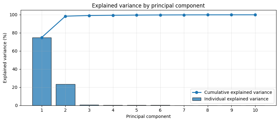
Interpretation:
The PCA results show that most of the variance in the hyperspectral data is concentrated in the first two principal components. PC1 has the largest eigenvalue (1.314583) and accounts for 74.92% of the total variance, indicating that it captures the main source of spectral variability in the dataset. PC2 explains an additional 23.49% of the variance and represents the next most important independent pattern of variation.
Together, PC1 and PC2 explain 98.41% of the total variance, which indicates that the hyperspectral data can be effectively summarized using only two principal components with minimal loss of information. The sharp decrease in eigenvalues after PC2 suggests that the remaining components contribute very little to the overall variance and are likely associated with minor spectral details or noise.
Overall, the PCA results confirm that the original hyperspectral dataset contains substantial redundancy, and that a low-dimensional representation using the first two principal components preserves nearly all of the important spectral information.
PCA Loadings
After applying PCA, we can inspect the loadings to understand how each principal component is related to the original spectral bands.
As we explained, PCA creates a new coordinate system by finding directions of maximum variance in the original band space. As a result, each principal component direction is defined by a set of weights applied to the original bands. When the original centered data are projected onto these directions, the result is a new set of variables called principal component scores.
For a single pixel with centered band values , the score of that pixel on the -th principal component is computed as:
where:
is the PCA score of the pixel on the -th principal component,
are the centered spectral band values for that pixel,
are the weights (loadings or eigenvector values) for the -th principal component.
For example, the score on PC1 is obtained using the weights of the first principal component:
and the score on PC2 is obtained using the weights of the second principal component:
Thus, the index identifies which principal component is being used, while the index over the bands identifies which original wavelength or spectral band is being weighted.
In matrix form, if is the centered data matrix, with pixels as rows and spectral bands as columns, then the PCA scores are obtained by projecting the data onto the PCA directions:
where:
contains the PCA-transformed data, or scores,
is the centered original data,
contains the PCA component vectors.
Thus, the loadings describe how the original spectral bands are combined, while the scores are the new data representation obtained after projection.
The loading values tell us how strongly each wavelength contributes to a principal component.
Interpreting PCA loadings: large positive values mean wavelengths increase the PC score, large negative values mean they decrease it, and values near zero mean little contribution.
For hyperspectral data, plotting the loadings against wavelength is especially useful because it shows which spectral regions contribute most strongly to each principal component. In addition, it allows us to interpret the PCA results in relation to the variance of the input data that we explored earlier.
# Number of principal components to visualize
show_pcs = min(3, N_PCS)

for i in range(show_pcs):
    plt.figure(figsize=(10, 3))
    plt.plot(
        wavelengths,
        np.abs(pca.components_[i]), # absolute loading
        linewidth=2,
        label=f"PC{i+1}"
    )
    plt.axhline(0, color="black", linewidth=0.8, alpha=0.6)
    plt.xlabel("Wavelength (nm)")
    plt.ylabel("Absolute Loading")
    plt.title(f"Absolute PCA loading curve: PC{i+1}")
    plt.legend()
    plt.grid(alpha=0.3)
    plt.tight_layout()
    plt.show()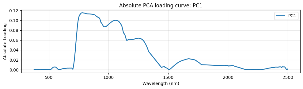
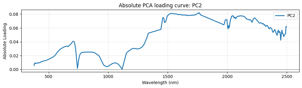
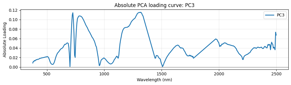
Interpretation:
The PCA loading curves show which wavelength regions contribute most to each principal component. Since the scene is dominated by vegetation, the strongest spectral variation is expected to be related to vegetation properties.
PC1 explains 74.919% of the total variance, making it the dominant component. Its loading curve is mainly positive and strongest between approximately 700 and 1300 nm, which corresponds to the red-edge, NIR, and early SWIR regions. This wavelength range is strongly associated with vegetation reflectance, canopy structure, biomass, and vegetation vigor. Therefore, PC1 can be interpreted as the main vegetation-related component in the scene.
An important observation is that the PC1 loading curve closely follows the band-wise standard deviation of the hyperspectral cube. The standard deviation plot shows that the largest spectral variability across valid pixels occurs mainly in the NIR region, and PC1 gives its highest weights in the same wavelength range. This indicates that PC1 is strongly influenced by the bands with the highest pixel-to-pixel variability. In other words, the dominant variance structure of the hyperspectral cube is directly reflected in the PC1 loading pattern.
PC2 explains 23.488% of the variance and captures a different spectral contrast. Compared with PC1, it gives more weight to parts of the SWIR region, suggesting sensitivity to differences related to moisture content, soil exposure, crop residue, or drier background materials. Thus, PC2 likely separates vegetation-dominated pixels from drier or more exposed surfaces.
Together, PC1 and PC2 explain 98.407% of the total variance, showing that most of the meaningful spectral variability in the scene is captured by these two components.
PC3 explains only 0.707% of the variance, so its contribution is much smaller. However, it may still contain useful finer spectral information, especially around the red-edge/NIR, water absorption-related regions, and parts of the SWIR. This component may help capture subtle differences related to crop condition, local moisture variation, soil background, or field-level differences.
Overall, the PCA results show that the main spectral structure of the scene is controlled primarily by vegetation strength, followed by moisture/dryness or exposed-surface contrasts, while PC3 adds smaller-scale spectral details. The next step is to examine the PCA score images to confirm how these spectral patterns appear spatially across the scene.
Visualizing PCA Score Images
So far, we have interpreted the PCA components using their explained variance and loading curves. The loading curves tell us which wavelength regions contribute to each principal component.
However, the loading curves do not show where those components are strong or weak in the image. To understand the spatial meaning of each component, we need to visualize the PCA scores as images.
Each column in scores corresponds to one principal component:
scores[:, 0]contains the PC1 scores,scores[:, 1]contains the PC2 scores,scores[:, 2]contains the PC3 scores.
To display them as images, we reshape the PCA scores back to the spatial dimensions of the original hyperspectral scene.
# Reshape PCA scores back to image space
score_maps = np.full((X_full.shape[0], N_PCS), np.nan, dtype=np.float32)
score_maps[valid_pixel_mask] = scores
pc_maps = score_maps.reshape(rows, cols, N_PCS).transpose(2, 0, 1)  # (N_PCS, rows, cols)

print(f"PC maps shape: {pc_maps.shape}")
PC maps shape: (10, 752, 784)
The resulting array pc_maps has the shape — confirmed by the printed output above — where:
is the number of principal components (the leading axis),
is the image height,
is the image width.
This band-first layout mirrors the (bands, rows, cols) convention used throughout the course. Individual component maps are accessed as pc_maps[i] (shape ), and the RGB composite is assembled by transposing the first three layers back to .
Each PCA component can now be visualized as a grayscale or diverging-color image. To better represent the spatial variation in PCA component intensities, the RdBu_r colormap was selected, as it clearly highlights both positive and negative score values across the image.
fig, axes = plt.subplots(2, show_pcs, figsize=(5 * show_pcs, 10))

for i in range(show_pcs):

    # Top row: PC images
    ax_img = axes[0, i]
    pc_img = pc_maps[i]

    pc_min = np.nanpercentile(pc_img, 2)
    pc_max = np.nanpercentile(pc_img, 98)
    pc_normalized = np.clip((pc_img - pc_min) / (pc_max - pc_min), 0, 1)

    im = ax_img.imshow(pc_normalized, cmap="RdBu_r")
    ax_img.set_title(f"PC{i+1}\n{explained_variance_pct[i]:.3f}% variance")
    ax_img.axis("off")
    plt.colorbar(im, ax=ax_img, fraction=0.046, pad=0.04)

    # Bottom row: Distribution histogram
    ax_dist = axes[1, i]
    pc_values = scores[:, i]
    ax_dist.hist(pc_values, bins=200, color='steelblue', edgecolor='none', alpha=0.8)
    ax_dist.set_xlabel("PC Score")
    ax_dist.set_ylabel("Frequency")
    ax_dist.set_title(f"PC{i+1} Distribution")
    ax_dist.grid(alpha=0.3, axis='y')

plt.tight_layout()
plt.show()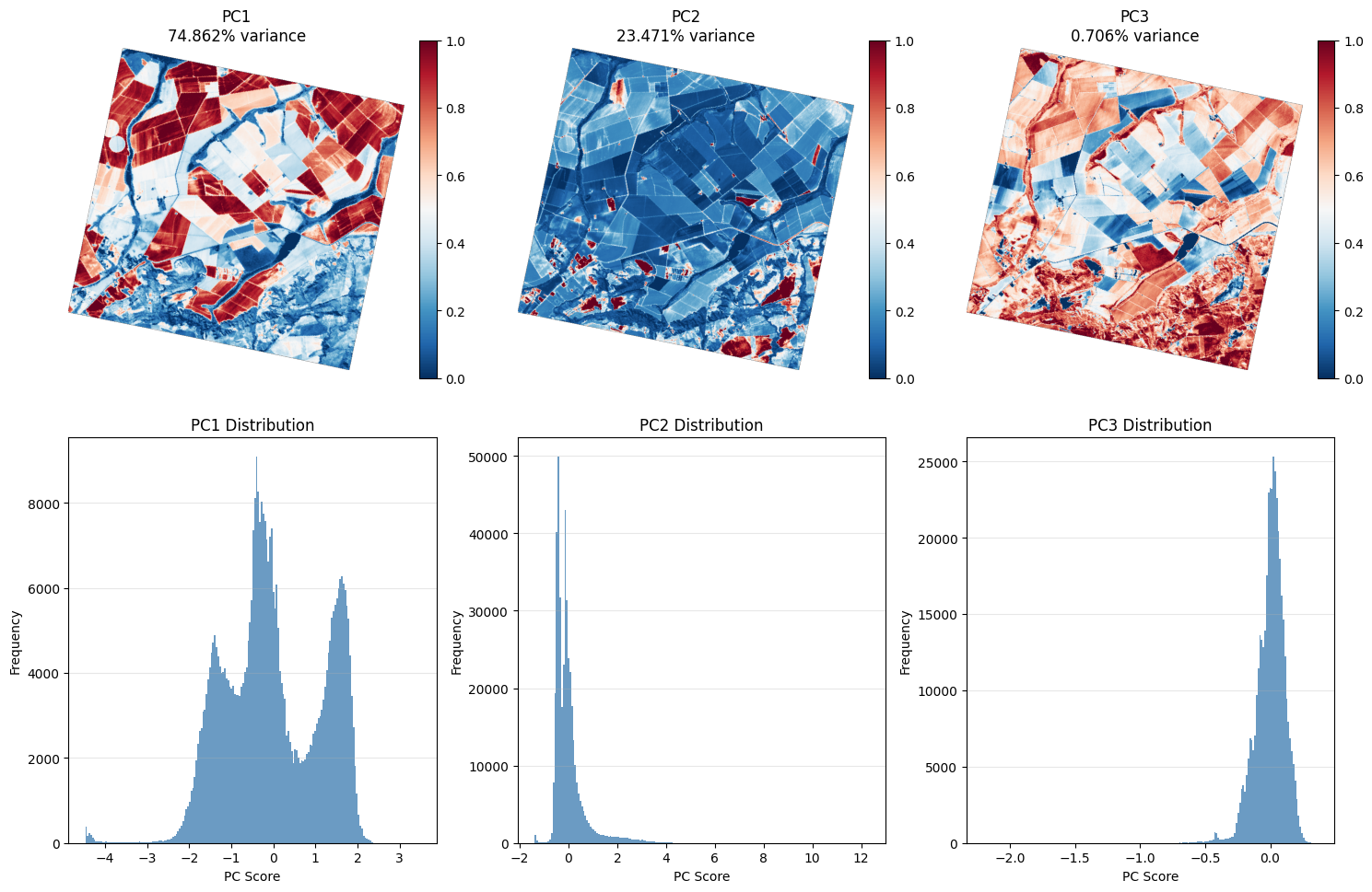
PCA RGB Composite
Another useful way to visualize PCA results is to create a color composite using the first three principal components. In this composite, PC1 is assigned to the red channel, PC2 to the green channel, and PC3 to the blue channel:
This produces a PCA-based RGB image, but it is important to note that the PCA values cannot always be displayed directly as RGB values. Standard RGB images require each color channel to be represented within a fixed display range, either 0–255 for 8-bit images or 0–1 for normalized images. Therefore, before assigning PC1, PC2, and PC3 to the red, green, and blue channels, each principal component score image should be rescaled or normalized to a valid RGB range. For example, each PC can be normalized using min–max scaling:
After normalization, the composite can be represented as:
where the values are either kept in the 0–1 range or multiplied by 255 to create an 8-bit RGB image. The purpose of this image is not to represent true color, but to visualize the main spectral patterns captured by PCA. Since PC1, PC2, and PC3 describe different sources of variance, their combination in RGB form can highlight differences in vegetation strength, soil exposure, water bodies, field boundaries, and subtle variations between agricultural parcels that may not be clear in individual spectral bands or single PCA score images.
# Use PC1, PC2, and PC3 as RGB channels
rgb = pc_maps[:3].transpose(1, 2, 0)  # Convert from (3, rows, cols) to (rows, cols, 3)

# Percentile normalization to 0–1
rgb_display = np.zeros_like(rgb)

for i in range(3):
    low, high = np.nanpercentile(rgb[:, :, i], [2, 98])
    rgb_display[:, :, i] = np.clip((rgb[:, :, i] - low) / (high - low), 0, 1)

# Display
plt.figure(figsize=(7, 7))
plt.imshow(rgb_display)
plt.title("RGB composite of PC1, PC2, and PC3")
plt.axis("off")
plt.show()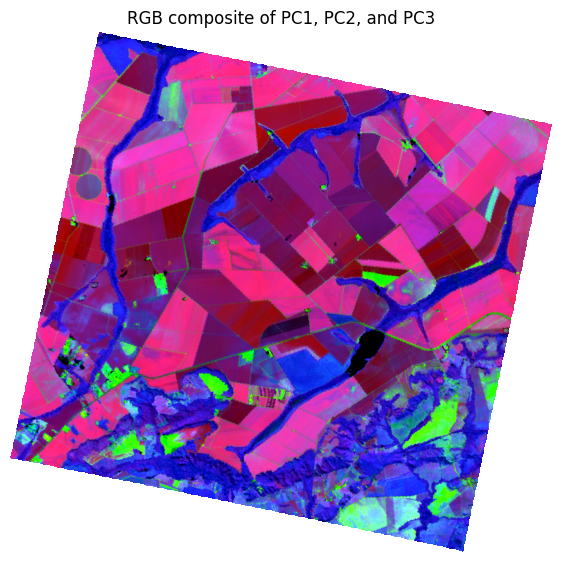
The PCA RGB composite summarizes the main spectral variations in a single false-color image. Because the component values were normalized to the 0–1 display range, the colors should be interpreted as relative contributions of the principal components rather than true surface colors. The widespread pink and magenta tones over agricultural fields indicate strong PC1 influence, consistent with vegetation-related reflectance. The green areas correspond mainly to higher PC2 values and are likely associated with exposed soil, sparse vegetation, or stronger soil background effects. In contrast, blue to dark blue tones indicate stronger PC3 contribution or low PC1 and PC2 values, highlighting more subtle variations such as field heterogeneity, water-related features, or shadowed areas. Overall, the composite improves visual separation between vegetated fields, bare soil, water bodies, and field boundaries.
Because the RGB image is built as:
the displayed color depends on the relative magnitude of the three PCs after stretching:
Red → high PC1, low PC2, low PC3
Green → high PC2, low PC1, low PC3
Blue → high PC3, low PC1, low PC2
Magenta/Pink → high PC1 + high PC3
Dark tones → all three are relatively low
In this image:
Pink/magenta agricultural fields mean PC1 is strong and PC3 also contributes, while PC2 is weaker.
Green patches mean PC2 is dominant, which matches the observation that bare soil or exposed surfaces are emphasized by PC2.
Blue river-like or low-reflectance structures mean PC3 is relatively strong there, or at least stronger than the other two after stretching.
Very dark areas have low contributions from all three displayed components.
How to Control PCA Values and Results
So far, you have run PCA using sklearn and selected the number of principal components. At first, it may seem that choosing the number of components is the only way to control PCA and guide its results. However, there is another important way to influence PCA: by modifying the data that PCA receives as input, namely the variation in X.
In this part of the lesson, we emphasize the importance of the nature of the input data, X. PCA outputs are determined by the variation within the dataset. This variation also affects how much of the total variance can be explained by the first principal component.
In other words, you can influence PCA results by controlling the variance structure of your input data. Two important points are especially relevant here.
Outliers in Your Dataset
Hyperspectral data comes with many challenges, and one of them is the presence of outliers. These outliers may be caused by sensor noise, atmospheric effects, or even rare materials within a scene. Although these values may represent only a small portion of the dataset, they can strongly influence PCA results.
In the previous example, we fitted PCA on centered, unscaled reflectance data without applying any outlier-handling procedure. Because PCA maximizes variance, this choice gives a large share of influence to the most extreme values in the data cube. Before interpreting PC1 as “the dominant land-cover signal,” it is important to ask whether a small number of unusual pixels or bands are steering the result.
In this section, we will show how PCA results change when PCA is fitted on a dataset after outlier handling. We will then compare these results with the PCA output obtained from the raw data.
Handling Outliers
Handling outliers is a broad topic that deserves a separate module because outliers can significantly affect the distribution of data values. Extreme values can shift the mean, making it less representative of the actual data, and they can also inflate the standard deviation. As a result, methods that rely on the mean and standard deviation may produce misleading results when outliers are present.
In our case, the influence of outliers can be observed in the previous results. For example, you can compare the results before and after replacing standard deviation-based clipping with Median Absolute Deviation (MAD)-based clipping as shown in Figure 8. The difference shows how the statistics changed once a more robust outlier-handling method was applied.
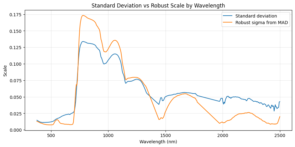
Figure 8:A visual comparison illustrating the difference between standard deviation and Median Absolute Deviation (MAD)-based clipping on hyperspectral data statistics. The figure highlights how MAD-based outlier handling provides more robust statistical estimates by reducing the influence of extreme values.
To evaluate the spectral behavior of the detected outliers, we inspected typical spectra and compared them with the most outlier-like spectra. As shown in Figure 9, the outlier-like spectra are not simply noisy versions of the typical spectra. Instead, they display a clearly different spectral response, suggesting that these pixels may represent unusual surface materials, rare land-cover conditions, or possible artifacts.
The typical spectra show a vegetation-like pattern, with low reflectance in the visible region, a strong red-edge increase near 700 nm, and high near-infrared reflectance. In contrast, the most outlier-like spectra show higher visible reflectance, a weaker near-infrared vegetation response, and much higher SWIR reflectance. This indicates that the outlier-like pixels are spectrally distinct from the dominant population. Because PCA is sensitive to variance, these unusual spectra can strongly influence the PCA components if raw PCA is applied without robust preprocessing.
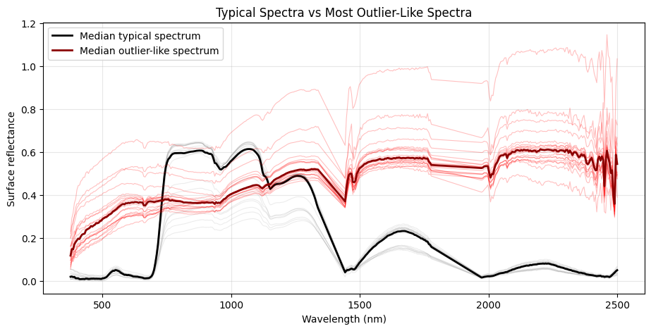
Figure 9:Typical spectra compared with the most outlier-like spectra. The outlier-like spectra show a distinct spectral behavior, indicating that they may represent rare surface conditions, unusual materials, or artifacts rather than simple random noise.
To evaluate how outlier handling affects the PCA results, we compared the raw PCA output with PCA results after applying robust clipping and pixel filtering. As shown in Figure 10, the main change appears in PC1. After handling the outliers, the percentage of variance explained by PC1 increased from about 75% in the raw PCA to approximately 85% in the outlier-handled PCA results. This indicates that robust preprocessing helped PCA capture a stronger dominant spectral pattern in the dataset.
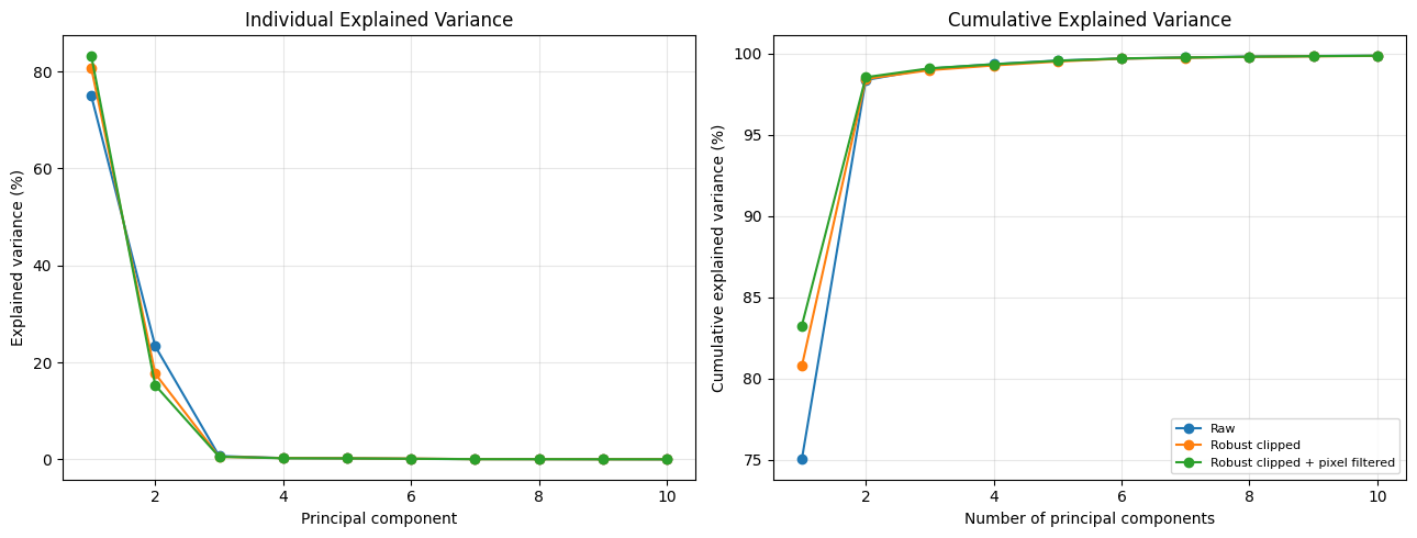
Figure 10:Comparison of PCA results before and after outlier handling. The largest change occurs in PC1, where robust clipping and pixel filtering increase the explained variance compared with raw PCA.
The PC1 loading curve also shows that outlier handling corrected the contribution of specific wavelength regions. These changes explain why the variance captured by PC1 increased after preprocessing. Although the explained variance for PC2 and PC3 remains relatively similar between the raw and outlier-handled methods, their loading patterns change noticeably. This means that the same amount of variance may be represented through different spectral contrasts after outlier handling.
The effect of these changes is also visible in the PCA RGB composite shown in Figure 11. After robust clipping, the RGB representation becomes more visually separated: fields show stronger orange, red, purple, and green tones, while water and darker areas appear more clearly as black or dark green. The bottom and edge areas also show stronger textural differences, and the overall scene has greater contrast between land-cover types.
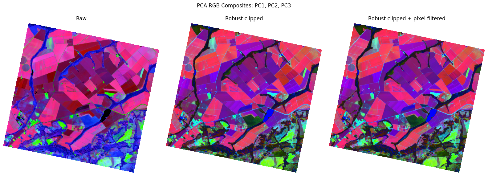
Figure 11:PCA RGB composite after outlier handling. The robust-clipped PCA emphasizes different spectral contrasts, improving visual separation between fields, water, dark areas, and edge textures.
Overall, these results show that outlier handling does not only change the numerical explained variance. It also changes the spectral information represented by the PCA components and improves the visual separation of land-cover patterns in the PCA RGB composite.
Partial Standardization Before PCA in Hyperspectral Data
The second point that we would like to direct your attention to is how to modify the variance of the data by yourself to direct the PCA results to meet your objective. In this lesson, we implemented PCA on the hyperspectral cube using the covariance matrix, meaning that the data were mean-centered but the bands were not fully standardized. This choice allows the natural variance structure of the scene to influence the PCA components. Bands with larger variance have more influence on the first principal components, while bands with smaller variance contribute less.
Based on this observation, the standard deviation of each band becomes a way to manipulate the PCA results. You are not limited to aggressive standardization that forces PCA to treat all bands equally. Instead, you can use different variance-scaling techniques so that high-variance bands do not completely dominate the PCA results, while low-variance bands are not neglected. This is an experimental area that depends on your research question or application.
There are many standardization and scaling techniques, such as partial standardization, robust scaling (as mentioned earlier with outliers), region-based scaling, and others. You can even design your own method for variance manipulation.
To show how modifying variance affects PCA results, we tried partial standardization. Instead of dividing each band by its full standard deviation, partial standardization divides each band by a power of its standard deviation. This creates a compromise between covariance PCA and correlation PCA. We tested several values of : 0, 0.25, 0.5, 0.75, and 1.
Mathematically, partial standardization can be written as:
where is the value of pixel in band , is the mean of band , is the standard deviation of band , and controls the strength of standardization. When , this is covariance PCA after mean-centering. When , this becomes full standardization, or correlation PCA. Intermediate values create a compromise between the two.
For example, when , each band is divided by the square root of its standard deviation. This is often called Pareto scaling. It reduces the dominance of high-variance bands, but it does not force all bands to have exactly the same variance.
Figure 12 shows how partial standardization compresses differences in band standard deviation. When , the original standard deviation pattern is preserved. When , all bands have an effective standard deviation of 1. Intermediate values such as , , and gradually reduce the contrast between high-variance and low-variance bands while preserving part of the original variance structure.
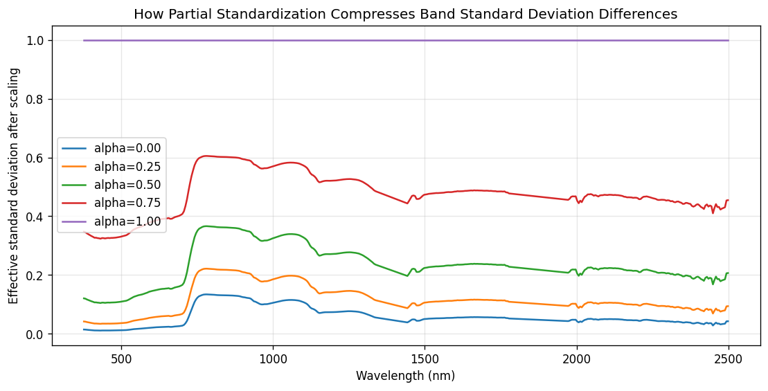
Figure 12:Effect of partial standardization on band standard deviation. Higher alpha compresses the difference between high- and low-variance bands.
This change directly affects the PCA results. As shown in Figure 13, when no standardization is applied, the first principal component explains a very large percentage of the total variance. This means that PC1 is strongly influenced by naturally high-variance spectral regions. As increases, variance becomes less concentrated in PC1 and is redistributed into PC2, PC3, and later components.
In this example, covariance PCA with gives a very dominant first component. As partial standardization becomes stronger, the first two or three components become more balanced. This indicates that weaker spectral structures, which were less visible in covariance PCA, become more influential after scaling.
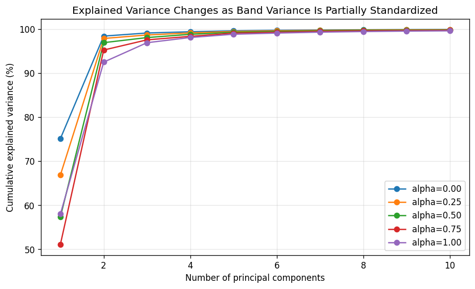
Figure 13:Effect of partial standardization on the explained variance of principal components. Higher alpha spreads variance more evenly across PCs.
The loading curves in Figure 14 provide a deeper interpretation. PCA should not be evaluated only by explained variance; the loading curves show which wavelengths contribute to each principal component. When , the PC loadings are more strongly controlled by high-variance spectral regions. When , the loadings reflect the correlation structure among bands after all wavelengths have been given equal variance. Intermediate values of produce loading curves between these two extremes.
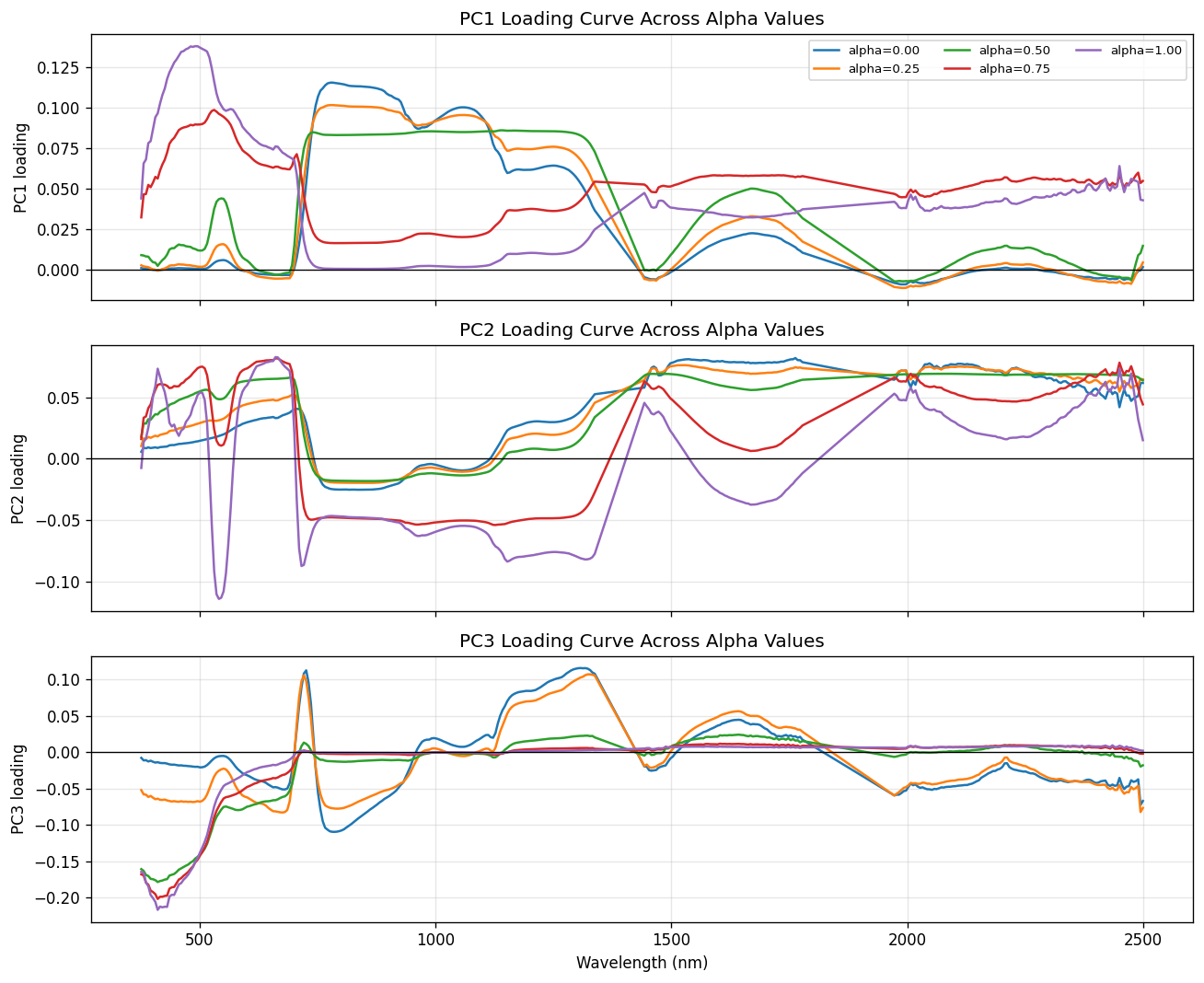
Figure 14:Effect of partial standardization on PCA loadings. The spectral contribution to each component shifts as alpha increases.
This matters because changing does not simply change the percentage of explained variance. It changes the covariance structure seen by PCA:
where is the original covariance matrix and is a diagonal matrix containing the band standard deviations. Therefore, different values of can rotate the PCA axes and produce different score images, loading curves, and interpretations.
The main lesson is that standardization before PCA is not only a yes-or-no decision. For hyperspectral data, partial standardization provides a useful middle ground. It allows us to reduce the dominance of high-variance bands while still preserving some of the natural variance structure of the scene.
In practice, the choice of should depend on the goal of the analysis. If the goal is to preserve the dominant physical variance of the scene, covariance PCA with may be appropriate. If the goal is to give all wavelengths equal importance, full standardization with may be useful. If the goal is to balance these two ideas, partial standardization, especially , can be a strong practical choice.
However, partial standardization should not replace proper preprocessing. Bad bands, noisy wavelengths, atmospheric absorption regions, and invalid pixels should still be removed or masked before PCA. Otherwise, stronger standardization may increase the influence of noise.
A good hyperspectral PCA workflow is to compare several scaling choices, inspect the PCA loading curves, examine the score images, and evaluate the result based on the final objective, such as visualization, compression, clustering, classification, or spectral interpretation.
From Outlier Handling to SuperPCA: Changing the Input Changes the PCA
The results above show that PCA is highly sensitive to the way the input data are prepared before fitting. By handling outliers and applying robust preprocessing, we changed the structure of the input data, which directly affected the explained variance, loading curves, and PCA RGB representation. This demonstrates that PCA results should not be interpreted as fixed outputs of the algorithm alone; they also depend strongly on the preprocessing choices applied before PCA.
This idea is also used in the broader hyperspectral imaging literature. For example, SuperPCA does not apply one global PCA model to the entire hyperspectral image. Instead, it first divides the image into homogeneous superpixel regions and then applies PCA separately within each region Jiang et al., 2018. From the same perspective as our outlier-handling experiment, SuperPCA shows that modifying the input structure before PCA can produce a different and often more meaningful low-dimensional representation.
Therefore, the key message is that PCA is not only affected by the mathematical decomposition itself, but also by how the data are selected, scaled, filtered, or spatially organized before PCA is fitted. Whether through robust outlier handling, standardization, or region-wise PCA, preprocessing plays a central role in shaping the final PCA results.
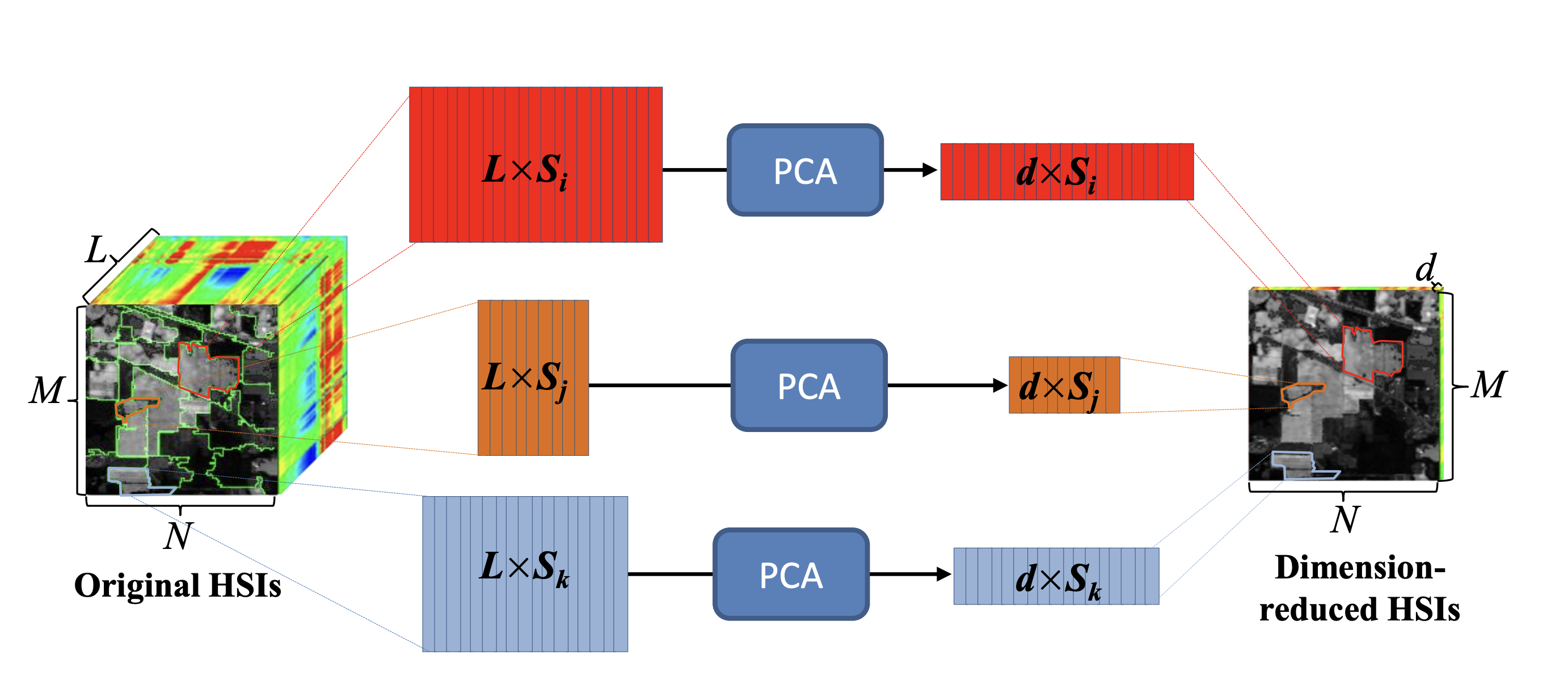
Figure 15:SuperPCA concept for hyperspectral dimensionality reduction. Instead of applying one global PCA projection to the whole image, the image is divided into homogeneous regions and PCA is fitted separately within each region. Adapted from Jiang et al. (2018).
PCA is not the end
PCA is a powerful and useful starting point for exploring hyperspectral data. It helps reduce the number of spectral bands while keeping much of the important variation in the data.
However, PCA is only one method among many. Dimensionality reduction has developed over time, and today there are many other approaches, including nonlinear methods and learning-based methods, as shown in Figure 16. These methods can sometimes reveal patterns that PCA may not capture.
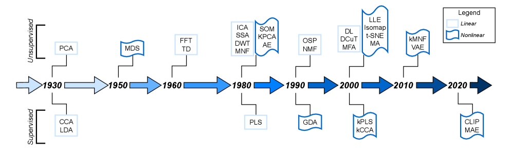
Figure 16:Historical development of dimensionality reduction methods, showing that PCA is part of a much broader family of approaches. Source: Mankovich et al. (2025).
One example is UMAP, a nonlinear dimensionality reduction method. In Figure 17, hyperspectral pixels are projected into a lower-dimensional space using UMAP, then grouped using K-means clustering. The same cluster colors are shown both in image space and in the UMAP embedding space.
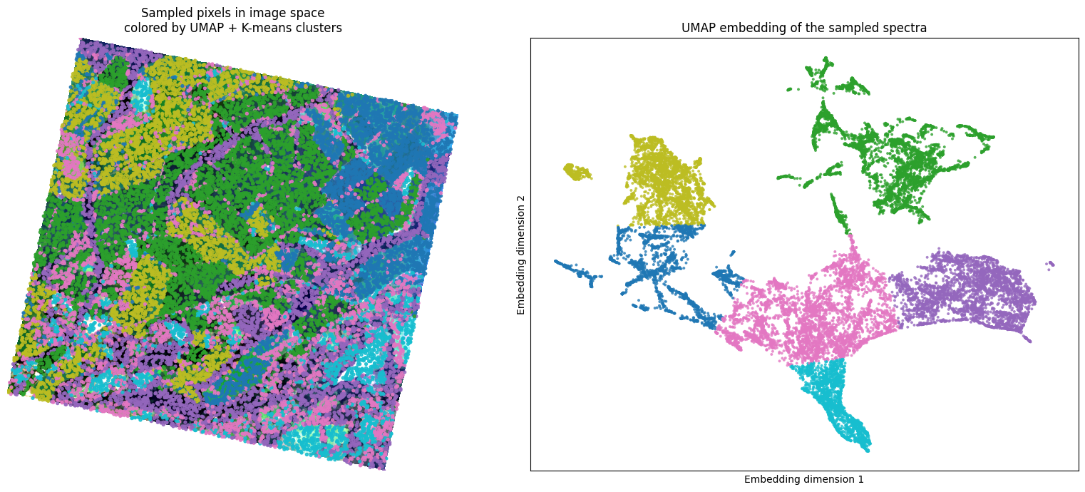
Figure 17:Example of using UMAP with K-means clustering to explore structure in hyperspectral data. The left panel shows sampled pixels in the image, and the right panel shows the UMAP embedding of their spectra. Source: Author’s experiment.
The main message is that PCA is a valuable first step, but it should not be the final step. Many other dimensionality reduction methods can be explored depending on the data, the goal of the analysis, and the type of patterns we want to discover.
# =====================================================================
# 🧰 TOOLKIT — YOUR TURN  (implement before the next lesson)
# Fill in the bodies below; the reference solution appears at the top of
# the next coding lesson (Module 4 · Lesson 3: Denoising).
# =====================================================================
import numpy as np
from sklearn.decomposition import PCA
from sklearn.preprocessing import StandardScaler

RANDOM_STATE = 31  # run_pca's default random_state needs this defined

# ---- transform ---------------------------------------------------------

def flatten_cube(cube, no_data=None):
    """Convert a cube from (bands, rows, cols) to a feature matrix (pixels, bands).

    Parameters
    ----------
    cube : ndarray, shape (bands, rows, cols)
        Hyperspectral data cube.
    no_data : ndarray, shape (rows, cols), optional
        Boolean mask of no-data pixels to exclude.

    Returns
    -------
    X : ndarray, shape (rows*cols, bands)
        Feature matrix for all pixels (invalid pixels still present, as NaN/inf).
    X_valid : ndarray, shape (n_valid_pixels, bands)
        Feature matrix containing only valid (finite) pixels.
    valid_mask : ndarray, shape (rows*cols,), dtype=bool
        Boolean mask indicating which pixels are valid.
    """
    # TODO: reshape (bands, rows, cols) -> (pixels, bands); build a valid_mask of
    #       finite pixels (and exclude no_data when given); return X, X[valid], valid_mask.
    pass

def run_pca(X, n_components=10, scale=False, random_state=RANDOM_STATE):
    """Run PCA, optionally after per-band standardization.

    Parameters
    ----------
    X : ndarray, shape (n_pixels, n_bands)
        Feature matrix of spectral data.
    n_components : int
        Number of principal components to compute.
    scale : bool
        If True, standardize each band before PCA.
    random_state : int
        Random seed for reproducibility.

    Returns
    -------
    X_pca : ndarray, shape (n_pixels, n_components)
        Transformed data in PCA space.
    pca_model : PCA
        Fitted PCA model object.
    scaler : StandardScaler or None
        Fitted scaler if scale=True, otherwise None.
    """
    # TODO: optionally standardize X with StandardScaler when scale=True; fit a
    #       PCA(n_components, random_state) and transform; return X_pca, pca_model, scaler.
    pass
What’s Next!
After reducing our data from ~380 bands to just 3 or 10 principal components, you might wonder: is it possible to reconstruct the original spectral bands? The answer is yes. In the next lesson, we will learn how to use the PCA components to reconstruct a hyperspectral data cube, allowing us to approximate the original data but with reduced noise.
See you in the next lesson!
- Abdi, H., & Williams, L. J. (2010). Principal component analysis. WIREs Computational Statistics, 2(4), 433–459.
- Ringnér, M. (2008). What is principal component analysis? Nature Biotechnology, 26(3), 303–304.
- Jia, X., & Richards, J. A. (1999). Segmented principal components transformation for efficient hyperspectral remote-sensing image display and classification. IEEE Transactions on Geoscience and Remote Sensing, 37(1), 538–542.
- Jiang, J., Ma, J., Chen, C., Wang, Z., Cai, Z., & Wang, L. (2018). SuperPCA: A superpixelwise PCA approach for unsupervised feature extraction of hyperspectral imagery. IEEE Transactions on Geoscience and Remote Sensing, 56(8), 4581–4593.
- Mankovich, N., Cohrs, K. H., Durand, H., Sitokonstantinou, V., Williams, T., & Camps-Valls, G. (2025). Dimensionality Reduction for Remote Sensing Data Analysis: A Systematic Review of Methods and Applications.