
Welcome to the next lesson in the analysis and applications module.
In the previous lesson, we used Principal Component Analysis, or PCA, to reduce the dimensionality of a hyperspectral image. We saw that a hyperspectral cube with hundreds of spectral bands can often be represented using only a small number of principal components.
But this leads to an important question:
Can we use those principal components to reconstruct the hyperspectral cube again?
The answer is yes. PCA does not only reduce dimensionality; it can also be used to reconstruct an approximation of the original data, as illustrated in Figure 1. For example, if we reduce a hyperspectral cube from around 420 bands to only a few principal components, we can transform those components back into the original spectral space.
However, the reconstructed cube will not be exactly the same as the original one. Some information is lost during dimensionality reduction, especially when we keep only a small number of principal components. The quality of the reconstruction depends on how many principal components we choose to keep.
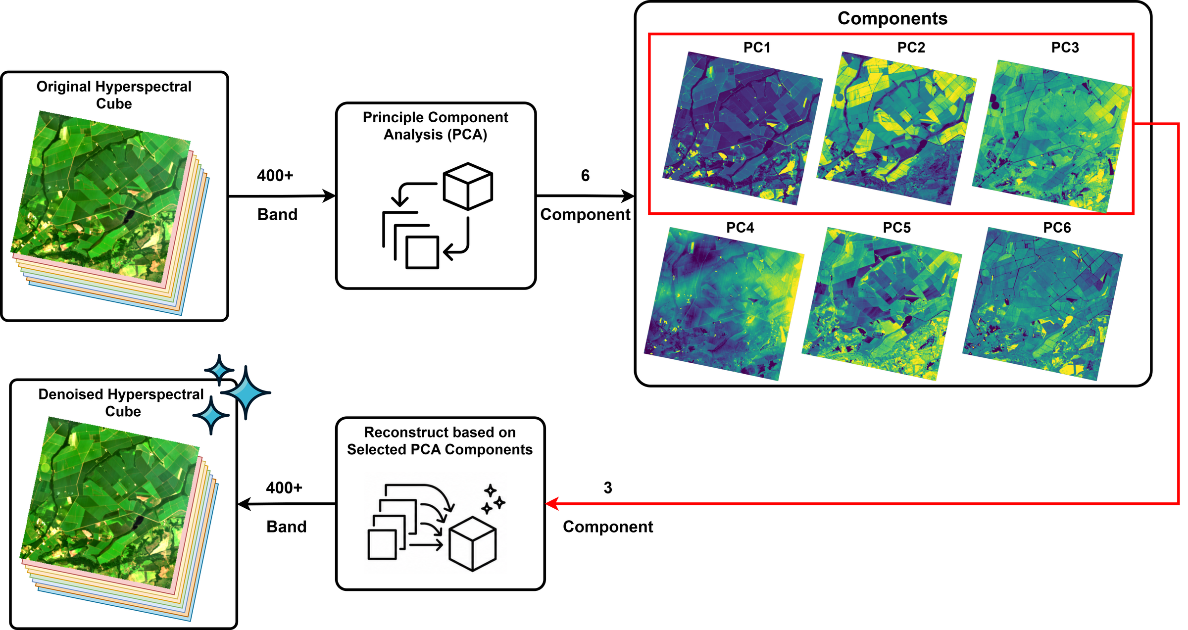
Figure 1:PCA-based reconstruction for denoising.
This idea is useful for denoising. In many hyperspectral images, the most important signal is captured by the first few principal components, while noise often appears in later components as we will see in this lesson. By reconstructing the cube using only the most informative components, we can reduce noise while preserving the main spectral and spatial patterns.
So, in this lesson, we move from asking:
How can PCA reduce the number of dimensions?
to asking:
How can PCA reconstruction help us denoise a hyperspectral image?
This process is commonly known as PCA-based denoising by reconstruction.
In this lesson, we will examine and compare the first ten PCA components to evaluate their contribution to the hyperspectral cube. This analysis will help us determine how many principal components should be selected for reconstruction, with the goal of preserving important spectral information while reducing noise.
Let’s get started!
Hyperspectral Cube for This Lesson
We will continue using the same agricultural scene from the previous lesson. This scene is particularly useful for demonstrating PCA-based denoising because it contains diverse land cover types—including vegetated crop fields, water bodies, bare soil, and field boundaries—which provide strong spectral contrast. This scene also contains visible noise, making it well-suited for demonstrating the effects of denoising.
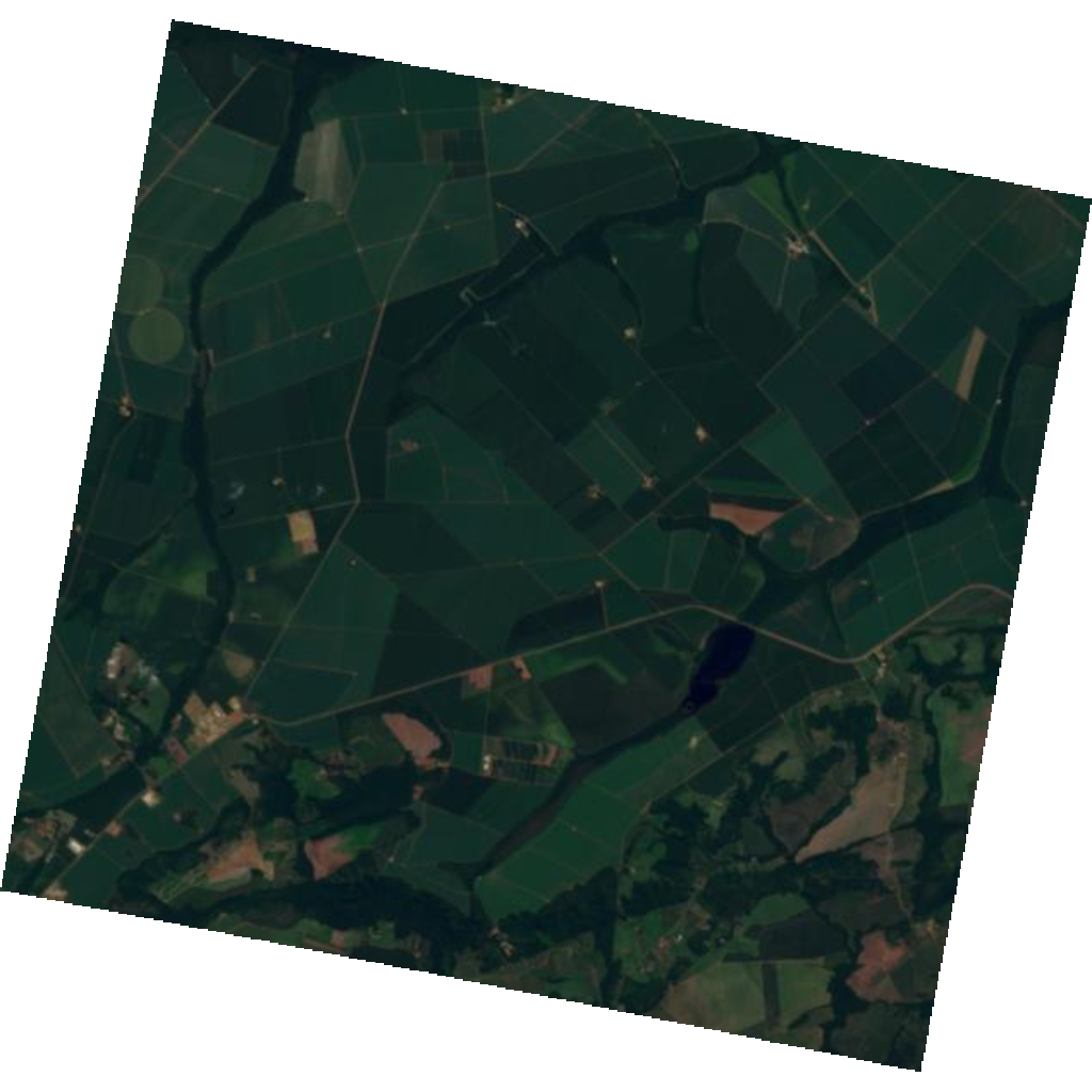
Scene: Tanager-1 scene near Campo Verde, Mato Grosso, Brazil.
Let’s load the hyperspectral cube from the HDF5 file using the same approach as in the previous lesson.
🧰 Your Toolkit so far
The reference solution through Module 4 · Lesson 2 — your loader, band/RGB helpers,
the safe index math, and last lesson’s flatten_cube and run_pca. Keep it at the top and
run it first. This lesson adds the spectral-similarity metrics (spectral_sam,
spectral_corr, spectral_mad) and sam_map.
# ==================
# 🧰 YOUR TOOLKIT  (reference solution so far — through Module 4 · Lesson 2)
# ==================

# Essential imports
import h5py
import numpy as np
import matplotlib.pyplot as plt
from sklearn.decomposition import PCA
from sklearn.preprocessing import StandardScaler
from matplotlib.colors import ListedColormap, BoundaryNorm


# Reproducibility for PCA / clustering
RANDOM_STATE = 31


# ---- setup -------------------------------------------------------------

def download_tanager_data(url, file_path):
    import os
    import urllib.request

    def _progress(count, block_size, total_size):
        mb_done = count * block_size / 1_000_000
        mb_total = total_size / 1_000_000
        print(f"\rDownloading... {mb_done:.1f} / {mb_total:.1f} MB", end="", flush=True)

    if not os.path.exists(file_path):
        urllib.request.urlretrieve(url, file_path, reporthook=_progress)
        print(f"\nDownload complete: {file_path}")
    else:
        print(f"File already exists, skipping download: {file_path}")
    return file_path


# ---- io ----------------------------------------------------------------

def load_hdf5(
    file_path,
    data_path='HDFEOS/GRIDS/HYP/Data Fields/surface_reflectance',
    nodata_path='HDFEOS/GRIDS/HYP/Data Fields/nodata_pixels',
    clean=True,
    band=None
    ):

    with h5py.File(file_path, 'r') as f:
        dset = f[data_path]
        # select all or a single band
        if band is None:
            data = dset[:].astype(np.float32)
        else:
            data = dset[band].astype(np.float32)
        attrs = dict(dset.attrs)

        wavelengths = np.asarray(attrs['wavelengths'], dtype=np.float32)
        good = np.asarray(attrs['good_wavelengths'], dtype=bool)
        no_data = f[nodata_path][:].astype(bool)

    if clean:
        if band is None:
            data = data[good]
            wavelengths = wavelengths[good]
            data[:, no_data] = np.nan
            good = good[good]
        else:
            # For a single band, check if it is good, else return all nan
            wavelengths = np.array([wavelengths[band]], dtype=np.float32)
            if not good[band]:
                data = np.full_like(data, np.nan)
            else:
                data[no_data] = np.nan
            good = np.array([good[band]], dtype=bool)

    attrs['wavelengths'] = wavelengths
    attrs['good_wavelengths'] = good

    return data, attrs, no_data


# ---- bands -------------------------------------------------------------

def nearest_band(wavelengths, target_nm):
    return int(np.argmin(np.abs(np.asarray(wavelengths) - target_nm)))

def nearest_band_index(wavelengths, target_nm):
    return nearest_band(wavelengths, target_nm)

# ---- transform ---------------------------------------------------------

def flatten_cube(cube, no_data=None):

    bands, rows, cols = cube.shape
    X = cube.reshape(bands, rows * cols).T
    valid_mask = np.isfinite(X).all(axis=1)
    if no_data is not None:
        valid_mask &= ~no_data.ravel()
    X_valid = X[valid_mask]
    return X, X_valid, valid_mask

def run_pca(X, n_components=10, scale=False, random_state=RANDOM_STATE):

    scaler = None
    X_input = X
    if scale:
        scaler = StandardScaler()
        X_input = scaler.fit_transform(X)
    pca_model = PCA(n_components=n_components, random_state=random_state)
    X_pca = pca_model.fit_transform(X_input)
    return X_pca, pca_model, scaler


# ---- visualization ----------------------------------------------------

def make_rgb(cube, wavelengths, r_nm=680, g_nm=550, b_nm=470,
             percentile_low=2, percentile_high=98, reference_cube=None):
    """Create a display RGB using per-channel percentile stretching.

    If `reference_cube` is provided, display limits are computed from both cubes
    so before/after RGB images use the same stretch.
    """
    r = nearest_band(wavelengths, r_nm)
    g = nearest_band(wavelengths, g_nm)
    b = nearest_band(wavelengths, b_nm)
    band_indices = (r, g, b)

    rgb = np.dstack([cube[idx] for idx in band_indices]).astype(np.float32)
    if reference_cube is None:
        stretch_rgb = rgb
    else:
        reference_rgb = np.dstack([reference_cube[idx] for idx in band_indices]).astype(np.float32)
        stretch_rgb = np.concatenate([rgb, reference_rgb], axis=0)

    rgb_display = np.zeros_like(rgb, dtype=np.float32)
    for channel in range(3):
        p_low, p_high = np.nanpercentile(
            stretch_rgb[:, :, channel],
            (percentile_low, percentile_high)
        )
        if not np.isfinite(p_low) or not np.isfinite(p_high) or p_high <= p_low:
            continue
        rgb_display[:, :, channel] = (rgb[:, :, channel] - p_low) / (p_high - p_low)

    return np.clip(rgb_display, 0, 1)
# Download the Tanager-1 Ortho SR HDF5 file using the provided
# download_tanager_data helper (defined just above).
url = "https://storage.googleapis.com/open-cogs/planet-stac/tanager1-release2-core-imagery/ortho_sr_hdf5/20250501_143138_87_4001_ortho_sr_hdf5.h5"
file_path = "20250501_143138_87_4001_ortho_sr_hdf5.h5"
download_tanager_data(url, file_path)File already exists, skipping download: 20250501_143138_87_4001_ortho_sr_hdf5.h5
'20250501_143138_87_4001_ortho_sr_hdf5.h5'# Load and clean the cube with your Toolkit loader
# (drops bad bands and sets no-data pixels to NaN across all bands).
cube, attrs, no_data = load_hdf5(file_path)
wavelengths = attrs["wavelengths"]
bands, rows, cols = cube.shapeQuick Recap: Running PCA
In the previous lesson, we used PCA to transform the hyperspectral cube into a smaller set of ordered components.
To avoid repeating the full PCA lesson, the next cell combines the essential steps into one implementation block:
Use the Toolkit
flatten_cube()helper to createX_full,X_valid, andvalid_pixel_mask.Fit PCA on
X_valid, because PCA cannot be fitted withNaNvalues.Use the Toolkit
run_pca()helper to obtain the PCA scores, loadings, and explained variance.Reshape the PCA scores back into image space using the valid-pixel mask so each component can be visualized as a map.
# The original cube shape from HDF5 is (bands, rows, cols)
bands, rows, cols = cube.shape

# Step 1: Use the Toolkit helper to flatten the cube and keep only valid pixels.
# `valid_pixel_mask` is 1-D, so we reshape it for image-space plotting and masking.
X_full, X_valid, valid_pixel_mask = flatten_cube(cube, no_data=no_data)
valid_pixels = valid_pixel_mask.reshape(rows, cols)

print("Original cube shape:", cube.shape)
print("All-pixel matrix shape:", X_full.shape)   # rows*cols x bands
print("Valid PCA input shape:", X_valid.shape)   # valid pixels x bands

# Step 2: Fit PCA with 10 components using your Toolkit's run_pca
scores10, pca10, _ = run_pca(X_valid, n_components=10)

print("Scores shape:", scores10.shape)  # valid pixels x 10
print("Explained variance ratio:")
print(pca10.explained_variance_ratio_)

# Step 3: Reshape PCA scores back into image space
pca_maps = np.full((10, rows, cols), np.nan, dtype=np.float32)
pca_maps[:, valid_pixels] = scores10.T.astype(np.float32)
Original cube shape: (368, 752, 784)
All-pixel matrix shape: (589568, 368)
Valid PCA input shape: (422557, 368)
Scores shape: (422557, 10)
Explained variance ratio:
[7.4861634e-01 2.3471415e-01 7.0617148e-03 2.7785811e-03 2.1786301e-03
 1.1992289e-03 7.1906607e-04 5.4972351e-04 3.5793195e-04 2.0224245e-04]
Explained Variance and Cumulative Explained Variance
Before deciding how many principal components to use for reconstruction, we first need to examine how much variance is explained by each component. From the previous lesson, we found that the first three principal components explain about 99.1% of the total variance in the hyperspectral cube. This indicates that most of the important information in the original cube is concentrated in only a few components.
However, selecting the number of components based only on the total variance percentage is not always the best approach. Although the first two or three components may retain most of the variance, we still need to visually inspect the individual PCA components and evaluate how much useful spatial and spectral information they contain. Some later components may contain meaningful details, while others may mainly represent noise.
To make this decision more clearly, we will plot the explained variance and cumulative explained variance for all components, as shown in Figure 2.
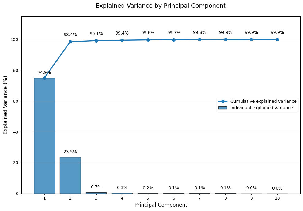
Figure 2:Explained variance and cumulative explained variance for each principal component used in the denoising step.
Visualization of PCA Components
The PCA scores are computed from the flattened data matrix, so they do not immediately appear as images. To inspect their spatial patterns, each score is mapped back to its original pixel location and reshaped into image space. This visualization helps determine how many components should be retained for denoising. Components that show clear spatial structure are more likely to contain meaningful signal, while components that appear mostly speckled or random are more likely dominated by noise.
# Visualize the first 10 PCA component score maps
# We use these to identify which components contain signal vs noise

fig, axes = plt.subplots(5, 2, figsize=(20, 30))
axes = axes.ravel()

for i in range(10):
    img = pca_maps[i]

    # Use percentile-based color limits for better contrast
    vmin, vmax = np.nanpercentile(img, [2, 98])

    # Display using a diverging colormap (RdBu_r) to show positive and negative scores
    im = axes[i].imshow(
        img,
        cmap="RdBu_r",
        vmin=vmin,
        vmax=vmax
    )

    axes[i].set_title(
        f"PC {i+1}\n"
        f"Explained variance = {pca10.explained_variance_ratio_[i]*100:.2f}%"
    )
    axes[i].axis("off")

    plt.colorbar(im, ax=axes[i], fraction=0.046, pad=0.04)

plt.tight_layout()
plt.show()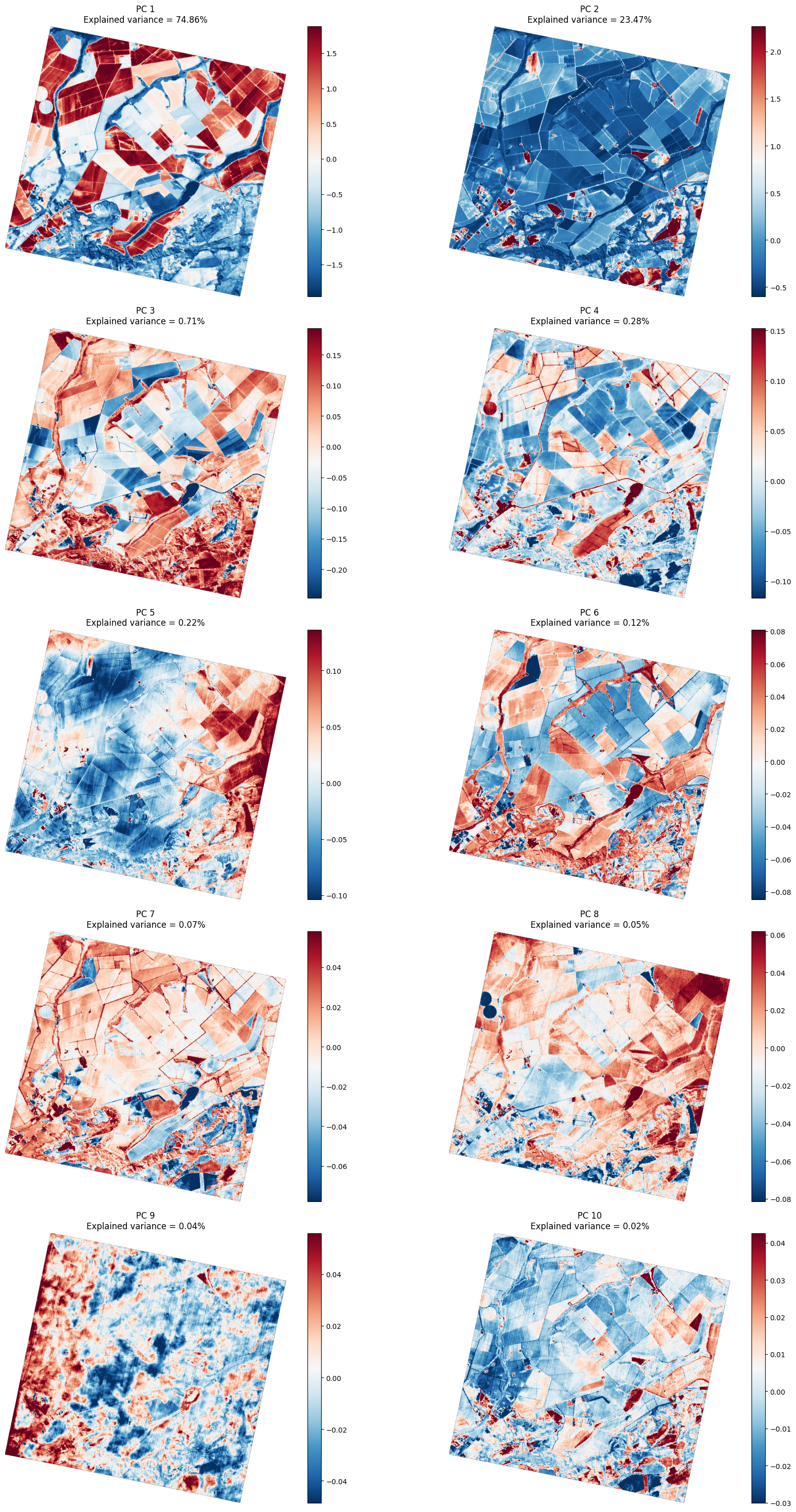
The PCA score maps make the separation between signal and noise more visible. In the first three components, the image shows meaningful spatial structure with minimal noise, such as field boundaries, vegetation patterns, and broad land-cover differences.
Starting from PC4, noise becomes more apparent. The later components show weaker scene structure and stronger artifact patterns, including visible striping, speckled texture, and bright regions or gradients not associated with surface features. Such patterns are less related to the main spatial structure of the scene and more likely represent residual noise or sensor-related effects.
For this reason, we will keep only the first three components for reconstruction. This allows us to preserve the dominant information in the image while reducing the noisy contribution from the later PCA components.
Reconstructing the image using selected PCA components
After selecting the number of principal components to keep, we can reconstruct an approximation of the original hyperspectral data.
This section builds on the previous PCA dimensionality reduction lesson. The previous lesson explained the forward PCA projection, where the original centered data is projected into PCA space:
In this lesson, we focus on the inverse step: reconstructing the data from the selected PCA scores and component vectors.
Assume the hyperspectral cube has already been reshaped into a 2D matrix:
where:
is the number of pixels,
is the number of spectral bands,
each row of represents one pixel spectrum.
The centered data was originally calculated as:
where is the mean spectrum removed during PCA centering.
After PCA projection, the selected PCA scores are:
where:
contains the PCA scores for the first components,
contains the first principal component directions as columns,
is the number of components kept.
To reconstruct the data using only these components, we project the PCA scores back to the original spectral space:
where:
is the reconstructed approximation of the original hyperspectral data,
maps the PCA scores back to the original band space,
is added back because it was removed during centering.
For example, if we keep , the reconstruction becomes:
This reconstruction uses only PC1, PC2, and PC3.
By reconstructing the image with only the first three components, we keep the dominant scene information and reduce the influence of later low-variance components that are more likely to contain noise or residual artifacts.
Reconstruction in scikit-learn
In scikit-learn, the PCA component matrix is stored slightly differently from the mathematical notation above.
The array pca.components_ has shape (n_components, n_bands), meaning each principal component is stored as one row. This is equivalent to storing rather than .
For reconstruction using the first three components, we can manually reconstruct the data as:
scores_3 = pca_scores[:, :3]
components_3 = pca.components_[:3, :]

X_reconstructed_3 = scores_3 @ components_3 + pca.mean_
This corresponds to the reconstruction equation, where pca.components_ represents the transposed component matrix:
Using inverse_transform()
Instead of manually multiplying the PCA scores by the component matrix, scikit-learn provides a direct method for reconstruction:
X_reconstructed = pca.inverse_transform(X_pca)This automatically performs the matrix multiplication and adds back the mean:
X_reconstructed = X_pca @ pca.components_ + pca.mean_where:
X_pcacontains the PCA scores,pca.components_contains the selected principal component vectors (stored as rows),pca.mean_is added back automatically byinverse_transform().
For example, if PCA was fitted using three components:
pca = PCA(n_components=3)
X_pca = pca.fit_transform(X)
X_reconstructed_3 = pca.inverse_transform(X_pca)
then X_reconstructed_3 is the reconstruction of the original data using only the first three principal components.
# Fit a 3-component PCA for reconstruction with run_pca. The first 3 components are
# the same ones we visualized above; we re-fit here for a clean reconstruction workflow.
scores3, pca3, _ = run_pca(X_valid, n_components=3)

X_reconstructed = pca3.inverse_transform(scores3)
print("Reconstructed X shape:", X_reconstructed.shape)  # valid pixels x bands

# Put reconstructed spectra back into cube shape
cube_reconstructed = np.full_like(cube, np.nan, dtype=np.float32)
cube_reconstructed[:, valid_pixels] = X_reconstructed.T.astype(np.float32)
print("Reconstructed cube shape:", cube_reconstructed.shape)
Reconstructed X shape: (422557, 368)
Reconstructed cube shape: (368, 752, 784)
Before-and-after denoising comparison
Now we compare the original hyperspectral cube with the PCA-denoised reconstructed hyperspectral cube.
For this lesson, we focus on selected visible wavelength bands. We select three visible wavelength regions (blue, green, and red) for both individual band comparisons and later for building an RGB composite image.
In the code below, we first define a helper function called nearest_band_index(). This function finds the band whose wavelength is closest to a target wavelength. This is useful because the hyperspectral sensor may not have a band exactly at 470 nm, 550 nm, or 680 nm.
We select three visible wavelength regions:
Blue band: approximately 470 nm
Green band: approximately 550 nm
Red band: approximately 680 nm
For each of these three bands, we plot three images:
The original band image
The PCA-denoised reconstructed band image
The difference image:
The difference image shows what was removed or changed by the PCA reconstruction. If the difference image mostly contains random-looking variation, this suggests that the PCA reconstruction mainly removed noise. If the difference image contains strong spatial patterns or object boundaries, then the reconstruction may also be removing useful image information.
Percentile-based display limits are used for visualization so that extreme values do not dominate the image contrast.
cube_denoised = cube_reconstructed

# Define target wavelengths for visible bands
blue_target_nm = 470
green_target_nm = 550
red_target_nm = 680

# Find the indices of bands closest to target wavelengths
blue_idx = nearest_band_index(wavelengths, blue_target_nm)
green_idx = nearest_band_index(wavelengths, green_target_nm)
red_idx = nearest_band_index(wavelengths, red_target_nm)

# Compare original / denoised / difference for all three visible bands
bands_to_compare = [
    ("Blue", blue_idx),
    ("Green", green_idx),
    ("Red", red_idx),
]

fig, axes = plt.subplots(len(bands_to_compare), 3, figsize=(14, 12))

for row, (name, idx) in enumerate(bands_to_compare):
    original = cube[idx]
    denoised = cube_denoised[idx]
    difference = original - denoised

    vmin, vmax = np.nanpercentile(original, [2, 98])
    dvmin, dvmax = np.nanpercentile(difference, [2, 98])

    im0 = axes[row, 0].imshow(original, vmin=vmin, vmax=vmax, cmap="gray")
    axes[row, 0].set_title(f"{name} band original\n{wavelengths[idx]:.1f} nm")
    axes[row, 0].axis("off")
    plt.colorbar(im0, ax=axes[row, 0], fraction=0.046, pad=0.04)

    im1 = axes[row, 1].imshow(denoised, vmin=vmin, vmax=vmax, cmap="gray")
    axes[row, 1].set_title(f"{name} band denoised\n{wavelengths[idx]:.1f} nm")
    axes[row, 1].axis("off")
    plt.colorbar(im1, ax=axes[row, 1], fraction=0.046, pad=0.04)

    im2 = axes[row, 2].imshow(difference, vmin=dvmin, vmax=dvmax, cmap="RdBu_r")
    axes[row, 2].set_title(f"{name} band difference\noriginal - denoised")
    axes[row, 2].axis("off")
    plt.colorbar(im2, ax=axes[row, 2], fraction=0.046, pad=0.04)

plt.tight_layout()
plt.show()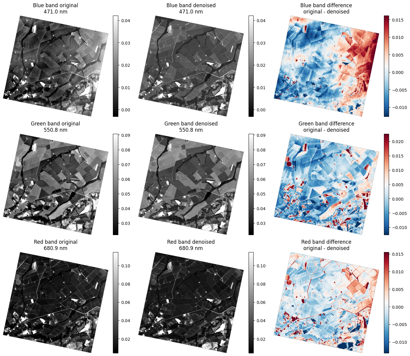
Interpretation:
The PCA denoising preserves the main spatial structure in all three visible bands while reducing unwanted variation.
In the blue band, the removed signal is mainly related to sensor noise and radiometric artifacts. The difference image clearly shows striping patterns and broad gradients across the scene that were largely removed by the reconstruction. The blue band shows the strongest denoising effect of the three visible bands.
In the green band, the denoising effect is moderate. The difference image shows some striping and subtle noise removal, but the residuals are weaker than in the blue band, indicating that the original green band was less affected by systematic noise.
In the red band, the residuals are the weakest of the three bands and are mostly concentrated around edges and field boundaries, indicating slight smoothing of fine spatial details. This suggests the red band had less noise to begin with compared to the shorter wavelengths.
This pattern will become even clearer when examining the RGB composite.
RGB composite comparison
To further evaluate the PCA denoising result, we can combine the three bands we just looked at in an RGB composite image. This comparison is not part of the PCA reconstruction itself, but it provides another visual assessment of how denoising affects the overall image appearance.
Comparing the original, denoised, and difference RGB images helps assess whether the main spatial patterns are preserved and whether sensor noise, striping, and radiometric artifacts are reduced.
# Build true-colour RGB composites of the original and denoised cubes using your
# Toolkit's make_rgb with a shared per-channel percentile stretch. This avoids a
# yellow or blue cast caused by one band dominating a single joint stretch.
r_idx = nearest_band(wavelengths, red_target_nm)
g_idx = nearest_band(wavelengths, green_target_nm)
b_idx = nearest_band(wavelengths, blue_target_nm)

rgb_original = make_rgb(
    cube, wavelengths,
    r_nm=red_target_nm, g_nm=green_target_nm, b_nm=blue_target_nm,
    reference_cube=cube_denoised
)
rgb_denoised = make_rgb(
    cube_denoised, wavelengths,
    r_nm=red_target_nm, g_nm=green_target_nm, b_nm=blue_target_nm,
    reference_cube=cube
)
rgb_difference = np.abs(rgb_original - rgb_denoised)

fig, axes = plt.subplots(1, 3, figsize=(15, 5))
axes[0].imshow(rgb_original)
axes[0].set_title(
    "Original RGB\n"
    f"R={wavelengths[r_idx]:.1f}, G={wavelengths[g_idx]:.1f}, B={wavelengths[b_idx]:.1f} nm"
)
axes[0].axis("off")
axes[1].imshow(rgb_denoised)
axes[1].set_title("Denoised RGB")
axes[1].axis("off")
axes[2].imshow(np.clip(rgb_difference * 3, 0, 1))
axes[2].set_title("RGB difference (enhanced 3×)")
axes[2].axis("off")
plt.tight_layout()
plt.show()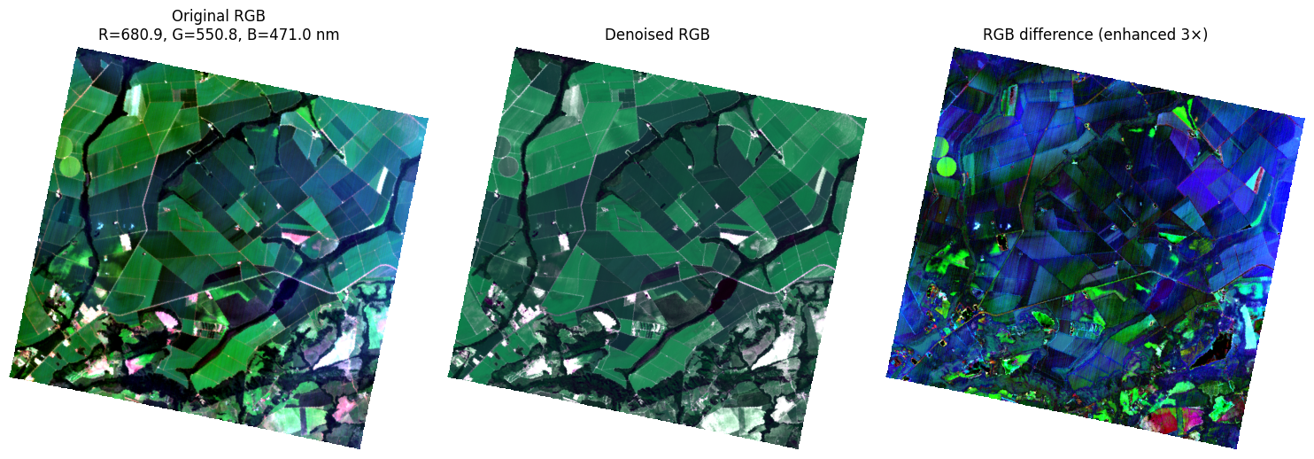
Interpretation:
The RGB comparison confirms that the PCA denoising improved the visual quality of the image while preserving the main land-cover structure. The shared per-channel stretch makes the original and denoised composites easier to compare without introducing a strong yellow or blue display cast from the RGB scaling itself.
The enhanced RGB difference image shows where the displayed colour values changed after denoising. These residuals mainly highlight broad gradients, sensor-related striping, and small-scale noise fluctuations while preserving the main agricultural field boundaries.
Overall, the RGB result supports the individual band-level interpretation from the previous section: PCA denoising reduces systematic artifacts and radiometric noise while largely preserving the important spatial features of the scene.
Comparing Narrow-Band Indices Before and After PCA Denoising
After evaluating the individual bands and the RGB composite, we can test the effect of PCA denoising on a vegetation spectral index. In the first lesson of this module, where we calculated narrow-band indices, the resulting index appeared somewhat noisy. In this lesson, we revisit that idea by calculating the Photochemical Reflectance Index (PRI) from both the original noisy hyperspectral cube and the PCA-denoised cube.
This comparison is important because spectral indices are often highly sensitive to noise, especially when they are calculated from narrow spectral bands. By comparing the original PRI, the denoised PRI, and the difference between them, we can evaluate whether PCA denoising improves the quality, stability, and reliability of the derived index.
# Calculate PRI (Photochemical Reflectance Index) for original and denoised cubes
# PRI is sensitive to changes in carotenoid pigments and is used to assess
# vegetation stress and photosynthetic efficiency

def pri_index(cube_in, wavelengths, wl1=531, wl2=570):
    """
    Calculate the Photochemical Reflectance Index (PRI).

    PRI = (R531 - R570) / (R531 + R570)

    This index is sensitive to changes in xanthophyll pigments and is commonly
    used to assess vegetation stress and photosynthetic light-use efficiency.

    Parameters:
        cube_in: Hyperspectral cube with shape (bands, rows, cols)
        wavelengths: Array of wavelength values for each band
        wl1, wl2: Wavelengths for PRI calculation (default: 531 and 570 nm)

    Returns:
        pri: PRI index map
        (i1, i2): Indices of bands used
    """
    i1 = nearest_band_index(wavelengths, wl1)
    i2 = nearest_band_index(wavelengths, wl2)

    r1 = cube_in[i1]
    r2 = cube_in[i2]

    denom = r1 + r2
    pri = np.full_like(r1, np.nan, dtype=np.float32)

    valid = np.isfinite(r1) & np.isfinite(r2) & (np.abs(denom) > 1e-12)
    pri[valid] = (r1[valid] - r2[valid]) / denom[valid]

    return pri, (i1, i2)

# Calculate PRI for both original and denoised cubes
pri_original, (pri_i1, pri_i2) = pri_index(cube, wavelengths, wl1=531, wl2=570)
pri_denoised, _ = pri_index(cube_denoised, wavelengths, wl1=531, wl2=570)
pri_difference = pri_original - pri_denoised

# Create side-by-side comparison plot
fig, axes = plt.subplots(1, 3, figsize=(15, 5))

# Use 92nd percentile for upper limit (PRI can have extreme outliers in noisy data)
ovmin, ovmax = np.nanpercentile(pri_original, [2, 92])
dvmin, dvmax = np.nanpercentile(pri_denoised, [2, 92])
difvmin, difvmax = np.nanpercentile(pri_difference, [2, 92])

# PRI is commonly shown with a diverging colormap
im0 = axes[0].imshow(pri_original, cmap="RdYlBu", vmin=ovmin, vmax=ovmax)
axes[0].set_title("Original PRI")
axes[0].axis("off")
plt.colorbar(im0, ax=axes[0], fraction=0.046, pad=0.04)

im1 = axes[1].imshow(pri_denoised, cmap="RdYlBu", vmin=dvmin, vmax=dvmax)
axes[1].set_title("Denoised PRI")
axes[1].axis("off")
plt.colorbar(im1, ax=axes[1], fraction=0.046, pad=0.04)

im2 = axes[2].imshow(pri_difference, cmap="RdBu_r", vmin=difvmin, vmax=difvmax)
axes[2].set_title("PRI difference\noriginal - denoised")
axes[2].axis("off")
plt.colorbar(im2, ax=axes[2], fraction=0.046, pad=0.04)

plt.tight_layout()
plt.show()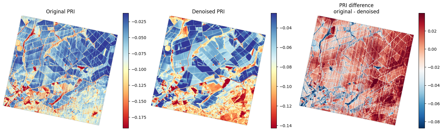
Interpretation:
The index image from the original data shows strong striping, gradients, and noisy spatial variation that make interpretation difficult. After denoising, the result is smoother and more spatially consistent, with clearer landscape-relevant patterns.
The difference image reveals the structured noise that was removed in the denoising process.
Overall, PCA denoising can improve not only individual spectral bands but also derived spectral indices, making them more reliable for analysis.
Spectral Profile Comparison
Visual comparisons are useful for assessing spatial quality, but hyperspectral data is primarily defined by its spectral information. Therefore, it is also important to compare the spectral signatures before and after PCA reconstruction.
In this step, a few valid pixels are selected from the image, and their original and reconstructed spectral profiles are plotted together to evaluate whether the denoised cube preserves the overall spectral shape while reducing band-to-band noise.
Let’s start by selecting pixels from different land cover types. The interactive pixel selection tool (used previously in the radiance vs. reflectance lesson) is shown below but commented out. We have already selected six representative pixels that are ready to use, though you are free to modify them for further exploration.
# Interactive plot of RGB using Plotly (commented out for static notebook execution)
# Uncomment the lines below to enable interactive RGB visualization with hover and zoom capabilities.


# import plotly.express as px

# # Replace NaN/Inf so Plotly can render (avoids 'invalid value encountered in cast' warning)
# rgb_safe = np.nan_to_num(rgb_denoised, nan=0.0, posinf=0.0, neginf=0.0)
# fig = px.imshow(rgb_safe)

# # Clean up the layout
# fig.update_layout(
#     title="<b>Pixel Hunter</b>: Hover for Coordinates, Drag to Zoom",
#     width=800,
#     height=800,
#     dragmode="zoom",
#     margin=dict(l=0, r=0, b=0, t=40)
# )

# fig.show()
In this part of the lesson, we will use the Spectral Angle Mapper (SAM) Kruse et al., 1993 as a comparison tool to measure the similarity between two spectral signatures of the same material.
SAM, or Spectral Angle Mapper, returns an angle. It measures the angle between a pixel spectrum and a reference or endmember spectrum by treating both spectra as vectors in spectral space, as illustrated in Figure 3:
where:
is the pixel spectrum vector.
is the reference or endmember spectrum vector.
is the dot product between the two spectra.
is the norm, or magnitude, of the pixel spectrum vector.
is the norm, or magnitude, of the reference spectrum vector.
is the spectral angle between the two spectra.
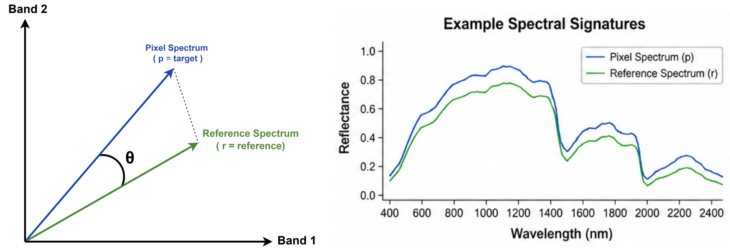
Figure 3:Conceptual illustration of the Spectral Angle Mapper (SAM) method. The pixel spectrum and reference spectrum are represented as vectors in spectral space. SAM measures the angle between these two vectors to evaluate spectral similarity.
The full mathematical range of SAM is:
In radians, the range is 0 to π (approximately 3.14).
The interpretation of SAM is straightforward: a lower SAM value indicates a better spectral match. A smaller angle means that the pixel spectrum and the reference spectrum have more similar spectral shapes. In contrast, a larger angle indicates greater spectral difference.
However, there is no universal threshold for what counts as a “good” SAM value. The acceptable threshold depends on several factors, including sensor noise, atmospheric correction quality, the number of spectral bands, the target material, and whether the reference spectra were collected from the image itself or from a laboratory or spectral library.
The main reason for using SAM in this lesson is to evaluate how much the denoised spectral signature, treated as the target spectrum, has changed compared with the original spectral cube, treated as the reference spectrum. In this context, a lower SAM value means that the denoising process preserved the original spectral shape more effectively, while a higher SAM value indicates a greater change between the denoised and original spectra.
In addition to SAM, we will also use other supporting spectral similarity metrics in the code, including Pearson correlation and mean absolute difference (MAD). These metrics provide complementary information about the relationship between the original and denoised spectra. Pearson correlation measures how similar the overall spectral trends are, and MAD measures the average magnitude of difference between the two spectra in reflectance units. However, the main focus of the comparison in this lesson remains SAM, while the other metrics are used to support and better interpret the results.
# Helper functions for spectral similarity metrics

def spectral_sam(spec1, spec2):
    """
    Calculate Spectral Angle Mapper (SAM) in radians between two spectra.

    Lower values indicate greater spectral similarity.
    """
    mask = np.isfinite(spec1) & np.isfinite(spec2)

    if np.sum(mask) < 2:
        return np.nan

    a = spec1[mask]
    b = spec2[mask]

    denom = np.linalg.norm(a) * np.linalg.norm(b)
    if denom == 0:
        return np.nan

    cosang = np.dot(a, b) / denom
    cosang = np.clip(cosang, -1, 1)

    return np.arccos(cosang)


def spectral_corr(spec1, spec2):
    """
    Calculate Pearson correlation coefficient between two spectra.

    Values range from -1 to 1, with higher values indicating greater similarity.
    """
    mask = np.isfinite(spec1) & np.isfinite(spec2)

    if np.sum(mask) < 2:
        return np.nan

    a = spec1[mask]
    b = spec2[mask]

    if np.nanstd(a) == 0 or np.nanstd(b) == 0:
        return np.nan

    return np.corrcoef(a, b)[0, 1]


def spectral_mad(spec1, spec2):
    """
    Calculate Mean Absolute Difference (MAD) between two spectra.

    Measures the average magnitude of difference in reflectance units.
    """
    diff = np.abs(spec1 - spec2)
    return np.nanmean(diff)
# Select specific pixels to compare spectra and residuals
# You can change these to any pixel coordinates you want to inspect
selected_pixels = [
(364, 369), # veg 1
(368, 273), # veg 2
(227, 105), # veg 3
(287, 596), # veg 4
(459, 513), # water
(594, 168) # building
]
n_pixels = len(selected_pixels)
fig, axes = plt.subplots(
n_pixels, 2,
figsize=(14, 3.5 * n_pixels),
sharex=True,
gridspec_kw={"width_ratios": [3, 1]}
)
if n_pixels == 1:
axes = np.array([axes])
for row_idx, ((r, c), i) in enumerate(zip(selected_pixels, range(1, n_pixels + 1))):
spec_original = cube[:, r, c]
spec_denoised = cube_denoised[:, r, c]
residual = spec_original - spec_denoised
sam_val = spectral_sam(spec_original, spec_denoised)
corr_val = spectral_corr(spec_original, spec_denoised)
mad_val = spectral_mad(spec_original, spec_denoised)
ax_spec = axes[row_idx, 0]
ax_res = axes[row_idx, 1]
ax_spec.plot(wavelengths, spec_original, label="Original")
ax_spec.plot(wavelengths, spec_denoised, label="Denoised", linestyle="--")
ax_spec.set_title(
f"P{i}: row={r}, col={c} | "
f"SAM={sam_val:.4f} rad, Corr={corr_val:.4f}, MAD={mad_val:.6f}"
)
ax_spec.set_ylabel("Reflectance")
ax_spec.grid(True, alpha=0.3)
ax_spec.legend()
ax_res.plot(wavelengths, residual)
ax_res.axhline(0, linestyle="--", linewidth=1)
ax_res.set_title("Residual")
ax_res.grid(True, alpha=0.3)
axes[-1, 0].set_xlabel("Wavelength (nm)")
axes[-1, 1].set_xlabel("Wavelength (nm)")
plt.tight_layout()
plt.show()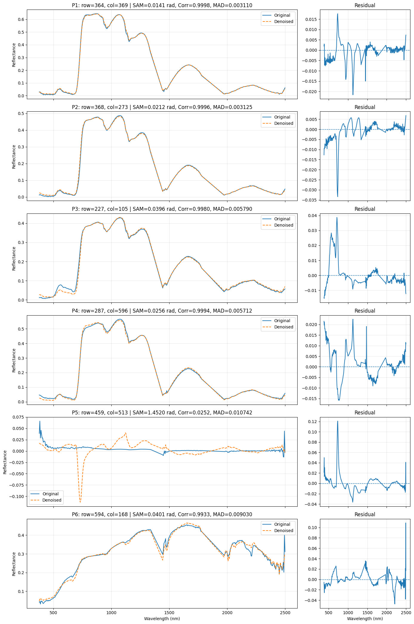
Interpretation
The spectral comparison between the original and denoised signatures shows that the denoising performance varies by target type. For the first four spectra, which correspond to vegetation pixels, the denoised and original signatures are highly consistent, with SAM values below 0.03 radians. These low angles indicate that the denoising process preserves the overall spectral shape very well. The main differences are concentrated in the visible short-wavelength region and in a few localized portions of the NIR/SWIR, where the denoised curves appear smoother than the original ones. This is also confirmed by the residual plots, which are mostly centered around zero with minimal variation. However, the third and fourth vegetation pixels show slightly larger deviations than the first two, especially in the visible and red-edge regions, indicating that some fine spectral details may be smoothed.
In contrast, the fifth spectrum shows very poor agreement between the original and denoised signatures, with a SAM value exceeding 1.1 radians, indicating severe distortion of spectral shape after denoising. The large spectral angle and the clear mismatch in both the spectral plot and residuals demonstrate that the denoising method fails for this pixel, likely because it corresponds to a water or dark low-reflectance target. The sixth spectrum shows intermediate behavior, with a SAM around 0.04-0.05 radians. The denoised signature still follows the overall pattern of the original, but noticeable local shifts are present, particularly in parts of the NIR and SWIR. Therefore, the denoising method can be considered highly effective for vegetation spectra, less accurate for bright non-vegetated surfaces, and unreliable for water or very dark pixels.
Overall, the results indicate that the denoising method performs very well for vegetation spectra, moderately for bright non-vegetated spectra, and poorly for water or very dark spectra. It’s important to remember that even if the spectral shape is well-preserved after denoising, or any similar processing, small changes to specific wavelengths may have taken place which can fundamentally change the physical measurement from the original spectrum and impact your downstream analysis.
From Pixels to the SAM Map (Spatial Assessment)
While pixel-based comparisons provide a detailed look at specific targets, they only tell us how denoising performed at those exact locations. To understand if the denoising is consistent across the entire landscape, we need a spatial assessment.
We do this by generating a SAM map. Instead of looking at one signature, the SAM map calculates the spectral angle for every single pixel in the image and displays it as a continuous image. This allows us to see if the discrepancies we observed in our pixel profiles (such as high discrepancy in water or low discrepancy in vegetation) follow a spatial pattern across the landscape. The map allows us to identify whether certain land-cover types or sensor artifacts are being handled consistently across the whole scene.
def sam_map(cube1, cube2, valid_mask=None):
    """
    Calculate pixelwise Spectral Angle Mapper (SAM) between two hyperspectral cubes.

    Parameters:
        cube1, cube2: Hyperspectral cubes with shape (bands, rows, cols)
        valid_mask: Optional boolean mask indicating valid pixels

    Returns:
        sam: 2D array of SAM angles in radians
    """
    # Calculate dot product across spectral dimension
    dot = np.nansum(cube1 * cube2, axis=0)

    # Calculate spectral norms for each pixel
    norm1 = np.sqrt(np.nansum(cube1**2, axis=0))
    norm2 = np.sqrt(np.nansum(cube2**2, axis=0))

    denom = norm1 * norm2

    # Calculate cosine of angle
    cosang = np.full_like(dot, np.nan, dtype=float)
    good = denom > 0

    cosang[good] = dot[good] / denom[good]
    cosang = np.clip(cosang, -1, 1)

    # Calculate angle in radians
    sam = np.arccos(cosang)

    # Apply valid pixel mask if provided
    if valid_mask is not None:
        sam[~valid_mask] = np.nan

    return sam


# Generate SAM map comparing original and denoised cubes
sam_img = sam_map(cube, cube_denoised, valid_mask=valid_pixels)

sam_bright = sam_img.copy()

# Calculate 99.5th percentile for display clipping
# This prevents extreme outliers from dominating the colorbar range
sam_bright_valid = sam_bright[np.isfinite(sam_bright)]
vmax = np.nanpercentile(sam_bright_valid, 99.5)

# Plot RGB and SAM map side by side for comparison
fig, axes = plt.subplots(1, 2, figsize=(14, 6))

# Left: Original RGB for reference
axes[0].imshow(rgb_original)
axes[0].set_title("Original RGB")
axes[0].axis("off")

# Right: SAM map showing spectral angle at each pixel
im = axes[1].imshow(sam_bright, vmin=0, vmax=vmax, cmap="magma")
axes[1].set_title("SAM map")
axes[1].axis("off")

# Add colorbar with informative label
cbar = fig.colorbar(im, ax=axes[1], fraction=0.046, pad=0.04)
cbar.set_label(f"SAM angle (radians), clipped at 99.5th percentile = {vmax:.3f}")

plt.tight_layout()
plt.show()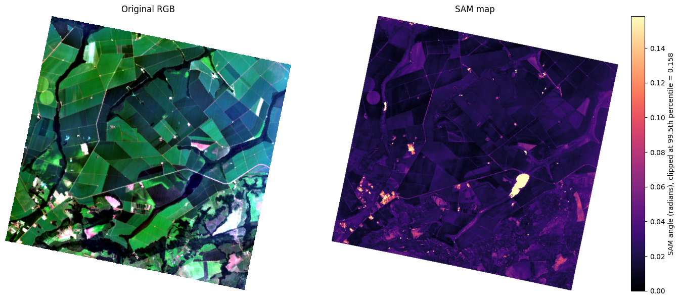
The SAM map reveals how PCA reconstruction behaves across different land covers. Since PCA denoising retains only the most dominant patterns of variance, the spatial distribution of SAM values shows how well each pixel type fits those dominant patterns.
Water bodies show the highest SAM values (bright yellow in the map), indicating severe spectral distortion. Water reflects very little light, resulting in an extremely weak signal. In a scene dominated by bright vegetation, the faint spectral features of water are captured primarily in higher-order components. When these components are discarded during reconstruction, the water pixels are forced toward a generic dark spectrum, losing their true spectral identity.
Bright anomalies such as metal roofs or highly reflective surfaces also show elevated SAM values. PCA is a global statistical method. When the image is dominated by vegetation, the principal components are tuned to vegetation spectral patterns. Small, intensely bright objects are statistical outliers whose unique spectral signatures appear mainly in late components. Discarding those components to remove noise also removes the spectral characteristics that distinguish these rare bright pixels, forcing them toward the scene average.
Agricultural fields show the lowest SAM values (dark purple), indicating excellent spectral preservation. These pixels represent the dominant variance in the scene, so the PCA model captures their spectral signatures in the first few components. This allows effective noise removal with minimal distortion to the spectral shape.
The SAM map shows us spatially where the PCA model failed to represent certain pixel types, but it does not tell us whether we retained enough components overall. To evaluate this, we plot SAM versus original spectral brightness. This visualization helps us assess the efficiency of our reconstruction.
We expect to see an L-shaped distribution:
The vertical stem: Low-brightness pixels where PCA discarded both noise and the weak signal, resulting in high SAM values.
The horizontal tail: High-brightness pixels where the PCA model captured the signal effectively, resulting in low SAM values.
This plot allows us to assess whether the denoising preserved spectral fidelity in bright pixels or inadvertently removed signal along with noise.
import matplotlib.colors as colors

# Calculate spectral norm (brightness) for each pixel
# This represents the overall magnitude of the spectral vector
orig_norm = np.sqrt(np.nansum(cube**2, axis=0))

# Filter valid data for plotting
mask = valid_pixels & np.isfinite(sam_img)
spectral_brightness = orig_norm[mask]
sam_angles = sam_img[mask]

plt.figure(figsize=(8, 6))

# Create 2D histogram with logarithmic color scale
# bins=200 provides high spatial resolution in the plot
# LogNorm() allows visualization of both sparse outliers and dense clusters simultaneously
h = plt.hist2d(spectral_brightness, sam_angles, bins=200, cmap='viridis', norm=colors.LogNorm())

# Add colorbar to show pixel density
cb = plt.colorbar(h[3])
cb.set_label('Number of pixels (log scale)')

plt.xlabel("Original spectral norm (Brightness)")
plt.ylabel("SAM angle (radians)")
plt.title("Density Distribution: SAM vs. Spectral Brightness")

# Optional: Uncomment to focus on the 0-0.35 radian range
# plt.ylim(-0.01, 0.35)

plt.grid(True, linestyle='--', alpha=0.4)
plt.tight_layout()
plt.show()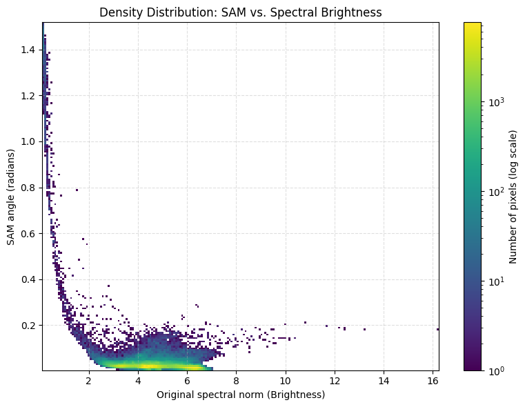
To move from “looking at patterns” to “making decisions,” we categorize the SAM values into discrete classes. This SAM Class Map acts as a traffic light system for our data quality. Instead of guessing how much a pixel changed, we can now quantify exactly how much of our image falls into “Excellent,” “Acceptable,” or “Distorted” categories.
# Calculate summary statistics for valid SAM values
sam_valid = sam_img[np.isfinite(sam_img) & valid_pixels]

print("SAM summary, radians")
print(f"Mean:   {np.nanmean(sam_valid):.4f}")
print(f"Median: {np.nanmedian(sam_valid):.4f}")
print(f"95%:    {np.nanpercentile(sam_valid, 95):.4f}")
print(f"99%:    {np.nanpercentile(sam_valid, 99):.4f}")
print(f"Max:    {np.nanmax(sam_valid):.4f}")

# Create discrete SAM angle classes based on spectral preservation quality
# These thresholds are specific to pre/post-processing comparison of the same spectrum
# < 0.01: High Fidelity - Excellent preservation
# 0.01-0.03: Good Preservation - Target met
# 0.03-0.06: Noticeable Distortion - Borderline
# 0.06-0.12: Poor Preservation - Failed
# > 0.12: Extreme Distortion - Artifactual
classes = np.full(sam_img.shape, np.nan)

classes[(sam_img >= 0)    & (sam_img < 0.01) & valid_pixels] = 1
classes[(sam_img >= 0.01) & (sam_img < 0.03) & valid_pixels] = 2
classes[(sam_img >= 0.03) & (sam_img < 0.06) & valid_pixels] = 3
classes[(sam_img >= 0.06) & (sam_img < 0.12) & valid_pixels] = 4
classes[(sam_img >= 0.12) & valid_pixels] = 5

# Define discrete colormap with one color per quality class
cmap = ListedColormap([
    "#2c7bb6",  # < 0.01 rad (dark blue) - High Fidelity
    "#abd9e9",  # 0.01-0.03 rad (light blue) - Good Preservation
    "#ffffbf",  # 0.03-0.06 rad (yellow) - Noticeable Distortion
    "#fdae61",  # 0.06-0.12 rad (orange) - Poor Preservation
    "#d7191c"   # > 0.12 rad (red) - Extreme Distortion
])

# Set NaN/invalid pixels to light gray
cmap.set_bad(color="lightgray")

# Define class boundaries for discrete colorbar
bounds = [0.5, 1.5, 2.5, 3.5, 4.5, 5.5]
norm = BoundaryNorm(bounds, cmap.N)

plt.figure(figsize=(8, 6))

im = plt.imshow(classes, cmap=cmap, norm=norm)

cbar = plt.colorbar(
    im,
    ticks=[1, 2, 3, 4, 5],
    boundaries=bounds,
    spacing="uniform"
)

cbar.ax.set_yticklabels([
    "< 0.01",
    "0.01-0.03",
    "0.03-0.06",
    "0.06-0.12",
    "> 0.12"
])

cbar.set_label("SAM angle class (radians)")

plt.title("SAM class map: spectral-shape change after denoising")
plt.axis("off")
plt.tight_layout()
plt.show()
SAM summary, radians
Mean: 0.0270
Median: 0.0201
95%: 0.0432
99%: 0.0887
Max: 1.5182
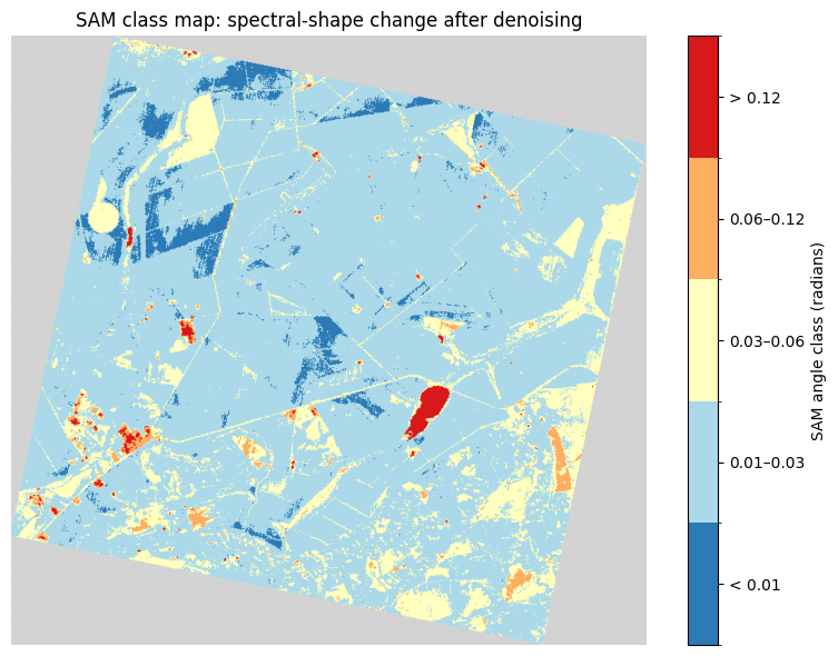
By binning the spectral angles, we can clearly see the geographical distribution of denoising success:
High Fidelity (Dark Blue, rad): Excellent preservation of spectral integrity. The processing has removed noise with almost no distortion to the spectral fingerprint.
Good Preservation (Light Blue, rad): Target met. Very minor smoothing of narrow absorption features may have occurred, but the result remains acceptable for most quantitative geochemical and biophysical modeling applications.
Noticeable Distortion (Yellow, rad): Borderline quality. The denoising has measurably changed the spectrum. The ability to distinguish between specific signatures may be reduced.
Poor Preservation (Orange, rad): Failed. Significant artifacts have been introduced. The processing has fundamentally altered the shape of the spectral curve through over-smoothing or spectral shift.
Extreme Distortion (Red, rad): Artifactual. The pixel is no longer spectrally representative of the original data.
Scientific Takeaway: A map like this allows us to set quality control thresholds for processing workflows. For example, a scientist might decide that only pixels in the High Fidelity and Good Preservation classes ( rad) are reliable enough for high-precision tasks like crop stress detection or mineral identification. Pixels in the orange and red classes indicate areas where the denoising algorithm struggled, typically corresponding to low-signal water bodies or statistically rare bright anomalies.
Challenge: Test the Limits of PCA Denoising
Now it’s your turn to apply these diagnostic tools to a new environment. Denoising is never “one-size-fits-all”—the optimal settings for a forest will be completely different than for an urban area or a mineral outcrop.
Choose a New Scene: Select a dataset from a different domain (e.g., an urban area, a coastal region, or a mineral-rich desert).
Experiment with : Run the PCA reconstruction using different numbers of components: .
Generate the Diagnostics: For each , produce the SAM Class Map and the SAM vs. Spectral Brightness density plot.
Guiding Questions for Your Analysis
Dominant vs. Subtle Features: Look at your first Principal Component (). Which land cover type does it represent? At what value of do the more subtle features finally re-appear in the reconstructed image?
Finding the “Sweet Spot”: Look at your SAM vs. Brightness scatter plot as you increase . How does the L-shaped distribution change?
The Cost of Smoothing: In your SAM Class Map, focus on the areas with high SAM values. Does increasing help preserve these unique pixels, or do they remain distorted because they are statistically rare compared to the rest of the scene?
Goal: Try to identify the Optimal for your specific scene—the point where you have removed the most noise without degrading the spectral signatures of the land covers you care about most.
Leveling Up: From PCA to MNF
Denoising is the foundation of everything that follows—from robust classification and mineral mapping to global terrestrial ecosystem monitoring. The cleaner your datacube, the more truth you can extract from the spectral signatures.
While reconstructing a cube from clean PCA components is an excellent starting point, it relies on a critical, sometimes flawed assumption: that maximum variance always equals maximum signal. In reality, structured noise can also exhibit high variance, meaning PCA will sometimes prioritize noisy bands as “principal” components.
To build truly advanced spectral analytics workflows, we have to look beyond simple variance. The Minimum Noise Fraction (MNF) transform Green et al., 1988 is the next evolutionary step. MNF orders components by noise level / image quality, not simply by total variance like PCA.
Your Independent Challenge: While we won’t be covering the mechanics or implementation of MNF in this course, your journey into spectral denoising shouldn’t stop here. I highly encourage you to take the initiative and research the MNF transform independently.
Challenge yourself to dive into the literature, explore the underlying math, and figure out how to implement it in Python. Transitioning from guided lessons to independent exploration is where real mastery happens.
- Kruse, F. A., Lefkoff, A. B., Boardman, J. W., Heidebrecht, K. B., Shapiro, A. T., Barloon, P. J., & Goetz, A. F. H. (1993). The spectral image processing system (SIPS)—interactive visualization and analysis of imaging spectrometer data. Remote Sensing of Environment, 44(2–3), 145–163.
- Green, A. A., Berman, M., Switzer, P., & Craig, M. D. (1988). A transformation for ordering multispectral data in terms of image quality with implications for noise removal. IEEE Transactions on Geoscience and Remote Sensing, 26(1), 65–74.