
Welcome to Lesson 4 of Module 2.
In the previous lesson, we mastered the Geometry of our data (Basic vs. Ortho).
After choosing between basic and ortho products, you face another critical choice when downloading Tanager-1 data: Radiance or Surface Reflectance.
While we covered the theoretical definitions in the second lesson of this module, this lesson is all about practical application. We will dive into the data to see exactly how these values change when transitioning from sensor-measured energy to the true reflective properties of the surface.
Before we start, take a moment to examine Figure 1. It perfectly illustrates the power of hyperspectral imagery: notice how Tanager-1 captures a rich, continuous spectral signature, revealing fine-grained details that are completely missed by the broad, discrete bands of a multispectral sensor like Sentinel-2.
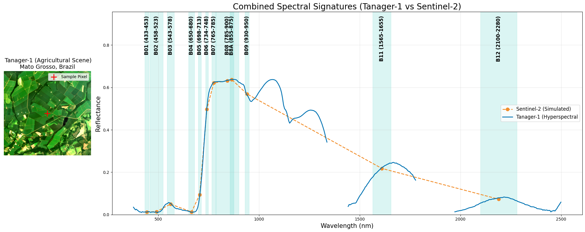
Figure 1:Spectral signature from the hyperspectral Tanager-1 narrowband sensor versus the multispectral Sentinel-2 broadband sensor.
Let’s Start!
Data Acquisition (Radiance & Surface Reflectance)
To perform a valid physics experiment, we need to compare apples to apples, that is, analyze the exact same scene in both Radiance and Surface Reflectance formats. Any differences we observe will then reflect the physics of atmospheric correction, not variations in location or acquisition.
We will download the Ortho versions of both products for the same scene used in the previous lesson (Basic vs. Ortho).
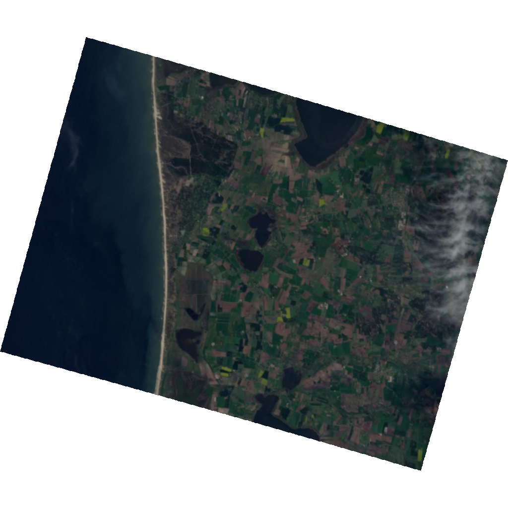
Why Ortho?
Ortho is not mandatory for this lesson. Since most users typically choose ortho products for geometrically aligned analysis, we use Ortho here for consistency.
🧰 Your Toolkit so far
This is your cumulative reference solution through Module 2 · Lesson 3 — the answer key to the previous lesson’s challenge. Keep it near the top and run it before anything else.
# =================
# 🧰 YOUR TOOLKIT
# =================

# Import necessary libraries

import h5py
import numpy as np

import matplotlib.pyplot as plt
import matplotlib.gridspec as gridspec
from matplotlib.ticker import MultipleLocator
import matplotlib.patches as mpatches

import plotly.express as px


# ---- setup -------------------------------------------------------------

def download_tanager_data(url, file_path):
    import os
    import urllib.request

    def _progress(count, block_size, total_size):
        mb_done = count * block_size / 1_000_000
        mb_total = total_size / 1_000_000
        print(f"\rDownloading... {mb_done:.1f} / {mb_total:.1f} MB", end="", flush=True)

    if not os.path.exists(file_path):
        urllib.request.urlretrieve(url, file_path, reporthook=_progress)
        print(f"\nDownload complete: {file_path}")
    else:
        print(f"File already exists, skipping download: {file_path}")
    return file_path

# ---- io ----------------------------------------------------------------

def print_structure(name, obj):
    level = name.count('/')
    indent = '    ' * level

    if isinstance(obj, h5py.Group):
        print(f"{indent}📂 {name}/")
    elif isinstance(obj, h5py.Dataset):
        print(f"{indent}📄 {name} | {obj.shape} | {obj.dtype}")

    if len(obj.attrs) > 0:
        for key, val in obj.attrs.items():
            val_str = str(val)
            if len(val_str) > 50:
                val_str = val_str[:50] + "..."
            print(f"{indent}    ↳ 🏷️ {key}: {val_str}")

def load_hdf5(file_path,
    data_path='HDFEOS/SWATHS/HYP/Data Fields/surface_reflectance',
    band=None
    ):

    with h5py.File(file_path, 'r') as f:
        dset = f[data_path]
        data = dset[:] if band is None else dset[band]
        attrs = dict(dset.attrs)
    return data, attrs
# Download the Basic and Ortho SR assets for this scene using your Toolkit's
# download_tanager_data (defined in the Toolkit cell above).
basic_sr_url = "https://storage.googleapis.com/open-cogs/planet-stac/tanager1-release2-core-imagery/basic_sr_hdf5/20250510_112042_16_4001_basic_sr_hdf5.h5"
ortho_sr_url = "https://storage.googleapis.com/open-cogs/planet-stac/tanager1-release2-core-imagery/ortho_sr_hdf5/20250510_112042_16_4001_ortho_sr_hdf5.h5"
# These filenames are reused throughout the lesson:
# Note: You can change the file name to any name you want.
basic_sr_path = "20250510_112042_16_4001_basic_sr_hdf5.h5"
ortho_sr_path = "20250510_112042_16_4001_ortho_sr_hdf5.h5"
download_tanager_data(basic_sr_url, basic_sr_path)
download_tanager_data(ortho_sr_url, ortho_sr_path)
print("✅ Assets ready")File already exists, skipping download: 20250510_112042_16_4001_basic_sr_hdf5.h5
File already exists, skipping download: 20250510_112042_16_4001_ortho_sr_hdf5.h5
✅ Assets ready
Setup & Data Loading
Import the required libraries and load the data. For a complete physical analysis, we need four components from the HDF5 files:
Radiance Cube — The 3D array of Top-of-Atmosphere (TOA) data.
Surface Reflectance Cube — The 3D array of Bottom-of-Atmosphere (BOA) data.
Wavelengths — The wavelength (in nm) for each band, used as the spectral (X) axis.
Good Wavelengths Mask — A binary flag (1 = good, 0 = bad) that marks noisy bands (e.g., water vapor absorption regions) so we can exclude them from analysis.
HDF5 paths: Instead of inspecting the full HDF5 structure again (which we covered in previous lessons), we’ve already done the HDF5 structure exploration for you to save time. To skip that step, use the following Tanager-1 internal paths to access the datasets and its attributes directly:
Radiance:
HDFEOS/GRIDS/HYP/Data Fields/toa_radianceReflectance:
HDFEOS/GRIDS/HYP/Data Fields/surface_reflectance
Wavelengths and Good Wavelengths Mask are metadata stored alongside the hyperspectral datasets. You don’t need a path to access them.
# Update these paths to match your specific downloaded files
ortho_rad_file = '20250510_112042_16_4001_ortho_radiance_hdf5.h5'
ortho_sr_file  = '20250510_112042_16_4001_ortho_sr_hdf5.h5'

# Define Internal HDF5 Paths
toa_path = 'HDFEOS/GRIDS/HYP/Data Fields/toa_radiance'
sr_path  = 'HDFEOS/GRIDS/HYP/Data Fields/surface_reflectance'

# 2. Data Loading — reuse the Toolkit loader (one call per cube)
ortho_rad_cube, rad_attrs = load_hdf5(ortho_rad_file, toa_path)
ortho_sr_cube,  sr_attrs = load_hdf5(ortho_sr_file,  sr_path)

# Now retrieve needed values straight from attrs dict instead of opening files with h5py again:
radiance_units = rad_attrs.get('Unit', 'Unknown unit')
good_bands = sr_attrs.get('good_wavelengths', None)

# Also get wavelengths from ATTRs if available
wvl_rad = rad_attrs.get('wavelengths', None)
wvl_sr = sr_attrs.get('wavelengths', None)

# 3. Verify both files share the same band center wavelengths (same scene).
assert np.array_equal(wvl_rad, wvl_sr), (
    "Wavelength arrays do not match between Radiance and SR files! "
    "Ensure both files are from the same Tanager-1 acquisition."
)
wavelengths = wvl_sr  # Use either — confirmed identical
print(f"Wavelength arrays match: {len(wavelengths)} bands confirmed.")

# 4. Verify dtypes — Tanager-1 products store both cubes as float32.
print(f"Radiance dtype:     {ortho_rad_cube.dtype}  |  Units: {radiance_units}")
print(f"Reflectance dtype:  {ortho_sr_cube.dtype}")

# 5. Replace -9999 Fill Values with NaN to prevent plotting errors
ortho_rad_cube[ortho_rad_cube == -9999] = np.nan
ortho_sr_cube[ortho_sr_cube == -9999]   = np.nan
Wavelength arrays match: 426 bands confirmed.
Radiance dtype: float32 | Units: W/(m^2 sr um)
Reflectance dtype: float32
RGB Comparison: Radiance vs. Surface Reflectance
To show the difference between Radiance and Surface Reflectance most dramatically, we will use a True Color (Red, Green, Blue) combination.
Why True Color?
The most noticeable visual difference between Radiance and Reflectance is caused by Rayleigh scattering (the “Blue Sky” effect).
Radiance (TOA): Because short wavelengths (mainly blue) are strongly scattered in the atmosphere, the raw image will often look hazy, washed out, or overly blue.
Reflectance (SR): Atmospheric correction mathematically removes this scattering effect, resulting in a crisp, clear image with higher contrast.
Let’s show this by plotting the images side-by-side. To create a true-color image that human eyes can understand, we need to extract the Red, Green, and Blue bands from our data cube. Our function will do three main things:
Find the wavelengths: Locate and select the specific bands closest to Red (680 nm), Green (550 nm), and Blue (470 nm) from the original hyperspectral cube.
Stack & Stretch: Combine the selected RGB bands into a single image and apply a 2%–98% contrast stretch to clip extreme dark and bright outliers. The normalization math looks like this:
Plot the Results: Map the radiance and surface reflectance images side-by-side for a direct visual comparison.
def compare_radiance_vs_reflectance(rad_cube, sr_cube, wvl, rgb_bands=(680, 550, 470)):
    """
    Plots a side-by-side comparison of Radiance and Reflectance.
    Returns the cleaned RGB Surface Reflectance image array.
    """

    # Find Band Index
    def find_idx(target_nm):
        # Calculates the difference between our target wavelength and all available wavelengths,
        # then returns the index of the smallest difference.
        return np.argmin(np.abs(wvl - target_nm))

    # Get the indices for R, G, B
    r_nm, g_nm, b_nm = rgb_bands
    idx_r = find_idx(r_nm)
    idx_g = find_idx(g_nm)
    idx_b = find_idx(b_nm)

    # Stack & Stretch: Build a normalized RGB image from the three selected bands
    def make_rgb(cube):
        # Stack the three bands into a single (H, W, 3) array
        img = np.dstack((cube[idx_r], cube[idx_g], cube[idx_b]))

        # Calculate the 2nd and 98th percentiles of the image
        p_2, p_98 = np.nanpercentile(img, (2, 98))

        # Apply the contrast stretch formula and clip values between 0 and 1
        return np.clip((img - p_2) / (p_98 - p_2), 0, 1)

    # Process Images
    rgb_rad = make_rgb(rad_cube)
    rgb_sr  = make_rgb(sr_cube)

    # Plotting the Comparison
    fig, (ax_rad, ax_sr) = plt.subplots(1, 2, figsize=(20, 10))

    ax_rad.imshow(rgb_rad)
    ax_rad.set_title("Radiance (Top-of-Atmosphere)\nNotice the blue haze & low contrast", fontsize=14)
    ax_rad.axis('off')

    ax_sr.imshow(rgb_sr)
    ax_sr.set_title("Reflectance (Bottom-of-Atmosphere)\nAtmosphere Removed (crisp & clear)", fontsize=14)
    ax_sr.axis('off')

    plt.show()

    # Output the clean image for use in the rest of the lesson
    return rgb_sr
Now, let’s pass our raw data cubes into the function we just built. Watch the output to see the difference atmospheric correction makes!
# Assuming ortho_rad_cube, ortho_sr_cube, and wavelengths are already loaded into memory.
# We capture the output into a variable named 'rgb_map_clean' so we can use it later.
rgb_map_clean = compare_radiance_vs_reflectance(ortho_rad_cube, ortho_sr_cube, wavelengths)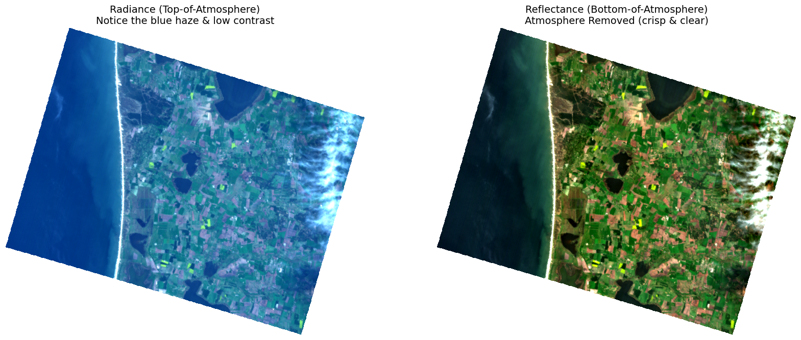
Interesting! Do you see the difference? At first glance, the left image (Radiance) might just look “brighter,” but look closer.
The left image (radiance) appears overly blue. This is partially due to Rayleigh scattering. The sunlight is bouncing off the air molecules and scattering into the field of view of our sensor. You aren’t just looking at the ground; you are looking through a thick layer of illuminated atmosphere.
The right image (surface reflectance) looks sharp and clear. The algorithm has mathematically removed the blue haze. Look at the water: it has turned into dark blue or black. This is correct because deep water absorbs almost all light. The data now represents the actual material on the ground, not the air above it.
Spectral Signature Comparison (Vegetation, Soil, and Water)
In the second part of this lesson, we will see the physics of remote sensing in action by comparing the spectral signatures of distinct materials. Specifically, we will examine three common land cover types: Vegetation, Soil, and Water.
We have pre-selected three coordinate points representing these features, which you will find entered in the code block below.
# YOU CAN UPDATE THESE COORDINATES based on your specific scene!
# Define your targets and their pixel coordinates (y, x)
# Format: (Row/Y, Col/X)
targets = {
    'Vegetation': (403, 495),
    'Soil':       (225, 486),
    'Water':      (400, 140)
}

# Define the colors for each target
colors = {
    'Vegetation':'darkgreen',
    'Soil':'tab:red',
    'Water':'tab:blue'
}

print(f"Spectral extraction points initialized for: {list(targets.keys())}")
Spectral extraction points initialized for: ['Vegetation', 'Soil', 'Water']
Mapping the Targets & Comparing Spectra
Now that we have defined our pre-selected coordinate points for Vegetation, Soil, and Water, it is time to bring it all together. We will create a unified dashboard that connects the geography of our image directly to its underlying physics, displaying:
Where the pixel is located (Map View).
What its unique physical makeup looks like in both radiance and surface reflectance (Spectral Plot).
Key Feature: “Bad Band” Masking
As you examine the spectral lines in the plots below, pay close attention to what happens around 1400 nm and 1900 nm. You will notice the two lines behave very differently in those regions.
Radiance (blue line): You will see dramatic, sharp dips in the signal. These are real measurements. The Earth’s atmosphere contains water vapor that absorbs almost all incoming solar radiation at those wavelengths, so the sensor receives almost no energy. What you are seeing is the atmosphere in action.
Surface Reflectance (green line): You will see gaps — the line simply disappears. This is because the
good_wavelengthsmask has hidden these bands entirely. The atmospheric correction algorithm flagged them as unreliable: if almost no light made it through the atmosphere in the first place, there is nothing meaningful to correct. Rather than produce a scientifically invalid reflectance value, the algorithm marks those bands as bad and we remove them from the plot.
To view our map and our spectral signatures at the same time, we need to build a custom dashboard. We will use a matplotlib feature called GridSpec.
GridSpec allows us to create asymmetric layouts. We will tell Python to make the left column a single, large image (our map), and split the right column into separate rows (one for each target’s spectral plot).
Because Radiance (Top-of-Atmosphere) and Reflectance (Bottom-of-Atmosphere) have completely different numerical scales, we cannot plot them on the exact same axis. Instead, we will use a technique called Dual Y-Axes (twinx), which allows us to put Radiance on the left axis (in blue) and Reflectance on the right axis (in green) of the same graph.
def plot_physics_dashboard(target_dict, color_dict, rad_cube, sr_cube, wvl, mask, bg_img, rad_units=''):
    """
    Generates a dashboard comparing Map Location vs. Spectral Signatures.
    """
    # Setup Grid Layout
    fig = plt.figure(figsize=(20, 4 * len(target_dict)))
    gs = gridspec.GridSpec(len(target_dict), 2, width_ratios=[1, 1.5])

    # Plot the Map (Left Column)
    ax_map = fig.add_subplot(gs[:, 0])
    ax_map.imshow(bg_img)
    ax_map.set_title("Target Locations", fontsize=16, fontweight='bold')
    ax_map.axis('off')

    # Drop a pin on the map for each target
    for name, (y, x) in target_dict.items():
        c = color_dict.get(name, 'red')
        ax_map.scatter(x, y, s=150, c=c, edgecolors='white', linewidth=2, label=name)
        ax_map.text(x + 15, y, name, color=c, fontsize=14, fontweight='bold', va='center')

    # Plot the Spectra (Right Column - One Row per Target)
    for idx, (name, (y, x)) in enumerate(target_dict.items()):
        ax1 = fig.add_subplot(gs[idx, 1])

        # Extract the specific pixel's data
        sig_rad = rad_cube[:, y, x]
        sig_sr  = sr_cube[:, y, x]

        # Apply the "Bad Band" mask to Surface Reflectance only.
        # Radiance is left unmasked — the deep absorption dips at ~1400 nm and ~1900 nm
        # are real physics (atmospheric water vapor absorbing solar energy).
        clean_rad = sig_rad.copy()
        clean_sr  = sig_sr.copy()
        clean_sr[mask == 0] = np.nan

        # Plot Radiance (Left Axis - Blue)
        color_rad = 'tab:blue'
        ln1 = ax1.plot(wvl, clean_rad, color=color_rad, linewidth=1.5, alpha=0.7, label='TOA Radiance')
        ax1.set_ylabel(f'Radiance ({rad_units})', color=color_rad, fontweight='bold')
        ax1.tick_params(axis='y', labelcolor=color_rad)
        ax1.grid(True, linestyle=':', alpha=0.6)

        if not np.all(np.isnan(clean_rad)) and np.nanmax(clean_rad) > 0:
            ax1.set_ylim(0, np.nanmax(clean_rad) * 1.1)

        # Title
        c = color_dict.get(name, 'black')
        ax1.set_title(f"{name} Signature (Pixel {x}, {y})", fontsize=14, fontweight='bold', color=c, loc='left')

        # Plot Reflectance (Right Axis - Green)
        ax2 = ax1.twinx()
        color_sr = 'tab:green'
        ln2 = ax2.plot(wvl, clean_sr, color=color_sr, linewidth=2.5, label='Surface Reflectance')
        ax2.set_ylabel('Reflectance (0-1)', color=color_sr, fontweight='bold')
        ax2.tick_params(axis='y', labelcolor=color_sr)

        if not np.all(np.isnan(clean_sr)) and np.nanmax(clean_sr) > 0:
            ax2.set_ylim(0, np.nanmax(clean_sr) * 1.1)

        # Legend (Top Plot Only)
        if idx == 0:
            lns = ln1 + ln2
            labs = [l.get_label() for l in lns]
            ax1.legend(lns, labs, loc='upper right')

        # --- NEW X-AXIS FORMATTING ---
        # Force the X-axis to place a tick mark every 100 nm
        ax1.xaxis.set_major_locator(MultipleLocator(100))

        # X-Axis Labels (Bottom Plot Only)
        if idx == len(target_dict) - 1:
            ax1.set_xlabel('Wavelength (nm)', fontsize=12)
            # Rotate the labels by 45 degrees so the numbers don't overlap
            ax1.tick_params(axis='x', rotation=45)
        else:
            ax1.set_xticklabels([])

    plt.tight_layout()
    plt.subplots_adjust(wspace=0.15, hspace=0.2)
plt.show()Now, let’s pass our data cubes into the dashboard function we just built. As you examine the output, pay close attention to two main things:
The Surface Cover: Look at how drastically the shape of the spectral signature changes depending on the surface type we are looking at (Vegetation vs. Soil vs. Water).
The Physics: Compare the raw Radiance (the blue line) with the atmospherically corrected Surface Reflectance (the green line) for each target. Notice how removing the atmosphere strips away the scattering and distortion, revealing the true, clear signature of the surface! What else do you see? Do you think we perfectly corrected for the atmosphere?
# Run the Dashboard

plot_physics_dashboard(
    target_dict=targets,
    color_dict=colors,
    rad_cube=ortho_rad_cube,
    sr_cube=ortho_sr_cube,
    wvl=wavelengths,
    mask=good_bands,
    bg_img=rgb_map_clean,
    rad_units=radiance_units
)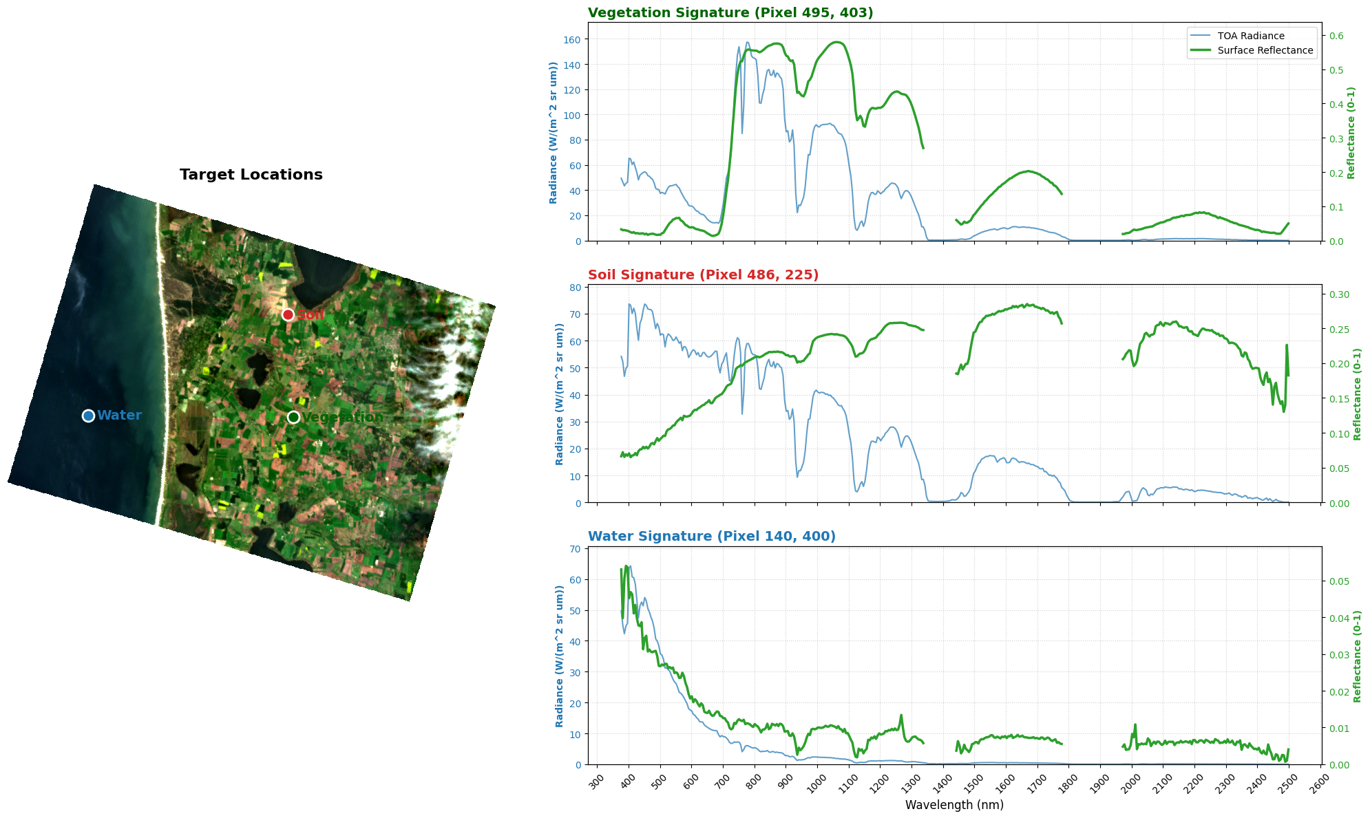
With our dashboard complete, we can now directly link spatial locations with their underlying physical properties. Focus your attention on the green line (Surface Reflectance) — this is the data type you will use for most land surface analyses.
The “Red Edge” (Vegetation)
The Shape: Notice the low overall reflectance in the visible range. Plants absorb a lot of the incoming light at these wavelengths. The reflectance is especially low in the blue (~450 nm) and red (~680 nm) regions where chlorophyll absorption peaks, with a small green bump around 550 nm (which is why healthy plants look green to our eyes). Then, just past 700 nm, there is a dramatic, steep jump. This is the famous “Red Edge.”
The Physics: Healthy plants strongly absorb red light (to power photosynthesis) but highly reflect and transmit Near-Infrared (NIR) light based on their cellular and canopy structure. The sharper and taller this jump is, the healthier and denser the vegetation canopy.
Comparing Radiance and Surface Reflectance: Notice how the green (SR) line is much smoother and cleaner than the blue (radiance) line in the visible region. This is atmospheric correction doing its job — removing the scattered skylight that obscured the surface signal.
The “Steady Rise” (Soil)
The Shape: Compared to vegetation, soil has a smoother signature. It starts low in the blue and gradually brightens as wavelength increases. Depending on the soil’s properties, you may or may not observe specific spectral features. In this pixel we see two dips in the NIR part of the spectrum that are similar to those we see in the vegetation spectrum. These are likely water vapor artifacts from the atmospheric correction process or some amount of green vegetation present in this pixel. You wouldn’t see these features in a lab-measured, pure soil spectrum.
The Physics: Dry mineral soils are broadly reflective across NIR and SWIR. Soil texture and moisture are the main controls on the signature along with mineral composition. Soil reflectance decreases with increased moisture.
Comparing Radiance and Surface Reflectance: The steady rise will be briefly interrupted by the atmospheric absorption bands around 1400 nm and 1900 nm — look for dips in the blue radiance line and gaps in the green SR line at those wavelength regions.
The “Black Hole” (Water)
The Shape: Water absorbs nearly all incoming light beyond the visible range. The reflectance line rises slightly in the blue-green (which is why deep water appears blue from above), then drops to nearly zero beyond ~750 nm.
The Physics: Deep, clear water is essentially a “black hole” for NIR and SWIR radiation. This makes it one of the easiest features to identify in hyperspectral data. If you see a spike in the infrared here, it would usually indicate extremely shallow water (the sensor is seeing the bottom) or the presence of submerged or aquatic vegetation or algae.
Comparing Radiance and Surface Reflectance: Compare the blue radiance line and the green SR line in the NIR region. Even though the true surface reflectance is near zero, the radiance signal will remain slightly above zero. This floor is atmospheric path radiance — skylight scattered directly into the sensor without ever touching the ground. It is one of the clearest illustrations in this entire lesson of why raw radiance misrepresents the actual surface.
A Simpler Approach for Everyday Use
The complex plotting we just built is fantastic for learning the physics of remote sensing. It allows us to directly compare raw Radiance to Surface Reflectance. However, writing that much formatting code every time you want to look at a pixel is exhausting!
In your actual day-to-day research, you will almost exclusively use the cleaned Surface Reflectance data.
Because we only need to plot one dataset now, we can write a much simpler, cleaner function. The code below uses a standard 1x2 layout:
Left: The map with our target locations.
Right: A single graph with all three spectral signatures plotted together.
Not only is this code much easier to read and write, but putting all three lines on the exact same graph makes it easy to visually compare their shapes and reflectance values directly against each other.
def plot_simple_spectra(target_dict, color_dict, sr_cube, wvl, mask, bg_img):

    # Create a simple figure with 1 row and 2 columns
    _, (ax_map, ax_plot) = plt.subplots(1, 2, figsize=(16, 6))

    # Map (Left)
    ax_map.imshow(bg_img)
    ax_map.set_title("Target Locations", fontsize=14, fontweight='bold')
    ax_map.axis('off')

    # Plot (Right)
    ax_plot.set_title("Surface Reflectance Signatures", fontsize=14, fontweight='bold')
    ax_plot.set_xlabel("Wavelength (nm)", fontsize=12)
    ax_plot.set_ylabel("Reflectance", fontsize=12)
    ax_plot.grid(True, linestyle='--', alpha=0.6)

    # Loop through the targets to plot points on the map AND lines on the graph
    for name, (y, x) in target_dict.items():
        c = color_dict.get(name, 'red')

        # Draw the dot on the map
        ax_map.scatter(x, y, s=100, c=c, edgecolors='white', zorder=5)
        ax_map.text(x + 10, y, name, color=c, fontweight='bold', fontsize=12)

        # Extract the data and apply the "Bad Band" mask
        signature = sr_cube[:, y, x].copy()
        signature[mask == 0] = np.nan

        # Draw the line on the graph
        ax_plot.plot(wvl, signature, label=name, color=c, linewidth=2)

    # Add the legend to the graph
    ax_plot.legend(loc='upper right')

    plt.show()
# NOTE: targets and colors already defined above
plot_simple_spectra(targets, colors, ortho_sr_cube, wavelengths, good_bands, rgb_map_clean)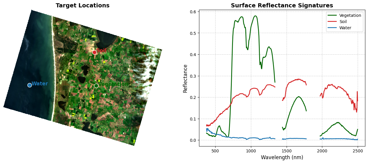
Spectral Variability Within a Class
A single pixel gives you one spectral signature, but is it representative? Real land cover is rarely uniform — a field contains shadows, soil gaps, plants at different growth stages, and more. Relying on a single point can be misleading.
A more robust approach is to sample a small spatial window of pixels around your target and plot the mean ± standard deviation across that neighborhood. The shaded band shows how much the spectra vary within that area:
A narrow band means the surrounding pixels are spectrally similar — your sample point is representative.
A wide band means high variability — the area is heterogeneous or mixed.
The analyze_pixel_variability Function
The function below samples a window_size × window_size pixel neighborhood around a target coordinate and does three things:
Extract the window: Slices a small 3D sub-cube from the main dataset centered on the target pixel.
Calculate statistics: Computes the mean and standard deviation across all pixels in the window at every wavelength.
Plot the result: Draws the mean line with a shaded ±1 standard deviation band using
fill_between, alongside a zoomed-in map showing exactly which pixels were sampled.
def analyze_pixel_variability(target_name, coords, sr_cube, wvl, mask, bg_img, window_size=5, color='tab:green'):
    """
    Plots the Mean Signature ± Standard Deviation for a specific spatial window.
    """

    # EXTRACT THE PIXEL WINDOW (ROI-Region of Interest)
    cen_y, cen_x = coords
    half_w = window_size // 2

    # Calculate the edges of our box.
    # Using max() and min() ensures the box doesn't break if we are at the very edge of the image!
    y_start = max(0, cen_y - half_w)
    y_end   = min(sr_cube.shape[1], cen_y + half_w + 1)
    x_start = max(0, cen_x - half_w)
    x_end   = min(sr_cube.shape[2], cen_x + half_w + 1)

    # Slice a small 3D box out of our main data cube
    roi_cube = sr_cube[:, y_start:y_end, x_start:x_end]

    # Flatten the spatial grid into a list of pixels so we can easily run math on them
    roi_flat = roi_cube.reshape(roi_cube.shape[0], -1)

    # APPLY THE "BAD BAND" MASK
    roi_clean = roi_flat.copy()
    # Replace all masked bands with NaN (Not a Number)
    roi_clean[mask == 0, :] = np.nan

    # CALCULATE MEAN & STANDARD DEVIATION
    import warnings
    # Because our "bad bands" are entirely NaNs, asking Python to find the average
    # of "nothing" throws an annoying RuntimeWarning. We will temporarily silence it here!
    with warnings.catch_warnings():
        warnings.simplefilter("ignore", category=RuntimeWarning)

        # Calculate the average and the spread (std dev) across the pixels for each wavelength
        mean_sig = np.nanmean(roi_clean, axis=1)
        std_sig  = np.nanstd(roi_clean, axis=1)

    # PLOTTING THE DASHBOARD
    fig = plt.figure(figsize=(20, 8))
    gs = gridspec.GridSpec(1, 2, width_ratios=[1, 1.5])

    # Plot the Zoomed-In Map
    ax_map = fig.add_subplot(gs[0])
    zoom_buff = 50 # How many pixels to show around our target
    ax_map.imshow(bg_img)

    # Force the map to zoom in on our specific coordinates
    ax_map.set_xlim(cen_x - zoom_buff, cen_x + zoom_buff)
    ax_map.set_ylim(cen_y + zoom_buff, cen_y - zoom_buff)

    ax_map.set_title(f"Selected {window_size}x{window_size} Pixel Window\n(Center: {cen_x}, {cen_y})", fontsize=14, fontweight='bold')
    ax_map.axis('off')

    # Draw the yellow Selection Box on the map to show our sampling area
    rect = mpatches.Rectangle(
        (x_start, y_start), x_end - x_start, y_end - y_start,
        linewidth=3, edgecolor='yellow', facecolor='none', linestyle='--'
    )
    ax_map.add_patch(rect)

    # Plot the Spectral Envelope
    ax_plot = fig.add_subplot(gs[1])

    # 1. Plot the solid line for the Mean (Average)
    ax_plot.plot(wvl, mean_sig, color=color, linewidth=2.5, label=f'Mean Signature (n={roi_flat.shape[1]} px)')

    # 2. Plot the Shaded Envelope for the Standard Deviation
    ax_plot.fill_between(wvl, mean_sig - std_sig, mean_sig + std_sig, color=color, alpha=0.25, label='±1 Std Dev (Variability)')

    # Dynamic Y-Limit to keep the chart clean
    if not np.all(np.isnan(mean_sig)) and np.nanmax(mean_sig) > 0:
        ax_plot.set_ylim(0, np.nanmax(mean_sig + std_sig) * 1.1)

    ax_plot.set_title(f"Intra-Class Variability: {target_name}", fontsize=14, fontweight='bold', color=color)
    ax_plot.set_xlabel("Wavelength (nm)")
    ax_plot.set_ylabel("Surface Reflectance")
    ax_plot.legend(loc='upper right')
    ax_plot.grid(True, linestyle=':', alpha=0.6)

    plt.show()
With our function ready, let’s put it to the test on our first target: Vegetation.
# Example 1: Check Vegetation (Is the crop uniform?)
analyze_pixel_variability(
    'Vegetation',
    targets['Vegetation'],
    ortho_sr_cube,
    wavelengths,
    good_bands,
    rgb_map_clean,
    window_size=5,
    color='tab:green'
)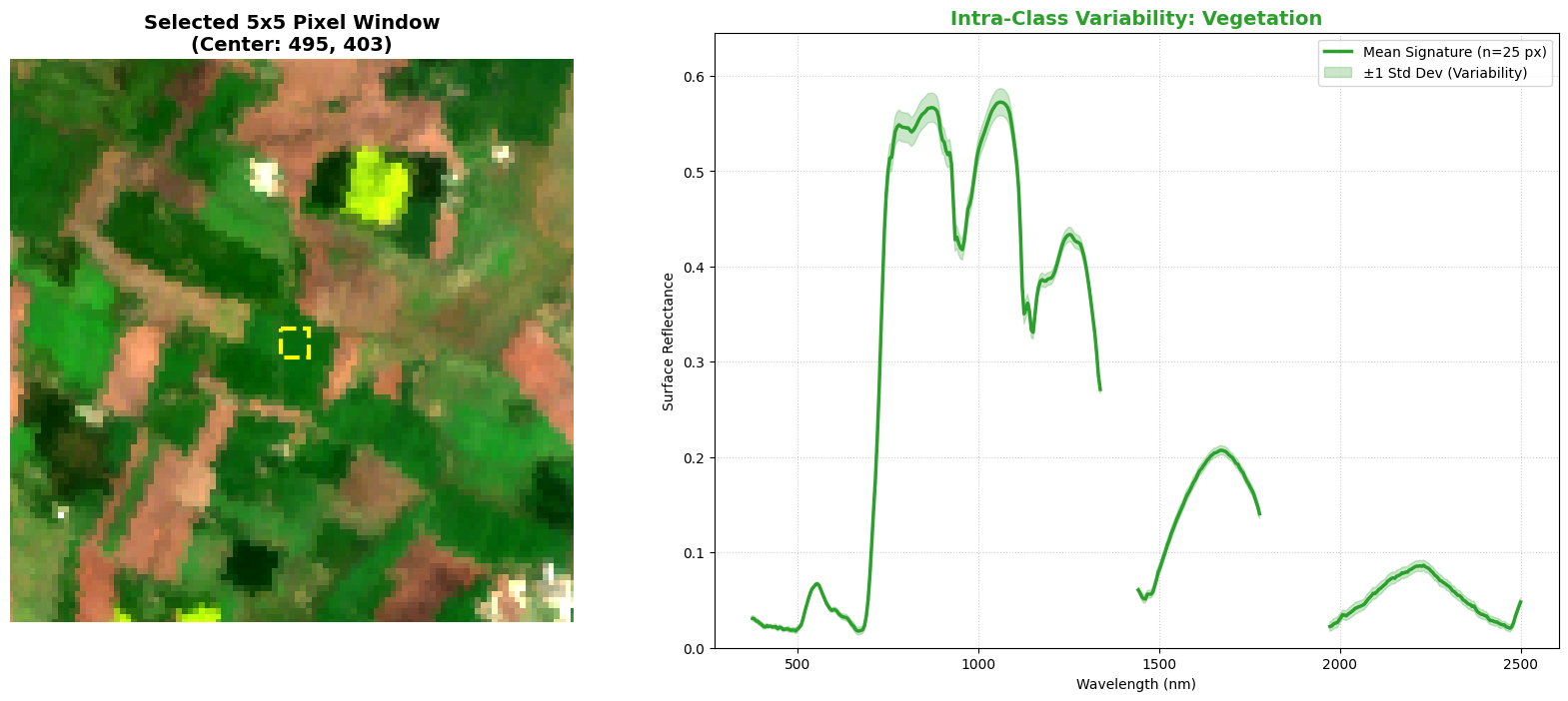
Look closely at the shaded green area in your plot. It represents ±1 standard deviation across the 25 pixels in the sampling window.
Visible region (400–700 nm): narrow spread. The shaded band is very tight here. All 25 pixels have nearly the same reflectance in the visible wavelengths — indicating they contain similar amounts of chlorophyll. This is a chemically uniform canopy.
Near-Infrared plateau (750 nm+): slightly wider spread. The variability increases in the NIR. This is structural: even within a uniform crop, small differences in leaf angle, canopy density, and shadowing change how NIR light scatters from pixel to pixel.
Let’s look at another example: Soil.
# Example 2: Check Soil (Is the bare field mixed with weeds?)

analyze_pixel_variability(
    'Soil', targets['Soil'],
    ortho_sr_cube, wavelengths, good_bands, rgb_map_clean,
    window_size=5, color='tab:brown'
)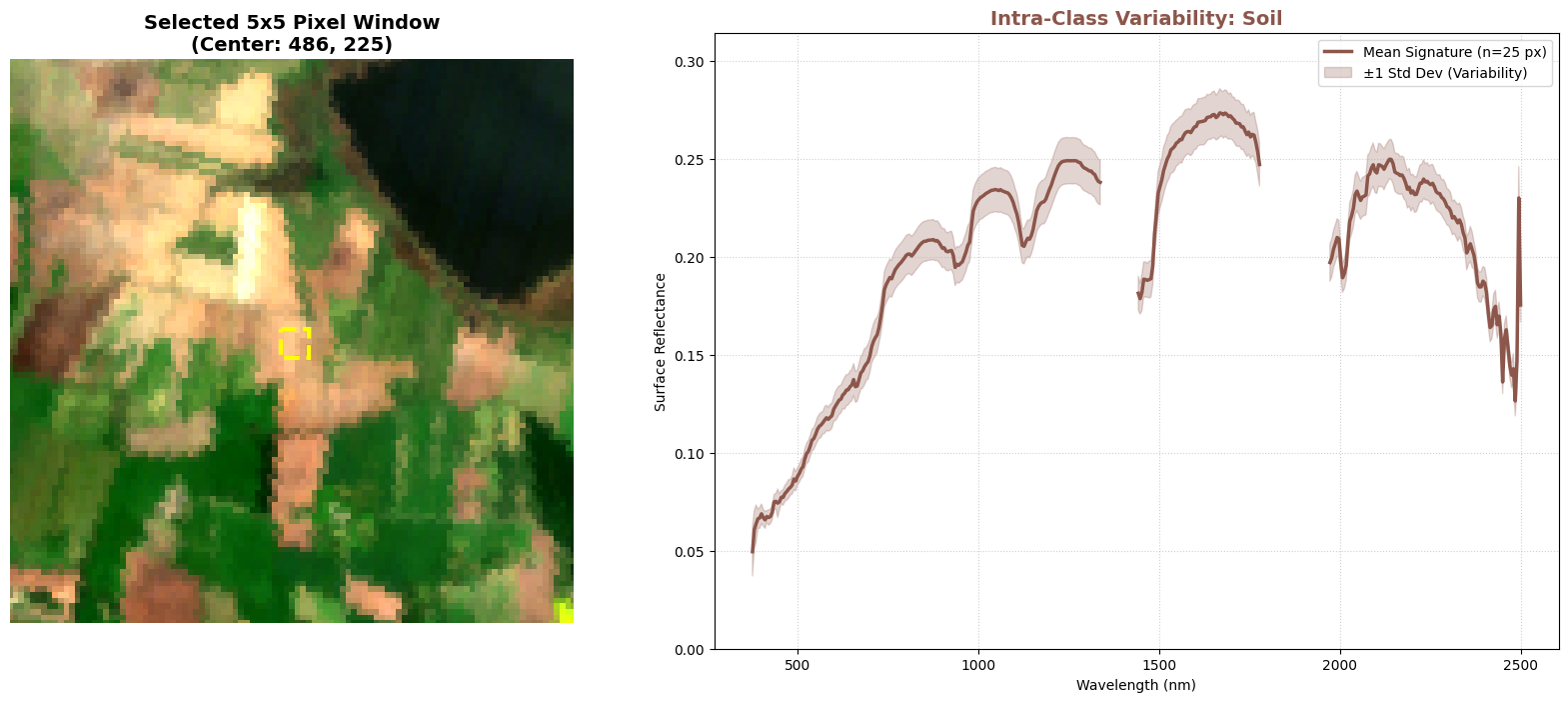
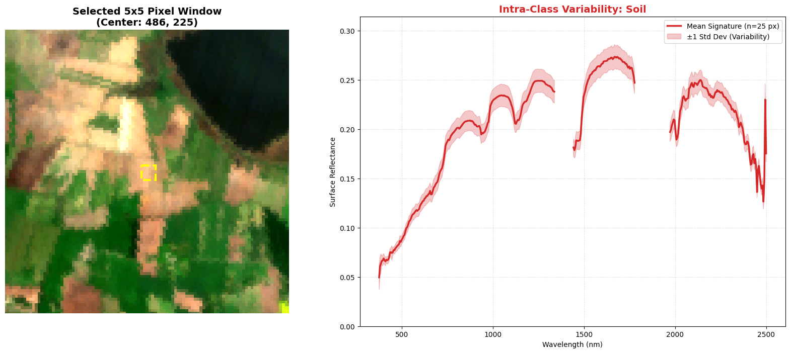
Look closely at the shaded brown area in your plot. It represents ±1 standard deviation across the 25 pixels in the sampling window.
The “Steady Rise” shape. The mean line starts low in the blue and rises gradually into the infrared — the classic signature of dry mineral soil. Unlike vegetation, there is no sharp spectral feature like the Red Edge; the response is broad and smooth across most of the spectrum. We do see some features that indicate our atmospheric correction may not have properly accounted for water vapor or possibly some sub-pixel vegetation is present in this area and those features indicate water in that plant material.
Wider spread compared to vegetation. The shaded band is noticeably broader here than it was for the vegetation target. A “bare” field is rarely uniform: small differences in soil moisture, surface roughness, clods of dirt, furrow shadows, and patches of crop residue all create pixel-to-pixel variation. The wider band reflects that physical heterogeneity.
Your Turn: Interactive Exploration
Our guided lesson ends here, but your exploration is just beginning!
Below, you will find a tool that plots our map in an interactive mode. This allows you to explore the image dynamically and discover the exact (y, x) pixel coordinates of any landscape feature that catches your eye, whether it is a different agricultural field, a dense patch of forest, or a man-made structure.
How to keep exploring:
Find a Target: Run the interactive map code below and hover over the image to find the coordinates of a new, interesting area.
Update the Dictionary: Scroll back up to the
targetsdictionary we defined earlier in the lesson.Plug in your Data: Replace the old coordinates with your new ones (you can even add new target names and colors!).
Analyze: Re-run the plotting and variability functions to uncover the unique physical signatures of the areas you chose.
Have fun exploring the physics of your own targets!
# Replace NaN/Inf so Plotly can render (avoids 'invalid value encountered in cast' warning)
rgb_safe = np.nan_to_num(rgb_map_clean, nan=0.0, posinf=0.0, neginf=0.0)
fig = px.imshow(rgb_safe)

# Clean up the layout
fig.update_layout(
    title="<b>Pixel Hunter</b>: Hover for Coordinates, Drag to Zoom",
    width=800,
    height=800,
    dragmode="zoom",
    margin=dict(l=0, r=0, b=0, t=40)
)

fig.show()# STEP 1: DEFINE TARGETS & COLORS
# YOU CAN UPDATE THESE COORDINATES based on your specific scene!
# Format: 'Class Name': (Row/Y, Col/X)
targets = {
'Vegetation': (403, 495),
'Soil': (225, 486),
'Water': (400, 140)
}
# Define the colors for our plots to keep everything consistent.
# Colors are chosen for visibility on the RGB map background.
colors = {
'Vegetation': 'darkgreen',
'Soil': 'tab:red',
'Water': 'tab:blue'
}# STEP 2: RUN THE PHYSICS DASHBOARD
# This will generate our map alongside the Radiance vs. Reflectance plots.
# Make sure your target dictionaries from the cell above are loaded!
plot_physics_dashboard(
target_dict=targets,
color_dict=colors,
rad_cube=ortho_rad_cube,
sr_cube=ortho_sr_cube,
wvl=wavelengths,
mask=good_bands,
bg_img=rgb_map_clean,
rad_units=radiance_units
)# STEP 3: ANALYZE INTRA-CLASS VARIABILITY
# Now, let's look at the 5x5 pixel neighborhood around each target.
# We will loop through our dictionary to generate a separate plot for each class.
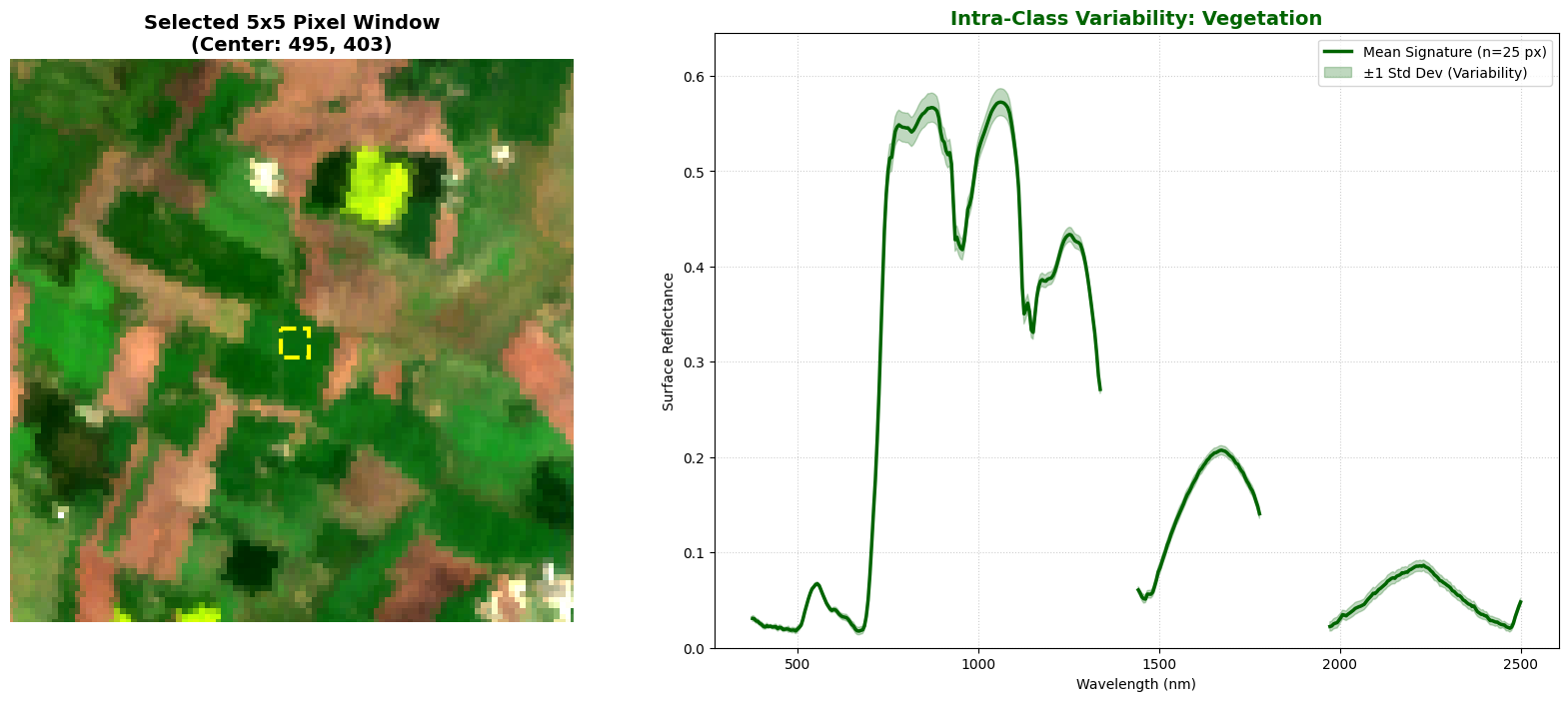
print("Calculating mean ± std dev for 5x5 spatial windows...")
# Loop through all three of our targets
for name, coords in targets.items():
# Grab the specific color we assigned to this target earlier
target_color = colors.get(name, 'black')
# Run our variability function for the current target
analyze_pixel_variability(
target_name=name,
coords=coords,
sr_cube=ortho_sr_cube,
wvl=wavelengths,
mask=good_bands,
bg_img=rgb_map_clean,
window_size=5, # Extracting a 5x5 pixel grid (25 pixels total)
color=target_color
)Calculating mean ± std dev for 5x5 spatial windows...

# =====================================================================
# 🧰 TOOLKIT — YOUR TURN  (implement before the next lesson)
# Fill in the bodies below; the reference solution appears at the top
# of the next coding lesson (Module 3 · Lesson 1: Data Cleaning and Preprocessing).
# =====================================================================
import numpy as np

# ---- bands -------------------------------------------------------------

def nearest_band(wavelengths, target_nm):
    """Return the index of the band whose wavelength is closest to ``target_nm``.

    Parameters
    ----------
    wavelengths : ndarray
        Per-band center wavelengths (nm).
    target_nm : float
        Wavelength of interest (nm).

    Returns
    -------
    int
        Index of the nearest band.
    """
    # TODO: return the int index of the band closest to target_nm
    #       (hint: np.argmin of np.abs(wavelengths - target_nm)).
    pass

# ---- visualization ----------------------------------------------------

def make_rgb(cube, wavelengths, r_nm=680, g_nm=560, b_nm=470,
             percentile_low=2, percentile_high=98):
    """Build a contrast-stretched true-colour RGB composite from a cube.

    Picks the bands nearest the three target wavelengths, stacks them, and
    applies a percentile stretch (computed with ``nanpercentile`` so NaN
    no-data is ignored).

    Parameters
    ----------
    cube : ndarray, shape (bands, rows, cols)
        Hyperspectral cube.
    wavelengths : ndarray
        Per-band center wavelengths (nm).
    r_nm, g_nm, b_nm : float
        Target wavelengths (nm) for the red, green, blue channels.
    percentile_low, percentile_high : float
        Percentiles for the contrast stretch.

    Returns
    -------
    ndarray, shape (rows, cols, 3)
        RGB image normalized to [0, 1].
    """
    # TODO: use nearest_band to pick the r/g/b band indices; np.dstack them;
    #       percentile-stretch with np.nanpercentile and np.clip to [0, 1].
    pass
Summary & Next Steps
You have covered a massive amount of ground in this lesson! By connecting spatial geography directly with its underlying physics, you accomplished two major things:
Proved the Physics: You compared Top-of-Atmosphere Radiance with Bottom-of-Atmosphere Surface Reflectance, seeing firsthand how atmospheric correction strips away scattering to reveal true material signatures.
Explored Real-World Variability: You moved beyond the assumption of a “perfect pixel” by extracting 5x5 spatial windows and plotting the mean ± standard deviation across each neighborhood, showing that natural land covers are complex mixtures of light, shadow, and background materials.
However, you might have noticed that we intentionally selected a pretty clear scene for these exercises (though there are some clouds!). In real-world remote sensing, nature is rarely that cooperative! We will tackle this messy reality head-on in Module 3, where we will build a Data Cleaning Pipeline using the quality masks included in the Tanager-1 product assets.
But before we move on to cleaning the data, there is one final piece of the puzzle to uncover: the metadata hidden inside the HDF5 file!
In our final short lesson for this module, you will learn how to read the structural information embedded directly inside these complex scientific files, exploring hierarchical elements that look exactly like this:
📂 HDFEOS INFORMATION/
    ↳ 🏷️ HDFEOSVersion: b'HDFEOS_5.1.15'
    📄 HDFEOS INFORMATION/StructMetadata.0 | () | |S32000
See you in the next short lesson: Decoding the Metadata!